To design links or create animations of menu buttons, you might need to use underlines. From this article, you’ll learn about several methods of creating a CSS underline: using text-decoration, border-bottom, background-image, box-shadow properties, or even SVG.
CSS Text-Decoration Property
The text-decoration property is the most straightforward way to underline text. The main issue with text-decoration, however, is its lack of customizability. We’ll see more customized examples further in this article.
For now, let’s see how we can use text-decoration for a simple CSS underline.
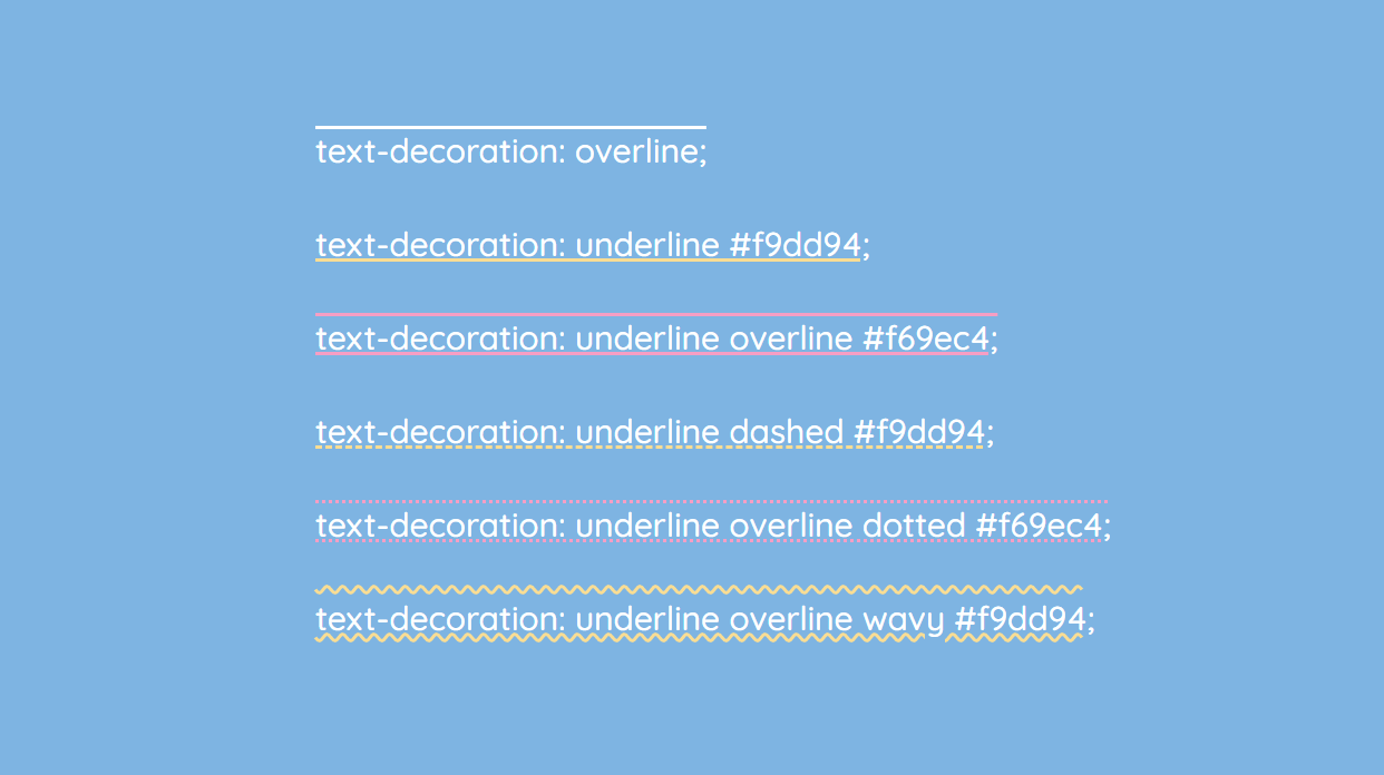
The text-decoration property is a shorthand property for 3 other properties:
- text-decoration-line (required): overline, underline, underline overline, line-through
- text-decoration-style: solid, dotted, dashed, wavy, double
- text-decoration-color: for example, #ccc, blue, currentColor, or inherit
Here are several examples:
To remove the underline, simply use text-decoration: none.
If you want to add CSS underline on hover only, use these CSS rules:
a { text-decoration: none; }
a:hover { text-decoration: underline; }
An alternative to text-decoration is the border-bottom property. With border-bottom, you can also add a padding. In the example below, the first link is created with the text-decoration property, and the second one with border-bottom:
a:nth-of-type(1) {
  color: #32557f;
  text-decoration: underline #32557f dashed;
}

a:nth-of-type(2) {
  color: #32557f;
  text-decoration: none;
  border-bottom: 2px dashed #32557f;
  padding-bottom: 3px;
}
Now let’s focus on fancier styling of the CSS underline.
Gradient Underline
You can create a gradient underline with background: linear-gradient and some other background properties. Here’s an example:
background: linear-gradient(to left, #f69ec4, #f9dd94 100%);
background-position: 0 100%;
background-size: 100% 2px;
background-repeat: repeat-x;
Read more tips on CSS gradients in CSS Gradients: 7 Examples of Usage.
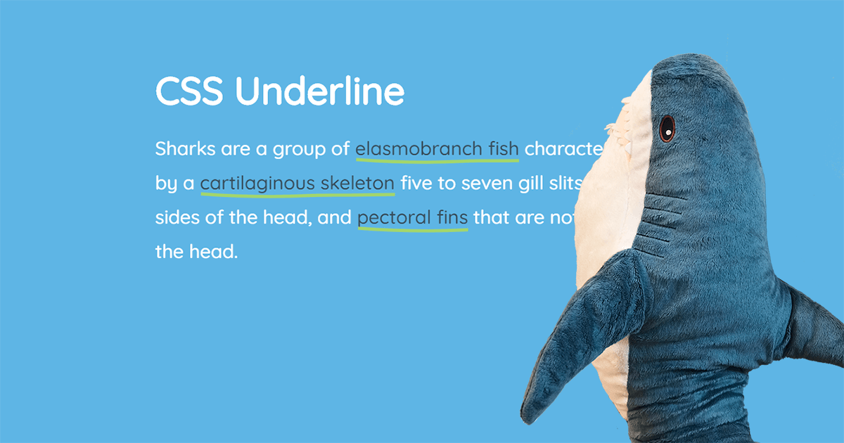
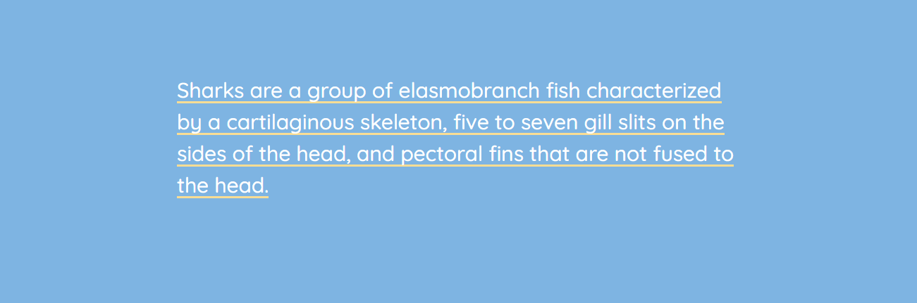
Short Underline
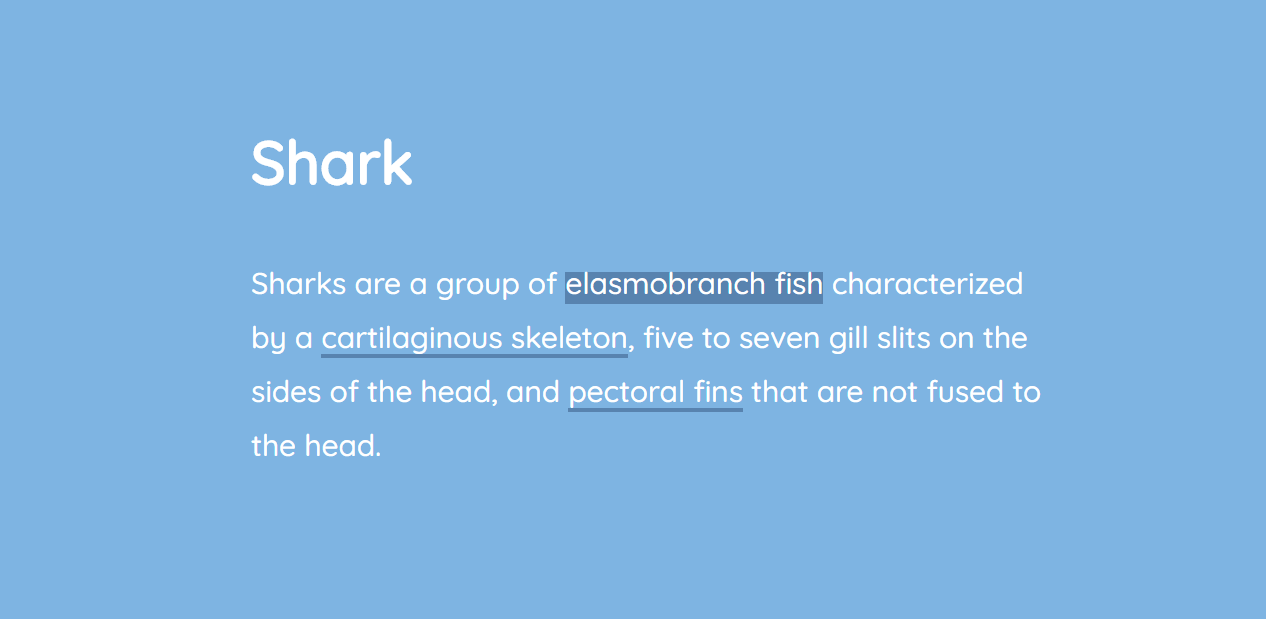
CSS underline can be of any width or height — even shorter than the word or the link. For example, if you need to create a short underline to mark the beginning of a sentence or a title, use the ::after pseudo-element with the border-bottom property:
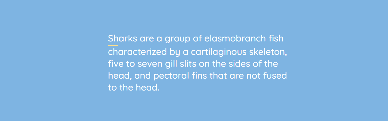
<p>Sharks are a <a href="#">group of elasmobranch fish</a> characterized by a cartilaginous skeleton, five to seven gill slits on the sides of the head, and pectoral fins that are not fused to the head.</p>
a::after {
  content: "";
  display: block;
  width: 32px;
  padding-top: 3px;
  border-bottom: 2px solid #f9dd94;
}
You can also set CSS underline thickness (for example, 2 px) by applying border-bottom: 2px solid #f9dd94;.
Marker-Style Underline
You can create a short skewed underline with the transform property:
h1 {
  padding: 30px 0 8px;
  position: relative;
}

h1::before {
  content: "";
  position: absolute;
  left: 7%;
  bottom: 16px;
  width: 150px;
  height: 14px;
  transform: skew(-12deg) translateX(-50%);
  background: rgba(238,111,87,0.5);
  z-index: -1;
}
Moreover, you can create a marker-style underline for a long piece of text. Here’s an example inspired by Codepen.io/Ash:
General styles:
body {
  padding: 4rem;
}

.box {
  padding: 2rem;
  max-width: 14rem;
  background-color: #f2f2f2;
  border-radius: 4px;
  max-width: 50rem;
}
Underline-specific styles:
:root {
  /* The intrinsic width of the underline stroke (in pixels). This is
   * the same as the height of the cap images. Don't specify the
   * units! This is because of some of the calculations we do later on. */
  --underline-intrinsic-width: 8;

  /* The actual width of the underline stroke we want to render (in pixels).
   * You can modify this, and the sizing and positioning should be calculated
   * accordingly. Again, Don't specify the units! */
  --underline-width: 12;

  /* The color used to draw the underline. It should match the color
   * used in the cap images... unfortunately we can't modify the SVG
   * fill via CSS because it's a background image. */
  --underline-color: #f1a1e3;

  /* We need to know the width of the cap images so that we
   * can position everything on the x axis accordingly. */
  --underline-cap-width: 4px;

  /* The border is positioned relative to the bottom of the line.
   * We can move it upwards a little to create an overlap effect. */
  --underline-offset-y: -2px;

  /* The padding to add to the x axis. By default, the caps would be
   * aligned with the beginning and end of the line. */
  --underline-padding-x: 0.12em;
}

.text {
  display: inline;
  --underline-width-scale: calc(var(--underline-width) / var(--underline-intrinsic-width));
  padding: 0 calc(var(--underline-padding-x) + calc(var(--underline-cap-width) * var(--underline-width-scale)));
  box-decoration-break: clone;
  background-repeat: no-repeat;
  color: #32557f;
  background-image:
    linear-gradient(180deg, var(--underline-color), var(--underline-color)),
    var(--cap-image-left),
    var(--cap-image-right);
  background-position-x:
    calc(var(--underline-cap-width) * var(--underline-width-scale)),
    0,
    100%;
  background-position-y: calc(100% - var(--underline-offset-y) * -1);
  background-size:
    calc(100% - calc(var(--underline-cap-width) * var(--underline-width-scale) * 2)) calc(var(--underline-width) * 1px),
    auto calc(var(--underline-width) * 1px),
	auto calc(var(--underline-width) * 1px);

  font-size: 3rem;
  font-weight: bold;
  --underline-width: 20;
  --underline-offset-y: -2px;
  /* The cap images to use that form the left and right shape.*/
  --cap-image-left: url(https://files-6lc03kjqt.now.sh/left-2.svg);
  --cap-image-right: url(https://files-e7gkh52mq.now.sh/right-2.svg);
}
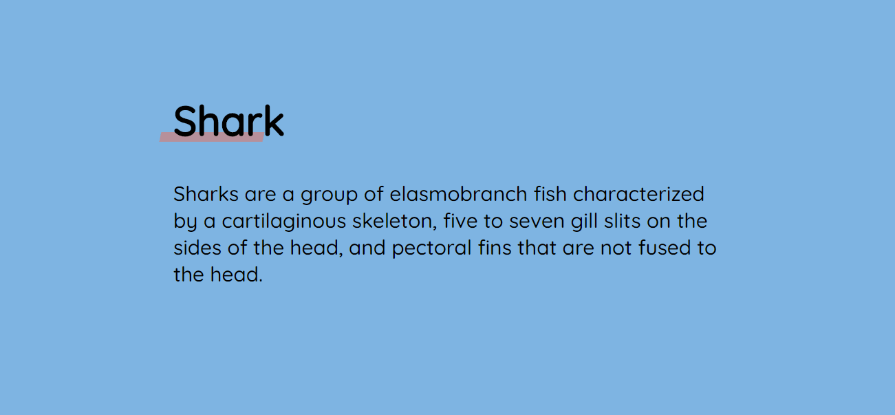
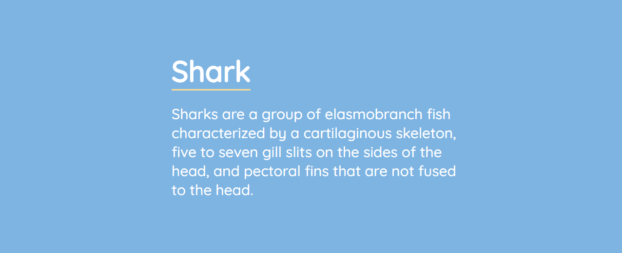
How to Underline a Title in CSS
To underline a title, you can use text-decoration: underline; but you can make it prettier if you use the border-bottom property. In the latter case, however, you need to add display: inline; so that the underline wouldn’t be longer than the word itself.
h1 {
  display: inline;
  border-bottom: 3px solid #f9dd94;
}
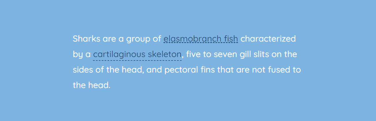
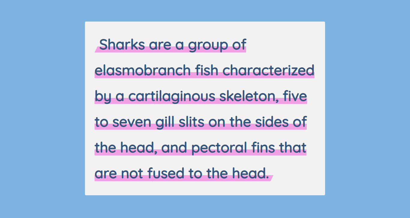
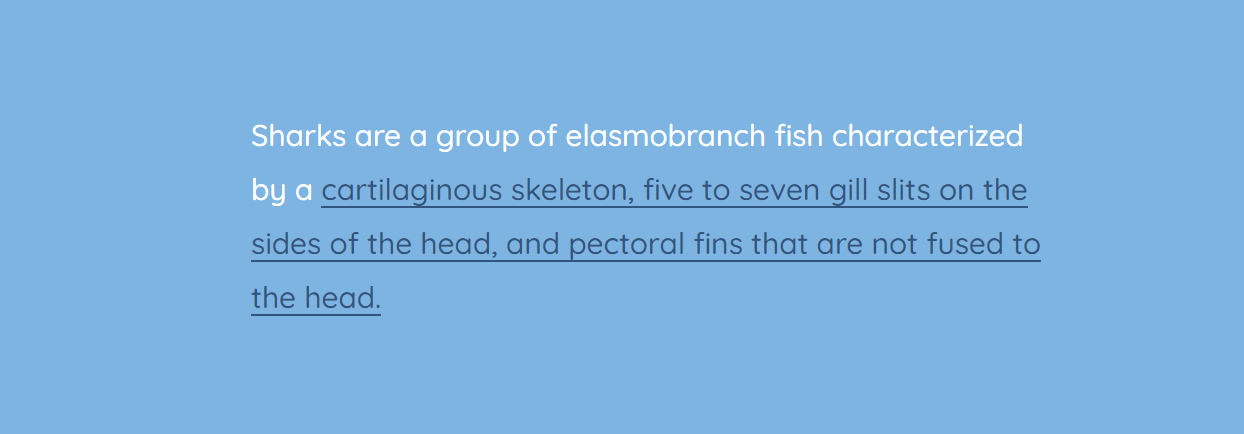
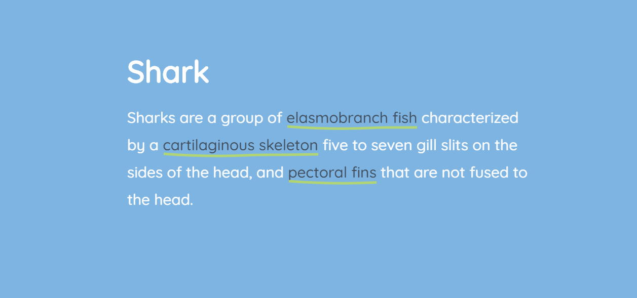
Multi-line Custom Underline
Now, say, we want to create an underline that spans over several lines of text. Not all methods would work for this.
In the two examples below, we’ll use background-image as it allows spanning multiple lines. Although you can use an actual image, this is just a line, so we use a linear gradient that will generate an image.
<p><span>Sharks are a group of elasmobranch fish characterized by a cartilaginous skeleton, five to seven gill slits on the sides of the head, and pectoral fins that are not fused to the head.</span></p>
p {
  margin: 0 auto;
  line-height: 1.5em;
}

span {
  background-image: linear-gradient(to right, #f9dd94 0%, #f9dd94 100%);
  background-repeat: repeat-x;
  background-position: 0 100%;
  background-size: 100% 3px;
}
background-repeat: repeat-x; makes the underline horizontal.
You can change the second value in background-position: 0 100%; to adjust how far from the top the underline should be.
You can also change the second value in background-size: 100% 3px; to adjust the desired height of the underline.
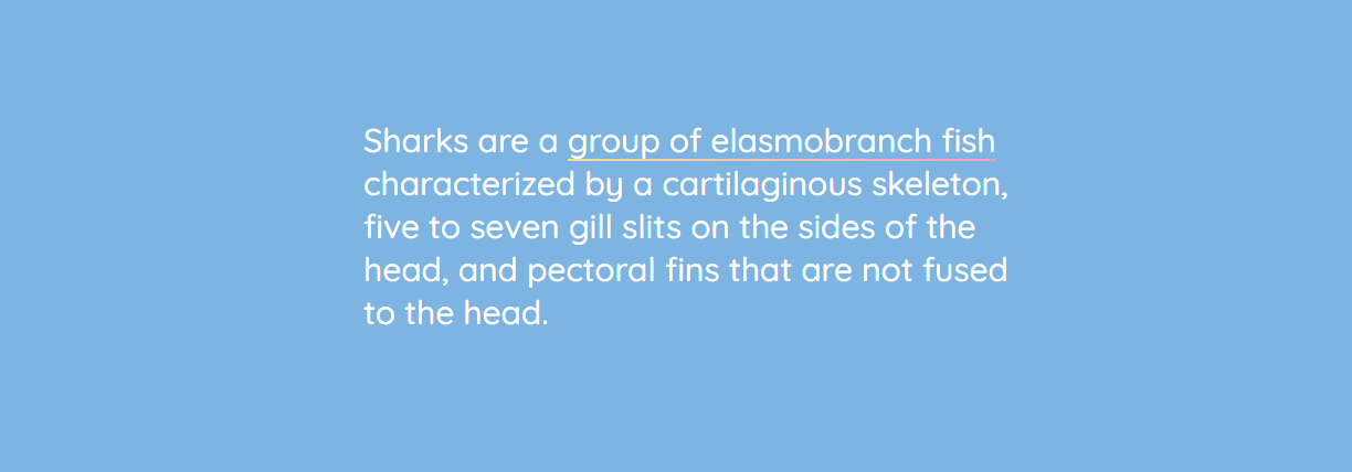
We can also create an animated multi-line underline that is displayed only on hover.
Here’s the markup:
<p>Sharks are a group of elasmobranch fish characterized by a <a href="#">cartilaginous skeleton, five to seven gill slits on the sides of the head, and pectoral fins that are not fused to the head.</a></p>
1. First, remove the default text-decoration.
2. Use background-image as it allows spanning multiple lines. As we want the underline to be the same color as the link, we use currentColor for both the start and end of the gradient. currentColor tells the browser to use the element’s color from the main color property.
3. Use background-position to set the image’s position in the lower left corner. In our example, 0% relates to the horizontal positioning and 100% to vertical. Also, disable background-repeat to prevent multiple instances of the image from being created. You can use a shorthand for these two properties (background: no-repeat 0 100%;).
4. Use background-size to specify a zero width and a 2 px height. Zero width means that the underline will only appear on hover. Otherwise, it won’t be visible.
5. Set the transition to background-size, so the change takes 0.3 seconds.
6. When hovering over the link, we change the width of the image to 100% creating a full underline, and transition provides animation.
Here’s the full code:
p a {
  color: #32557f;
  text-decoration: none;
  background:  no-repeat 0 100%;
  background-image: linear-gradient(currentColor, currentColor);
  background-size: 0% 2px;
  transition: background-size .3s ease;
}

p a:hover, a:focus {
  background-size: 100% 2px;
}
Using Images as CSS Underline
You can also use actual images (e. g. SVG or PNG) to style CSS underlines. Here are a couple of examples inspired by John D. Jameson’s CodePen.
Star-shaped CSS underline:
body {
  line-height: 1.6;
}

p {
  background-image: url("https://s3-us-west-2.amazonaws.com/s.cdpn.io/78779/star.svg");
  background-position: 0 1.3em;
  background-size: 10px 9px;
  background-repeat: repeat-x;
}
Heart-shaped underline:
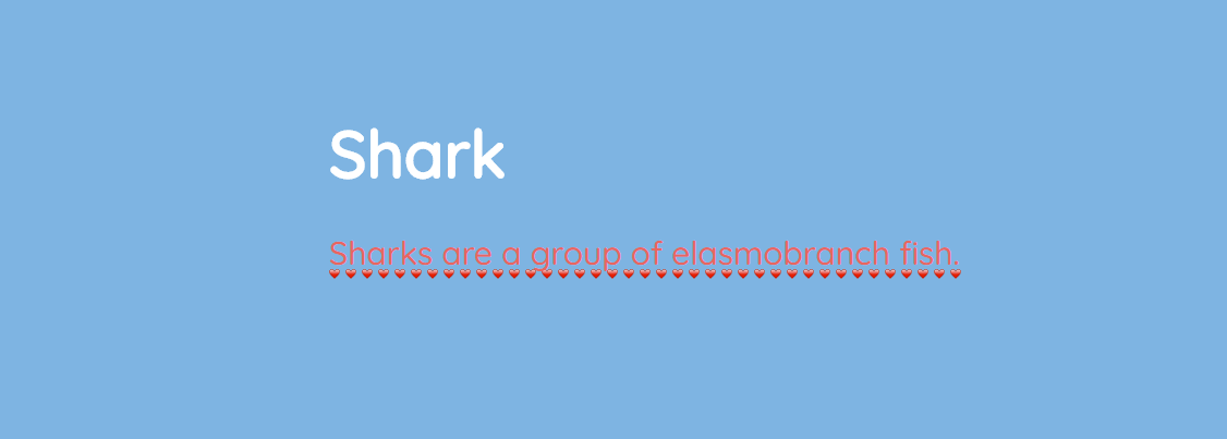
body {
  line-height: 1.8;
}

p {
  background-image: url("https://s3-us-west-2.amazonaws.com/s.cdpn.io/78779/heart.png");
  background-position: 0 1.4em;
  background-size: 15px 9px;
  color: #e8665f;
  background-repeat: repeat-x;
}
Read more about backgrounds: CSS Background.
Animated Underline on Hover
Let’s now create an animated underline of menu buttons on hover. We’ll need this markup:
<ul>
  <li><a href="#">About</a></li>
  <li><a href="#">Portfolio</a></li>
  <li><a href="#">Blog</a></li>
  <li><a href="#">Contact</a></li>
</ul>
Here are common styles for 4 examples that will follow next:
body {
  padding: 100px 50px;
  font-family: "Quicksand", sans-serif;
  font-size: 30px;
  line-height: 1.3;
  color: #fff;
  background-color: #7eb4e2;
}

ul {
  margin: 100px auto 0;
  list-style: none;
  display: flex;
  flex-direction: column;
  justify-content: space-between;
  text-align: center;
  padding: 0;
  max-width: 600px;
}

@media screen and (min-width: 600px) {
    ul {
        flex-direction: row;
    }
}
We’ll remove the standard text-decoration and add a border using CSS pseudo-elements. This border would be then animated with CSS transition properties.
Animated underline on hover #1

li {
  position: relative;
  padding: 15px 0;
}

a {
  color: #fff;
  text-transform: uppercase;
  text-decoration: none;
  letter-spacing: 0.15em;
  display: inline-block;
  padding: 15px 20px;
  position: relative;
}

a::after {
  content: "";
  position: absolute;
  bottom: 0;
  left: 50%;
  display: block;
  background: none repeat scroll 0 0 transparent;
  height: 2px;
  width: 0;
  background: #fff;
  transition: width 0.3s ease 0s, left 0.3s ease 0s;
}

a:hover::after {
  width: 100%;
  left: 0;
}
Animated underline on hover #2

li {
  position: relative;
  padding: 30px;
}

a {
  color: #fff;
  text-transform: uppercase;
  text-decoration: none;
  letter-spacing: .25em;
  display: inline-block;
  padding: 15px;
  position: relative;
}

a:hover::after {
  width: 100%;
  right: 0;
}

a::after {
  background: none repeat scroll 0 0 transparent;
  bottom: 0;
  content: "";
  display: block;
  height: 4px;
  right: 0;
  position: absolute;
  background: linear-gradient(to left, #f69ec4, #f9dd94 100%);
  transition: width .5s ease 0s, right .5s ease 0s;
  width: 0;
}
Animated underline on hover #3

ul {
  margin: 40px;
  padding: 0 40px;
  background-color: #32557f;
  min-width: 200px;
}

a {
  display: inline-block;
  text-decoration: none;
  color: #fff;
  font-size: 18px;
  letter-spacing: 2px;
  text-transform: uppercase;
  position: relative;
  transition: all 0.4s ease;
  padding: 30px;
}

a::after {
  content: "";
  position: absolute;
  height: 2px;
  background-color: #f69ec4;
  width: 0;
  left: 50%;
  bottom: 0;
  transform: translateX(-50%);
  transition: 0.5s cubic-bezier(0.68, -0.55, 0.265, 1.55) all;
}

a:hover { color: #f69ec4; }
a:hover::after { width: 100%; }
Animated underline on hover #4

a {
  text-decoration: none;
  margin: 10px;
  display: inline-block;
  color: #f9dd94 ;
}

a::before,
a::after {
  content: "";
  height: 4px;
  background: #32557f;
  display: block;
  transition: width 0.3s ease-in-out;
  margin: 0 auto;
}

a::before { width: 100%; }
a::after { width: 0; }

a:hover::before { width: 0; }
a:hover::after { width: 100%; }
Read more tips on styling a menu: How To Create a Navigation Bar: 6 Useful Tricks.
Animated underline with the box-shadow property
You can also create an underline with the box-shadow property that attaches a shadow to an HTML element. You can make this shadow larger on hover by increasing the vertical offset. See the example below.
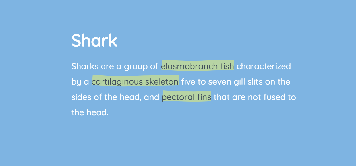
<p>Sharks are a group of <a href="#">elasmobranch fish</a> characterized by a <a href="#">cartilaginous skeleton</a>, five to seven gill slits on the sides of the head, and <a href="#">pectoral fins</a> that are not fused to the head.</p>
a {
  text-decoration: none;
  box-shadow: inset 0 -2px 0 rgba(50,85,127,0.5), 0 2px 0 rgba(50,85,127,0.5);
  transition: box-shadow .3s;
  color: inherit;
  overflow: hidden;
}

a:hover {
  box-shadow: inset 0 -30px 0 rgba(50,85,127,0.5), 0 2px 0 rgba(50,85,127,0.5);
}
Here we attach two shadows to our <a> element:
- inset changes the shadow from an outer shadow (outset) to an inner shadow
- 0 -30px 0 rgba(50,85,127,0.5): 0 is the horizontal offset, -30px the vertical offset, 0 the blur radius, and rgba(50,85,127,0.5) is a half-transparent (0.5 opacity) shade of blue
- 0 2px 0 rgba(50,85,127,0.5): 0 is the horizontal offset, 2px the vertical offset, 0 the blur radius
Read more on CSS shadows in our article CSS Shadows.
“Handwritten” Animated Underline on Hover
For the finale, let’s create fancy underlines that would appear on hover. The first would remind of a handwritten stroke and the second one of a gentle stroke of a marker.
We’ll do this with the help of Scalable Vector Graphics (SVG). We’ll have an HTML element for SVG and a block for text with links (choose either .ink-svgline or .link-svgmarker).
General structure:
<div class="svg-wrap">
    <!-- Invisible SVG block -->
</div>
<section class="link-svgline">
    <!-- First SVG example -->
</section>
<section class="link-svgmarker">
    <!-- Second SVG example -->
</section>
Replace the “Invisible SVG block” comment with the following code:
<svg viewBox="0 0 400 20" xmlns="http://www.w3.org/2000/svg">
  <path id="svg_line" d="m 1.986,8.91 c 55.429038,4.081 111.58111,5.822 167.11781,2.867 22.70911,-1.208 45.39828,-0.601 68.126,-0.778 28.38173,-0.223 56.76079,-1.024 85.13721,-1.33 24.17379,-0.261 48.42731,0.571 72.58115,0.571"></path>
</svg>
<svg viewBox="0 0 400 60" xmlns="http://www.w3.org/2000/svg">
  <path id="svg_marker" d="m 3.518915,27.827324 c 55.429038,4.081 111.581115,5.822 167.117815,2.867 22.70911,-1.208 45.39827,-0.601 68.126,-0.778 28.38172,-0.223 56.76078,-1.024 85.13721,-1.33 24.17378,-0.261 48.4273,0.571 72.58114,0.571"></path>
</svg>
Here are the CSS rules to hide this element:
.svg-wrap {
  position: absolute;
  width: 0px;
  height: 0px;
  overflow: hidden;
}
And here are CSS rules that are common for both examples that will follow:
body {
  padding: 100px 50px;
  font-family: "Quicksand", sans-serif;
  font-size: 30px;
  line-height: 1.8;
  color: #fff;
  background-color: #7eb4e2;
}

a {
  color: #404d5b;
  text-decoration: none;
  outline: none;
}

section {
  position: relative;
  z-index: 1; /* needed for setting pseudo-element z-index */
  overflow: hidden;
  backface-visibility: hidden;
}

section a {
  position: relative;
  display: inline-block;
  outline: none;
  color: #404d5b;
  vertical-align: bottom;
  text-decoration: none;
  white-space: nowrap;
}

section a::before,
section a::after {
  pointer-events: none;
  backface-visibility: hidden;
  font-smoothing: antialiased;
}
First SVG example
Replace the “First SVG example” comment with this piece of code (use whatever text you need, only keep the structure with classes):
<p>Sharks are a group of <a href="#">elasmobranch fish<svg class="link-svgline"><use xlink:href="#svg_line"></use></svg></a> characterized by a <a href="#">cartilaginous skeleton<svg class="link-svgline"><use xlink:href="#svg_line"></use></svg></a> five to seven gill slits on the sides of the head, and <a href="#">pectoral fins<svg class="link-svgline"><use xlink:href="#svg_line"></use></svg></a> that are not fused to the head.</p>
CSS:
.link-svgline a svg.link-svgline {
  position: absolute;
  top: 100%;
  left: 0;
  overflow: hidden;
  margin: 0;
  width: 100%;
  height: 20px;
  transition: stroke-dashoffset 0.3s ease-in-out;
  transform: translateY(-90%);
  fill: none;
  stroke: #b1d474;
  stroke-width: 5;
  stroke-dasharray: 400px;
  stroke-dashoffset: 400px;
}

.link-svgline a:hover svg.link-svgline {
  stroke-dashoffset: 0px;
}
Second SVG example
Replace the “Second SVG example” comment with this piece of code:
<p>Sharks are a group of <a href="#">elasmobranch fish<svg class="link-svgline"><use xlink:href="#svg_marker"></use></svg></a> characterized by a <a href="#">cartilaginous skeleton<svg class="link-svgline"><use xlink:href="#svg_marker"></use></svg></a> five to seven gill slits on the sides of the head, and <a href="#">pectoral fins<svg class="link-svgline"><use xlink:href="#svg_marker"></use></svg></a> that are not fused to the head.</p>
CSS:
.link-svgmarker a svg.link-svgline {
  position: absolute;
  top: 100%;
  left: 0;
  z-index: -1;
  overflow: hidden;
  margin: 0;
  width: 100%;
  height: 60px;
  opacity: 0.5;
  transition: stroke-dashoffset 0.3s ease-in-out;
  transform: translateY(-100%);
  fill: none;
  stroke: #f0f567;
  stroke-width: 36;
  stroke-dasharray: 400px;
  stroke-dashoffset: 400px;
}

.link-svgmarker a:hover svg.link-svgline {
  stroke-dashoffset: 0px;
}
The last two examples are inspired by a Tympanus demo.
Read also: