An animated bar chart race helps visualize the change in trends over time. To create a chart of this type, you usually need a dataset that includes dates, categories (like countries, names, titles, etc.), and numeric values.
See the final bar chart race video in a new window.
Prerequisites
- Python installed on your machine
- pip: package management system (it comes with Python) (alternatively, you can use Conda)
- Pandas: a library to prepare data for plotting
- Matplotlib: a plotting library
- Bar Chart Race: a library to create bar chart races with Matplotlib
- Jupyter Notebook: an online editor for data visualization
- FFmpeg: a tool to generate a video file with the animated chart
You can download the latest version of Python for Windows on the official website.
To install Pandas, Matplotlib, and Jupyter Notebook, you’ll need to install recommended Scientific Python Distributions. Type this in your terminal:
pip install numpy scipy matplotlib ipython jupyter pandas sympy nose
And here’s the command to install Bar Chart Race with pip:
pip install bar_chart_race
Or with Conda:
conda install -c conda-forge bar_chart_race
Finally, download FFmpeg and install it using an instruction manual.
If, while installing FFmpeg, the system requires the vulkan-1.dll file, you can download it, rename it to vulkan-1.dll, put it into your C:\Windows\System32 folder (or the like), and run the C:\ffmpeg\bin\ffmpeg.exe -codecs command again. After installing, you may need to restart your computer.
Data Preparation
We’ll generate our bar chart race from a CSV file. For this, we’ll use Kaggle’s “Refugees in the United States, 2006–2015” dataset, namely the refugee_status.csv file.
From now on, we’ll be working in a Jupyter Notebook.
First, import all the necessary libraries:
import pandas as pd
import matplotlib.pyplot as plt
import bar_chart_race as bcr
The code below would read the file, determine which values to read as NaN, and parse dates:
filename = 'refugee_status'
data = pd.read_csv(filename + '.csv',
                   index_col=0, na_values=['-', 'D'],
                   infer_datetime_format=1, parse_dates=True)
data.head()
Next, we’ll delete commas, convert integers to numeric type, transpose the table, and drop columns we don’t need:
data.replace(',','', regex=True, inplace=True)
data = data.apply(pd.to_numeric, errors='coerce', axis=1)
data = data.fillna(0).T
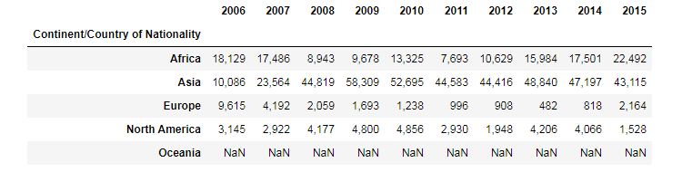
data = data.drop(['Other', 'Unknown', 'Total', 'Africa', 'Asia', 'Europe',
'North America', 'Oceania', 'South America'], axis = 1)
data
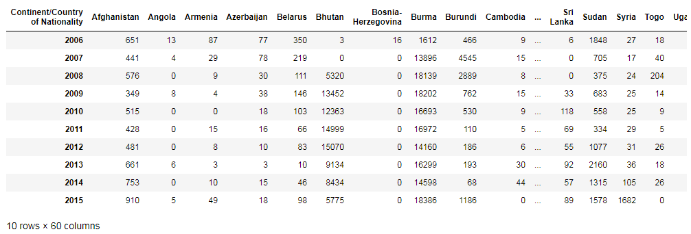
The data above is an example of properly formatted data to create bar chart races. Its index contains the time component, each row represents a period of time, and every column holds the value for a particular category.
Read also my article 50+ Pandas Tricks to learn more about manipulations with datasets.
Plotting
Now we’ve reached the most interesting part. Run this code to generate bar chart races:
df = data
bcr.bar_chart_race(
df=df,
filename='refugees.mp4',
orientation='h',
sort='desc',
n_bars=7,
fixed_order=False,
fixed_max=False,
steps_per_period=10,
period_length=1500,
interpolate_period=False,
label_bars=True,
bar_size=.90,
period_label={'x': .99, 'y': .25, 'ha': 'right', 'va': 'center'},
period_summary_func=lambda v, r: {'x': .99, 'y': .18,
's': '',
'ha': 'right', 'size': 8, 'family': 'Courier New'},
perpendicular_bar_func='median',
figsize=(5, 3),
dpi=500,
cmap='dark24',
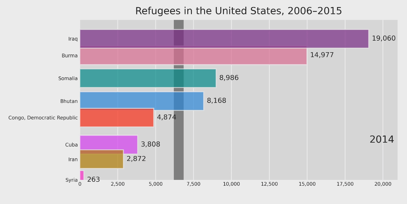
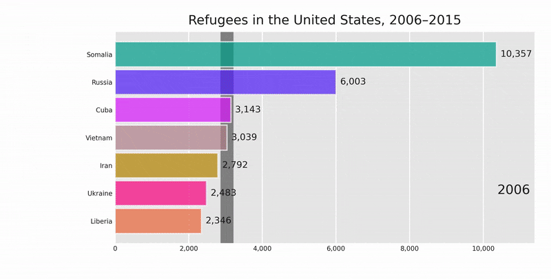
title='Refugees in the United States, 2006–2015',
title_size=10,
bar_label_size=7,
tick_label_size=5,
shared_fontdict={'color' : '.1'},
scale='linear',
writer=None,
fig=None,
bar_kwargs={'alpha': .7},
filter_column_colors=True)
Here are variables you may want to change:
- filename='refugees.mp4' is the name of the MP4 file with the output
- n_bars=7 sets the number of bars displayed in the chart (in our example, the library displays the top 7 countries with the highest values for each year)
- steps_per_period=10 is the number of steps for each period (in other words, it means how often bars are moving)
- period_length=1500 is the time during which the chart is displayed for each period/year
- title='Refugees in the United States, 2006–2015' is the chart title
The result of this code will be an MP4 file. It will be located in the same folder that contains our notebook with the bar chart race code.
See the final bar chart race video in a new window.
That’s it, our Matplotlib bar chart races are ready. You can download the notebook on GitHub to get the full code.
How to use the video file
First, you can embed it in your HTML using the <video> tag:
<video width="1000px" height="auto" controls loop>
  <source src="refugees.mp4" type="video/mp4">
</video>
It’s a good idea to include width and height attributes. If they are not set, the page might flicker while the video loads.
The controls attribute adds video controls, like play, pause, zoom, and volume. And the loop attribute allows playing the video indefinitely.
Second, you can create a GIF animated image from your MP4 file using Ezgif.com or similar services.
Read also: