Marching Ants
The code below by Lea Verou allows creating a marching ants effect. Click the demo link below to see it in animation. It’s useful to attract attention to an important announcement on your web page.

@keyframes ants { to { background-position: 100% } }

.marching-ants {
  padding: 1em;
  border: 1px solid transparent;
  background:
  linear-gradient(white, white) padding-box,
  repeating-linear-gradient(-45deg, black 0, black 25%, white 0, white 50%) 0 / .6em .6em;
  animation: ants 12s linear infinite;
}
Use a dashed border to create a simple stitched edge effect with no animation.

.stitched {
  background: #7eb4e2;
  border: 10px dashed #32557f;
}
Half-Transparent Border
To create a half-transparent border, use a parent div to set a background and a child div for the element with a transparent border.

.transparent-parent {
  background: url('skate.jpg');
}

.transparent {
  width: 300px;
  height: 100px;
  border: 10px solid hsla(0,0%,100%,.5);
  background: #fff;
  background-clip: padding-box;
}
Blurred Border
If you want to visually blur the border of an element, use a pseudo-element, put it behind the parent element with z-index, apply a transparent border, add the background-clip, filter, and clip-path properties.

$url: url(img/shark.jpg);
$b: 1.5em; // border-width
$blur: blur(9px);
$rect: inset(0);

.blurred {
	position: relative;
	border: solid $b rgba(#000, .03);
	height: 50vmin;
	max-width: 13em;
	max-height: 7em;
	background: $url 50%/ cover
			 border-box /* background-origin */
			 padding-box /* background-clip */;
	font-size: 2em;

	&:before {
		position: absolute;
		z-index: -1; /* put it *behind* parent */
		/* go outside padding-box by
		 * a border-width ($b) in every direction */
		top: -$b; right: -$b; bottom: -$b; left: -$b;
		border: inherit;
		border-color: transparent;
		background: inherit;
		background-clip: border-box;
		/* -webkit-prefixed version
		 * still needed for
		 * some mobile browsers */
		-webkit-filter: $blur;
			   filter: $blur;
		-webkit-clip-path: $rect;
			   clip-path: $rect;
		content: '';
	}
}
Multiple Borders
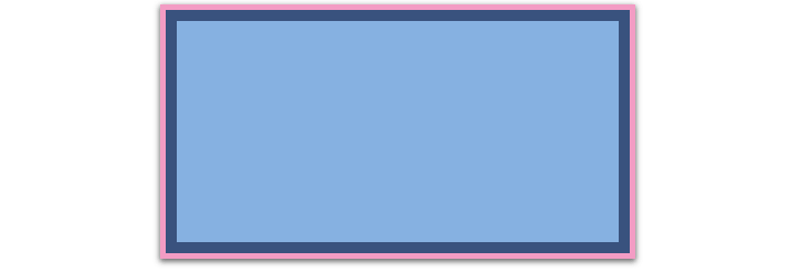
Use the box-shadow property when you need a lot of borders of the same style. The borders created by the box-shadow property overlap each other. The first one surrounding the inner content is the border whose value you indicated in the first line.

        .multiple1 {
  background: #7eb4e2;
  box-shadow: 0 0 0 10px #32557f,
              0 0 0 15px #f69ec4,
              0 2px 5px 15px rgba(0,0,0,.6);
}
Use the outline property when you need only two borders of different styles.

.multiple2 {
  background: #7eb4e2;
  border: 10px solid #32557f;
  outline: 15px solid #f69ec4;
}
Borders with Inner Rounding
To create a border with inner rounding, use a parent div for an external border and a child div for the rounded element.

.rounding-parent {
  background: #32557f;
  padding: .8em;
}

.rounding {
  width: 100%;
  height: 100%;
  background: #7eb4e2;
  border-radius: .8em;
  padding: 1em;
}
Or (without a parent element):
.rounding2 {
  background: #7eb4e2;
  border-radius: .8em;
  box-shadow: 0 0 0 .4em #32557f;
  outline: .8em solid #32557f;
}
Envelope Border
To create the classic “envelope” border effect, use the linear-gradient and repeating-linear-gradient values of the background property.

.envelope {
    padding: 1em;
    border: 1em solid transparent;
    background: linear-gradient(white, white)
                padding-box,
                repeating-linear-gradient(-45deg,
                #f69ec4 0, #f69ec4 12.5%,
                transparent 0, transparent 25%,
                #7eb4e2 0, #7eb4e2 37.5%,
                transparent 0, transparent 50%)
                0 / 5em 5em;
}
Serrated Border
The serrated edge effect can be made of two triangles overlapping one another. To hide the overlapping, just lay a solid color on top.

$lightblue: #7eb4e2;
$darkblue: #32557f;

.serrated {
    width: 75%;
    padding: 10px 10px;
    border: 10px solid transparent;
    border-width: 10px 0;
    background-color: $lightblue;
    background-color: hsla(0, 0%, 0%, 0);
    background-image:
        linear-gradient($lightblue, $darkblue),
        linear-gradient(to bottom right, transparent 50.5%, $lightblue 50.5%),
        linear-gradient(to bottom left, transparent 50.5%, $lightblue 50.5%),
        linear-gradient(to top right, transparent 50.5%, $darkblue 50.5%),
        linear-gradient(to top left, transparent 50.5%, $darkblue 50.5%);
    background-repeat: repeat, repeat-x, repeat-x, repeat-x, repeat-x;
    background-position: 0 0, 10px 0, 10px 0, 10px 100%, 10px 100%;
    background-size: auto auto, 20px 20px, 20px 20px, 20px 20px, 20px 20px;
    background-clip: padding-box, border-box, border-box, border-box, border-box;
    background-origin: padding-box, border-box, border-box, border-box, border-box;
}
Border Image
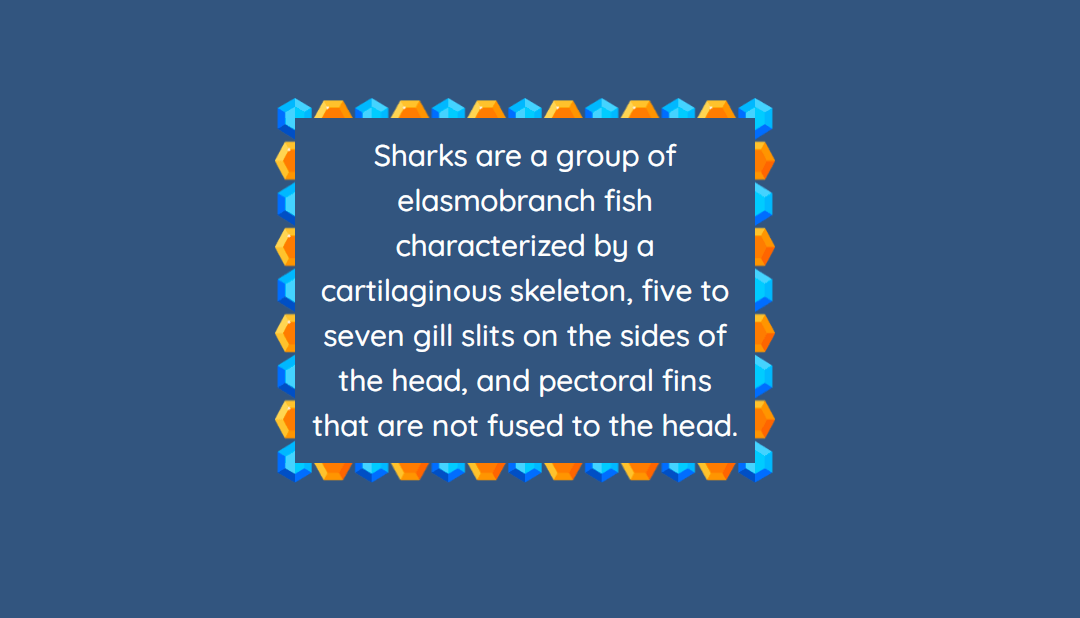
You can set an image as a border with the border-image property:
p {
  border: 20px solid transparent;
  padding: 15px;
  border-image-source: url(img/gems.png);
  border-image-repeat: round;
  border-image-slice: 100;
}

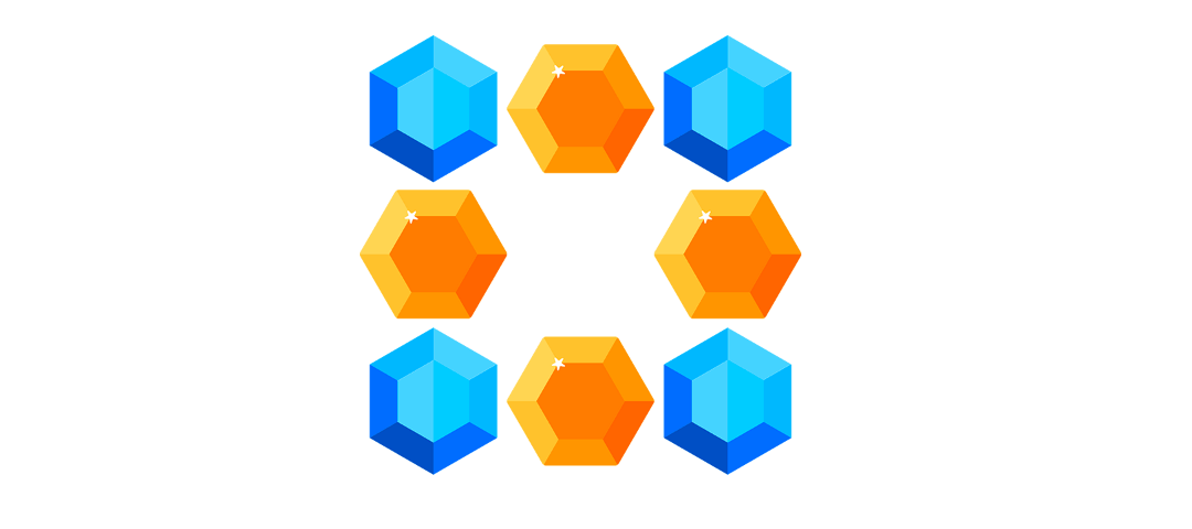
Here’s the original picture (gems.png):

Read also:
