Height and Width
For starters, let’s remember that you need to always specify height and width inside the <img> tag. Here’s why.
A web page usually renders in two stages: first as the HTML is rendered, and then once the image is rendered. This might cause the main content to jump down after the image is loaded.
Suppose we have the following markup:
<h1>Banana</h1>
<p>A banana is an elongated, edible fruit – botanically a berry – produced by several kinds of large herbaceous flowering plants in the genus Musa.</p>
<div class="container">
    <img alt="Banana" src="img/banana.jpg" />
</div>
<p>In some countries, bananas used for cooking may be called "plantains", distinguishing them from dessert bananas.</p>
And this is how the page will be rendered: (1) the HTML is rendered, (2) the image is loaded, and the page’s content below the image jumps down.
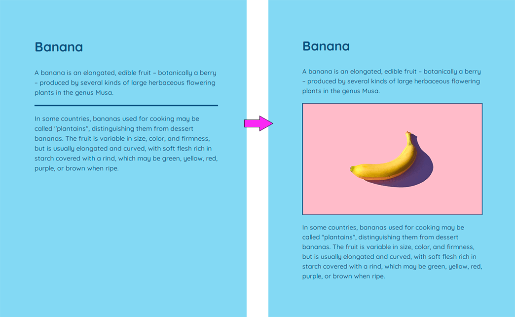
Layout shifts can be quite bothersome, especially if you’ve already started reading the article. To avoid this (and also to increase load speed), provide width and height attributes in the <img> tag so even when the browser has just the HTML, it still can allocate the appropriate amount of space to the image:
<div class="container">
    <img alt="Banana"
        src="img/banana.jpg"
        width="1600px"
        height="900px" />
</div>
Moreover, the latest browser versions now calculate the aspect ratio for images based on the height and width values placed as attributes in <img>. For example, if your image is defined by width=1600px and height=900px, this gives you an aspect-ratio of 16:9.
In addition to setting height and width in HTML, you can also set height and width in the CSS. This would override the image size indicated in the <img> tag. But you also need to add the aspect-ratio property based on the width and height attributes in <img>. For example:
img {
  width: 100%;
  height: auto;
  aspect-ratio: attr(width) / attr(height); // or 16/9
}
For accessible images, remember to include the alt or aria-label attributes describing what we can see in the picture. The alt attribute goes inside the <img> tag, and aria-label goes inside the images’ container and is intended for multiple images that should be considered as a single image.
Responsive Images
Now let’s see how we can create a responsive image. There are three main ways to do this:
1. Use the <img> with the srcset attribute for simple responsive images.
2. Use the <picture> tag to change your image’s width/height ratio at specific viewports or conditionally serve your images in modern formats like WebP.
3. Use media queries to create responsive background images.
srcset
You can prepare several identical images of different sizes, each intended for a specific viewport, and then use the srcset attribute to choose the required image. It will provide faster website loading on mobile devices while keeping high resolution on the desktop.
srcset creates a list of image sources that will be selected based on the screen resolution. It can be used with or instead of the src attribute.
There are several ways to use srcset.
1. You can explicitly set image sizes for each device. In the example below, we’re providing multiple copies of the same image and letting the browser pick the most appropriate one. We’re also labeling images with their width, using w descriptors. So if fish-s.jpg is 320 × 480, we label it as 320w.
<img src="fish.jpg"
    srcset="
        img/fish-mobile.jpg 320w,
        img/fish-wide-mobile.jpg 480w,
        img/fish-tablet.jpg 768w,
        img/fish-desktop.jpg 1024w,
        img/fish-large.jpg 1280w"
    sizes="
        (max-width: 20em) 30vw,
        (max-width: 30em) 60vw,
        (max-width: 40em) 90vw"
    alt="A fish in the sea">
w descriptors need to be paired with the sizes attribute so that the browser will know how large the displayed image would be. For example, (max-width: 20em) 30vw would tell the browser that when the viewport is 30 vw wide (or less), the image will be 20 em wide.
You can use pixels instead of ems. Or you can use calc(). For example, calc(50vw - 2rem) says the image will be 50% of the viewport width minus 2 rem, to account for padding or border.
In the sizes attribute, you can also set just a minimum size (70vmin means 70% of viewport’s smaller dimension):
<img
    alt="A fish in the sea"
    srcset="
      fish-s.jpg  300w,
      fish-m.jpg  600w,
      fish-l.jpg  1200w,
      fish-xl.jpg 2000w"
  sizes="70vmin">
If the browser viewport is, say, 1400 px wide, the browser will try to select the smallest available image that is at least 1400 px wide (fish-l.jpg in this case).
You can try Cloudinary’s Responsive Image Breakpoints Generator tool to generate breakpoints based on resolution and size step.
Remember to include <meta name="viewport" content="width=device-width"> in the <head> tag. This forces browsers to adopt their real viewport width for loading web pages.
→ Meta Tags and Other Useful HTML Tags
You can put even more information in the sizes attribute:
<img
    alt="A fish in the sea"
    src="images/fish.svg"
    srcset="images/fish-big.jpg 2000w,
        images/fish-small.jpg 1000w"
    sizes="(min-width: 1000px) 33vw, 96vw"/>
In this example, sizes="(min-width: 1000px) 33vw, 96vw" says: “This image is in a three-column layout on large screens and close to full-width (96% of the viewport) otherwise.”
2. You can stick to the 1× and 2× versions of srcset for images less than, say, 600 px wide.
<img
    alt="A fish in the sea"
    src="images/fish-big.png"
    srcset="images/fish-small.png 1x,
        images/fish-big.png 2x"
    style="max-width: 600px" />
In this example, we’ve made the default “small” (1×) copy of the image. We also provide a 2× (“big”) version for high-resolution (higher pixel-density) screens.
You can create as many image variants as you like:
<img
    alt="A fish in the sea"
    src="fish-small.jpg"
    srcset="
        fish-big-1.jpg 1.5x,
        fish-big-2.jpg 2x,
        fish-big-3.jpg 3x,
        fish-big-4.jpg 4x">
<picture>
You can also use srcset inside the <picture> tag. It’s useful when you want not only to increase performance but also to use different images, for example, full and cropped images, horizontal and tall images, or zoomed-out images depending on the size of the screen and differences in the layout.
<picture>
    <source media="(min-width: 421px)" srcset="images/fish-big.jpg"/>
    <source media="(max-width: 420px)" srcset="images/fish-tall.jpg"/>
    <img src="images/fish-small.jpg" alt="A fish in the sea"/>
</picture>
Another example:
<picture>
    <source
      srcset="fish-zoomed-out-2x.jpg 2x, fish-zoomed-out.jpg"
      media="(min-width: 1000px)" />
    <source
      srcset="fish-2x.jpg 2x, fish.jpg"
      media="(min-width: 600px)" />
    <img
      srcset="fish-zoomed-out-2x.jpg 2x"
      src="fish-zoomed-out.jpg"
      alt="A fish in the sea" />
</picture>
The <picture> tag can also be used for fallbacks. For example, you can use WebP image for modern browsers and a JPG fallback for older browsers:
<picture>
    <source srcset="fish.webp">
    <img src="fish.jpg" alt="A fish in the sea">
</picture>
By the way, the WebP format reduces the size of images by 19–64%. This translates into websites that load faster. You can convert images to WebP using an online tool such as Online-Convert.com.
Responsive background images
If you need to create a responsive background image as opposed to an image in the <img> tag, use media queries to change the background-image source. For example:
.img {
  background-image: url(fish-small.jpg);
}

@media
  (min-width: 468px),
  (-webkit-min-device-pixel-ratio: 2),
  (min-resolution: 192dpi) {
  .img {
    background-image: url(fish-large.jpg);
  }
}
Another way is to use the image-set() function in CSS:
.img {
  background-image: url(image-384.jpg);
  background-image:
    image-set(
      url(image-384.jpg) 1x,
      url(image-768.jpg) 2x,
    );
}
→ CSS Background and Image Effects
Image Positioning
To control how your image stretches inside its container as well as to adjust the image’s position, you can use the object-fit and object-position properties. They are similar to the background-position and background-size properties that allow us to manipulate the content of a background.
object-fit
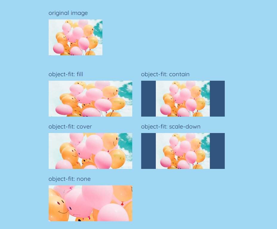
The object-fit property defines how an element responds to the height and width of its content box and allows us to control how it stretches inside its box.
object-fit can have one of these values:
- fill: stretches the image to fit the content box, regardless of its aspect-ratio (the default value)
- contain: increases or decreases the size of the image to fill the box whilst maintaining its aspect-ratio
- cover: lets the image to fill the height and width of its box, once again preserving its aspect ratio but often cropping the image in the process (this value is most useful in many cases)
- scale-down: compares the difference between none and contain to find the smallest object size
- none: ignores the height and width of the parent and retains the original size of the image
Here are several examples:
<div class="content-box">
    <img src="img/balloons.jpg" alt="">
</div>
.content-box { width: 40%; }
img { height: 120px; background-color: $color-navy; }
object-position
Another property, object-position, allows us to move an image around within its box.
Here are several examples:
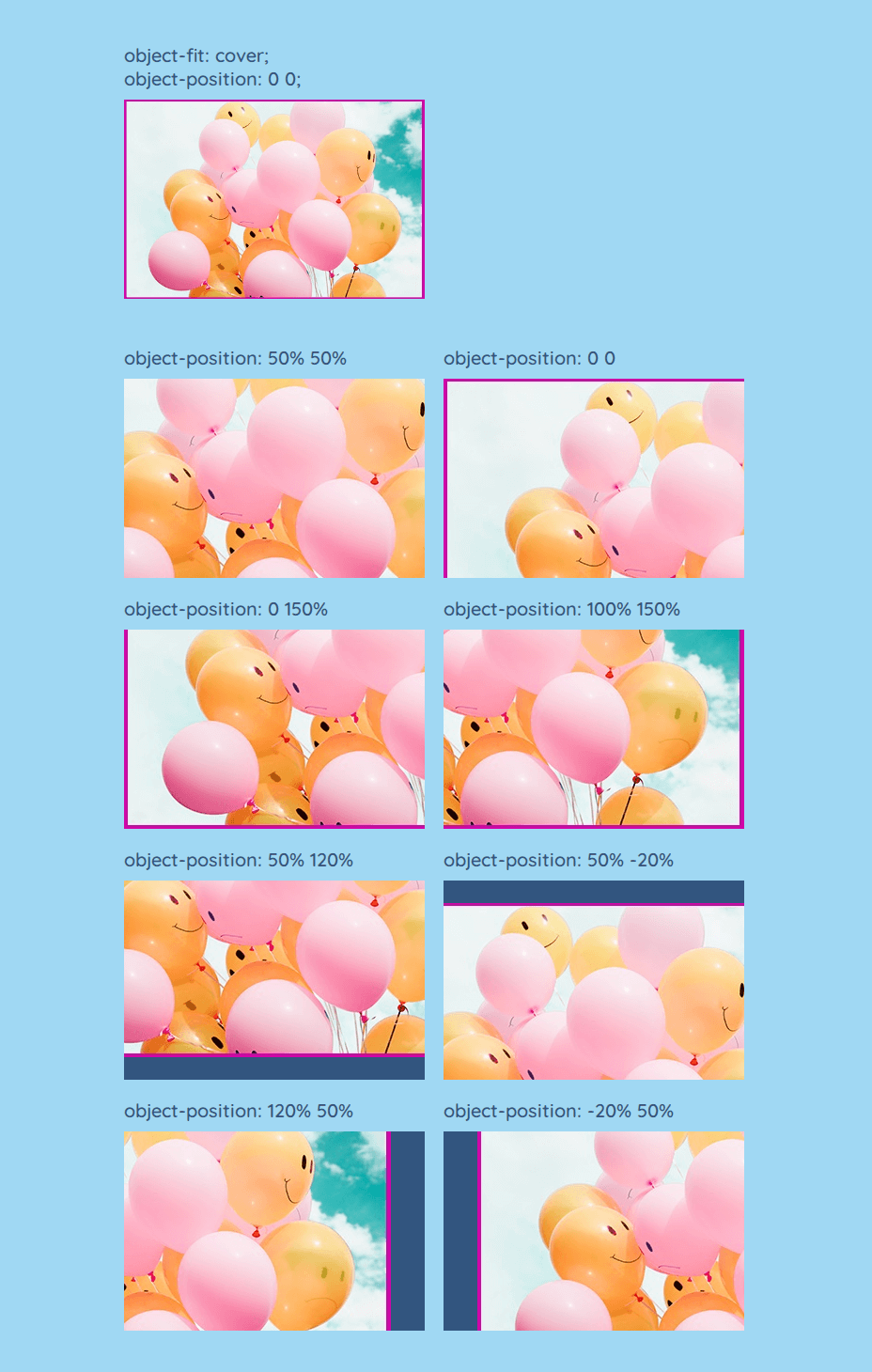
Image Optimization
You can do these things to boost your website performance:
- Reduce file size
- Lazy-load images to increase performance
- Apply content-visibility to the sections of your web page
Reduce file size
You can compress images for a website (PNG and JPG) manually using TinyPNG or TinyJPG. This will reduce the image size by 50–70%.
You can also reduce the image file size by using lossless compression tools such as jpegtran or jpegoptim for JPG, or OptiPNG or PNGOUT for PNG.
Lazy Loading
Lazy loading means waiting to load an image until it is in or near the viewport. For example, if an image is far down the page and the user never scrolls there, the image won’t load. And this will speed up loading and increase the page’s performance.
Lazy loading can be applied with the loading="lazy" attribute:
<img
    alt="Banana on pink background"
    src="img/banana-big.jpg"
    srcset="img/banana-small.jpg 1x,
        img/banana-big.png 2x"
    style="max-width: 600px"
    height="1200"
    width="742"
    loading="lazy" />
You can also add a gradient image placeholder that will be visible until the image is loaded:
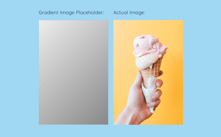
img {
  background: linear-gradient(135deg, #eee 0%, #888 100%);
}
→ CSS Gradients: 8 Examples of Usage
Note that the loading="lazy" attribute is not supported in IE, Safari, and Opera Mini/Mobile.
Another method is to use JS code that generates gradient image placeholders and creates a lazy loading experience:
Rahul Nanwani in his article recommends not to lazy-load all the images:
- Any image that is present in the viewport, or at the beginning of the webpage (headers, banners, logos), should not be lazy-loaded.
- Any image that is just slightly off the viewport should not be lazy-loaded.
- If the page isn’t too long, maybe just a single scroll or two, or if there are less than 5 images outside the viewport, then lazy loading can be avoided altogether.
content-visibility
If your web page contains many images and other media content, you can use the content-visibility: auto property, which provides performance improvements. In fact, this property can give an increase in speed by up to 7 times! Here’s what you need to do:
1. Section large vertical chunks of the page.
2. Apply content-visibility: auto; to them.
3. Take a guess how tall the element’s content is, for instance, contain-intrinsic-size: 1000px;. Thus must not be the exact height of the content.
.section {
  content-visibility: auto;
  contain-intrinsic-size: 100px 1000px;
}
content-visibility forces the user agent to skip the markup and rendering of elements that are not on the screen. It works almost like lazy loading, only applies not in time of loading, but the moment of rendering.
Currently, content-visibility is not supported in IE, Firefox, Safari, and Opera Mini/Mobile.
Sources of Free Images & Icons
Last but not least, here are the lists of free sources of images and icons that you can use in your work.
Free images:
Free icons: