Error bars are used on graphs to indicate an error, uncertainty in a measurement, or the variability of data. For example, if you have a data set with minimum/maximum values, you can calculate the average value and show the variability with the help of error bars.
Prerequisites
To create an error bars chart, we’ll need the following:
- Python installed on your machine
- Pip: package management system (it comes with Python)
- Jupyter Notebook: an online editor for data visualization
- Pandas: a library to prepare data for plotting
- Matplotlib: a plotting library
- Seaborn: a plotting library (we’ll only use part of its functionally to add a grid to the plot and get rid of Matplotlib’s default borders)
You can download the latest version of Python for Windows on the official website.
To get other tools, you’ll need to install recommended Scientific Python Distributions. Type this in your terminal:
pip install numpy scipy matplotlib ipython jupyter pandas sympy nose seaborn
Getting Started
Create a folder that will contain your notebook (e.g. “matplotlib-bar-chart”) and open Jupyter Notebook by typing this command in your terminal (don’t forget to change the path):
cd C:\Users\Shark\Documents\code\matplotlib-bar-chart
py -m notebook
This will automatically open the Jupyter home page at http://localhost:8888/tree. Click on the “New” button in the top right corner, select the Python version installed on your machine, and a notebook will open in a new browser window.
In the first line of the notebook, import all the necessary libraries:
import matplotlib.pyplot as plt
import matplotlib as mpl
import pandas as pd
import seaborn as sns
%matplotlib notebook
You’ll need the last line (%matplotlib notebook) to display plots in input cells.
Data Preparation
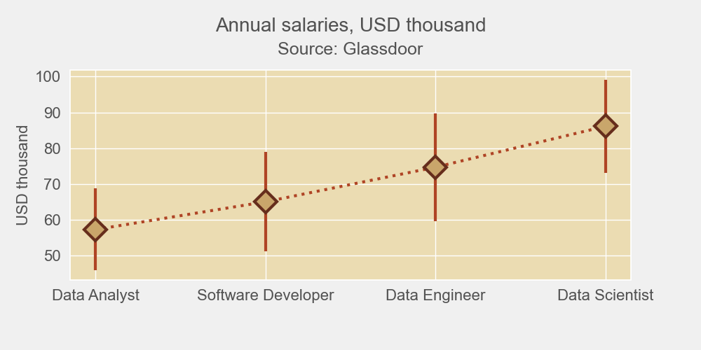
Let’s create a chart that will show average salaries as well as their minimum and maximum values as data variations. We’ll plot a Matplotlib/Seaborn error bars chart using a .csv file. You can download the file on GitHub (glassdoor-data.csv).
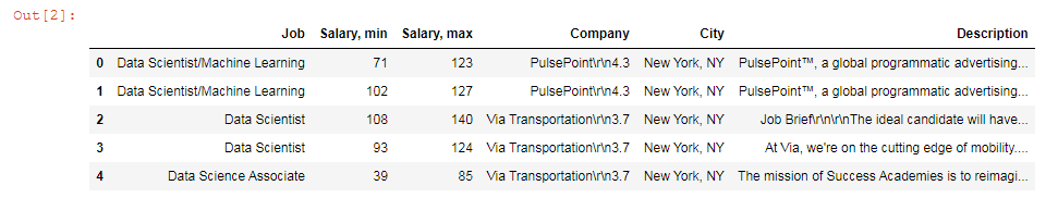
On the second line in your Jupyter notebook, type this code to read the file:
df = pd.read_csv('glassdoor-data.csv')
df.head()
This will show the first 5 lines of the .csv file:
Next, sort and format values for plotting:
# Get rid of all non-numeric values
df['Salary, min'] = (pd.to_numeric(df['Salary, min'],errors='coerce').fillna(0)).astype(int)
df['Salary, max'] = (pd.to_numeric(df['Salary, max'],errors='coerce').fillna(0)).astype(int)

# Create a new column with average values
df['Mean'] = df[['Salary, min', 'Salary, max']].mean(axis=1)

# Select jobs for which you want the salaries to be displayed on the graph
jobs = [
        'Data Scientist',
        'Data Analyst',
        'Data Engineer',
        'Software Developer']

def get_grp(x, df, col_name, my_list):
    for c in my_list:
        if c in df[col_name][x]:
            return c

selected = df.loc[df['Job'].isin(jobs)]
selected = selected.groupby(lambda x : get_grp(x, df, 'Job', jobs))
table = selected.mean()
table.sort_values(['Mean'], ascending=[True], inplace=True)
table
The output will look like this:
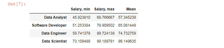
We’ll use this table to create our Matplotlib error bar chart.
Plotting
We’ll create a Matplotlib error bar chart in 5 steps. All the code snippets below should be placed inside one cell in your Jupyter Notebook.
1. Create subplots
First, set Seaborn styles with the chosen face color:
sns.set(rc={'axes.facecolor':'#EBDCB2'})
Next, draw a figure with a subplot.
fig, ax = plt.subplots(figsize=(10,5), facecolor=(.94, .94, .94))
plt.tight_layout()
figsize=(10,5) creates a 1000 × 500 px figure.
plt.tight_layout() adjusts subplot params so that subplots are nicely fit in the figure.
2. Create bars
means = table['Mean']
mins = table['Salary, min']
maxes = table['Salary, max']

ax.errorbar(table.index, means, [means - mins, maxes - means],
            fmt='D',
            mfc = '#C9A66B',
            mec = '#662E1C',
            ms = 16,
            mew = 3,
            ecolor='#AF4425',
            lw=3,
            ls = ':',
            color='#AF4425')
ax.errorbar will plot an error bar chart. This function takes several optional arguments:
- fmt='D' means diamond data points. This can also be '.' (point), 'o' (circle), 's' (square), 'p' (plus), '*' (star), '8' (octagon), etc. See more examples in Matplotlib documentation
- mfc = markerfacecolor
- mec = markeredgecolor
- ms = markersize
- mew = markeredgewidth
- ecolor (color of variability lines)
- lw = linewidth
- ls = linestyle ('-', '--', '-.', ':', '')
- color (color of the line between error bars)
3. Create ticks and labels
font_color = '#525252'

# Create ticks and set their color
plt.xticks(color=font_color)
plt.yticks(color=font_color)

# Set ticks’ font size
for label in (ax.get_xticklabels() + ax.get_yticklabels()):
    label.set_fontsize(16)

# Create y-axis label
ax.set_ylabel('USD thousand', color=font_color, fontsize=16)
4. Set title and subtitle
# Set the title and subtitle
subtitle = fig.suptitle('Annual salaries, USD thousand', y=.95, fontsize=20, color=font_color)
title = plt.title('Source: Glassdoor', pad=16, fontsize=18, color=font_color)

# Set title position
title.set_position([.5, 1])

# Adjust subplots so that the title, subtitle, and labels would fit
plt.subplots_adjust(top=0.8, bottom=0.2, left=0.1, right=0.9)
5. Save the chart as a picture
filename = 'mpl-errorbar'
plt.savefig(filename+'.png', facecolor=(.94, .94, .94))
You might need to repeat facecolor in savefig(). Otherwise, plt.savefig might ignore it.
That’s it, your Matplotlib error bar chart is ready. You can download the notebook on GitHub to get the full code.
Read also: