Prerequisites
To create a line chart with annotations, we’ll need the following:
- Python installed on your machine
- Pip: package management system (it comes with Python)
- Jupyter Notebook: an online editor for data visualization
- Pandas: a library to create data frames from data sets and prepare data for plotting
- Matplotlib: a plotting library
- Seaborn: a plotting library (we’ll only use part of its functionally to add a grid to the plot and get rid of Matplotlib borders)
You can download the latest version of Python for Windows on the official website.
To get other tools, you’ll need to install recommended Scientific Python Distributions. Type this in your terminal:
pip install numpy scipy matplotlib ipython jupyter pandas sympy nose seaborn
Getting Started
Create a folder that will contain your notebook (e.g. “matplotlib-line-chart”) and open Jupyter Notebook by typing this command in your terminal (don’t forget to change the path):
cd C:\Users\Shark\Documents\code\matplotlib-line-chart
py -m notebook
This will automatically open the Jupyter home page at http://localhost:8888/tree. Click on the “New” button in the top right corner, select the Python version installed on your machine, and a notebook will open in a new browser window.
In the first line of the notebook, import all the necessary libraries:
import matplotlib.pyplot as plt
import matplotlib as mpl
import matplotlib.dates as mdates
import matplotlib.ticker as ticker
import pandas as pd
import seaborn as sns
from datetime import datetime
%matplotlib notebook
You’ll need the last line (%matplotlib notebook) to display plots in input cells.
Data Preparation
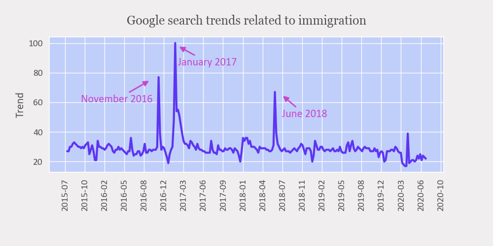
Let’s create a Matplotlib line chart with annotations showing Google trends related to immigration. We’ll use a .csv file for plotting. You can download the file on GitHub (imm_trends.csv).
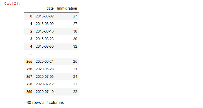
On the second line in your Jupyter notebook, type this code to read the file. We delete all columns except “date” and “immigration”.
df = pd.read_csv('imm_trends.csv')
df = df.drop(labels=['isPartial', 'visas', 'residence permit'],axis='columns')
df
Here’s the output:
Let’s also find maximum values — we’ll need to know them to create annotations:
maximums = df.sort_values(by='Immigration', ascending=False).head()
maximums

Our first annotation would be for values in rows #66 (2016-11-06), the second #78 (2017-01-29), and the third #150 (2018-06-17).
We also must tell Matplotlib that the dates in our data set are indeed dates:
df['date'] = pd.to_datetime(df['date'], format='%Y/%m/%d')
We’ll need this to change the format from “year-month-day” to “year-month” on our graph.
Plotting
We’ll need the following variables for plotting:
sns.set(rc={'axes.facecolor':'#c0cefa'}) # graph facecolor
font_color = '#525252'
csfont = {'fontname':'Georgia'} # title font
hfont = {'fontname':'Calibri'} # main font
ann_color = '#c449cc' # annotation color
We’ll create a Matplotlib line chart with annotations in 6 steps. All the code snippets below should be placed inside one cell in your Jupyter Notebook.
1. Create a figure and subplots
fig, ax = plt.subplots(facecolor='#f0eeee')
fig.set_size_inches(10, 5)
ax.plot('date', 'Immigration', data=df, color='#5d35f2', linewidth=3)
plt.tight_layout()
fig, ax = plt.subplots(facecolor='#f0eeee') — this would create a figure with one subplot. Here, facecolor would set the color of the figure as a whole.
fig.set_size_inches(10, 5) creates a 1000 × 500 px figure.
plt.tight_layout() adjusts subplot params so that subplots are nicely fit in the figure.
2. Format dates
ax.xaxis.set_major_formatter(mdates.DateFormatter('%Y-%m'))
ax.xaxis.set_major_locator(ticker.MultipleLocator(100))
plt.xticks(rotation=90)
This would change the date format from “year-month-day” to “year-month”, set date frequency on the graph, and rotate the dates 90 degrees. Note that mdates.DateFormatter would work only if you used pd.to_datetime to convert dates earlier (see the Data Preparation section for more details).
3. Set a title
ttl = ax.set_title('Google search trends related to immigration', fontsize=18, pad=18, color=font_color, **csfont)
ttl.set_position([.5, 1.02])
4. Create annotations
Next, we’ll create three annotations for date values placed in rows #66, 78, and 150 in our dataframe (df).
Annotations can be created with ax.annotate, which takes several parameters.
1. Indicate the text that will be used for the annotation (e. g. 'November 2016').
2. Set the arrow position (e. g. (df['date'][60], 75), where df['date'][60] — the date in the row #60 — is a timestamp on the x-axis (Timestamp('2016-09-25 00:00:00')) and 75 is the y-axis coordinate).
3. Set the annotation text position (e. g. (df['date'][10], 60), where df['date'][10] is a timestamp where the text begins and 60 is the y-axis coordinate).
4. Set other parameters: text color, arrow properties, the font size and family. Check Matplotlib documentation for more.
arrowprops=dict(arrowstyle='-|>', color=ann_color, linewidth=2)

# Annotation for df['date'][66]
ax.annotate('November 2016',
            xy=(df['date'][60], 75), # arrow position (x, y)
            xytext=(df['date'][10], 60), # text position (x, y)
            color=ann_color,
            arrowprops=arrowprops,
            fontsize=16,
            **hfont)
# Annotation for df['date'][78]
ax.annotate('January 2017',
            xy=(df['date'][80], 98), # arrow position (x, y)
            xytext=(df['date'][80], 85), # text position (x, y)
            color=ann_color,
            arrowprops=arrowprops,
            fontsize=16,
            **hfont)
# Annotation for df['date'][150]
ax.annotate('June 2018',
            xy=(df['date'][155], 65), # arrow position (x, y)
            xytext=(df['date'][155], 50), # text position (x, y)
            color=ann_color,
            arrowprops=arrowprops,
            fontsize=16,
            **hfont)
5. Create labels and ticks, set their color and font
ax.set_ylabel('Trend', color=font_color, fontsize=16, **hfont)
plt.xticks(color=font_color, **hfont)
plt.yticks(color=font_color, **hfont)
for label in (ax.get_xticklabels() + ax.get_yticklabels()):
    label.set_fontsize(14)

# Adjust subplots so that the title and labels would fit
plt.subplots_adjust(top=0.85, bottom=0.3, left=0.1, right=0.9)
6. Save the file
filename = 'mpl-line-chart'
plt.savefig(filename+'.png', facecolor=('#f0eeee'))
You might need to repeat facecolor in savefig(). Otherwise, plt.savefig might ignore it.
That’s it, our Matplotlib line chart is ready. You can download the notebook on GitHub to get the full code.
Read also: