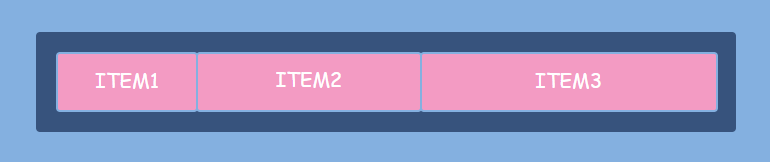
CSS flexbox (Flexible Box Layout Module) is a layout module that consists of the flex container (the parent element) and the flex items (the children elements). The flex items can be organized as a row or as a column, and the available free space can be distributed between them in various ways.
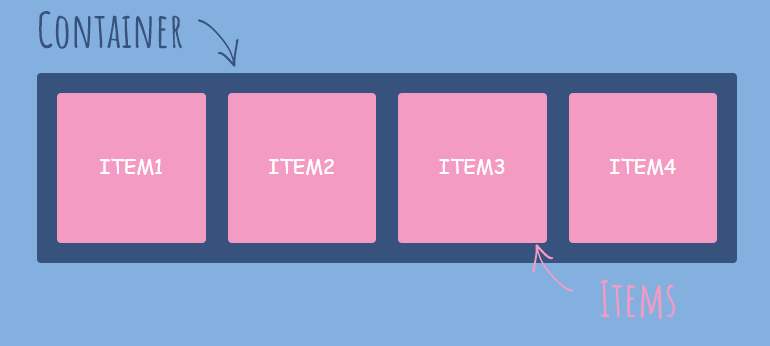
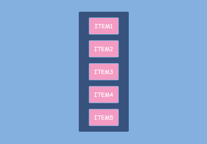
<div class="container">
    <div class="item">
        <p>Item1</p>
    </div>
    <div class="item">
        <p>Item2</p>
    </div>
    <div class="item">
        <p>Item3</p>
    </div>
    <div class="item">
        <p>Item4</p>
    </div>
</div>
With the help of flexbox you can:
- Automatically scale elements (alter height or width) so that they fill the available space
- Automatically shrink or grow elements to make them fit into the container and prevent overflow
- Change the order of the items
- Solve the problem of horizontal and vertical centering
- Create columns of the same height
- Create a footer sticking to the bottom of the page
- Design navigation panels
- And more
Flexbox layout is intended for small-scale layouts, while the Grid layout is most appropriate to larger scale layouts.
Flexbox elements can have many properties some of which are set on the flex container and the others are set on the flex items.
Properties that apply to the flex container:
- align-content
- align-items
- display
- flex-direction
- flex-flow
- flex-wrap
- justify-content
Properties that apply to the flex items:
- align-self
- flex
- flex-basis
- flex-grow
- flex-shrink
- order
How to Create the Flex Container
The display: flex; property applies to the container, makes the container a block element, and enables the flex layout for all its direct children.
.container {
  display: flex;
}
The display: inline-flex; works in the same way. Only it creates a container as an inline element.
.container {
  display: inline-flex;
}
Note that some properties do not work when applied to the flex items, namely clear, float, and vertical-align. And pseudoelements such as ::first-letter and ::first-line has no effect on a flex container. Also, an absolutely-positioned flex item does not participate in flex layout.
Don’t use percentage paddings or margins in a flex container as older browser behavior will vary.
How to Create a Row or Column
If you want to arrange the flex items to look like a row or a column, apply the flex-direction property to the container.
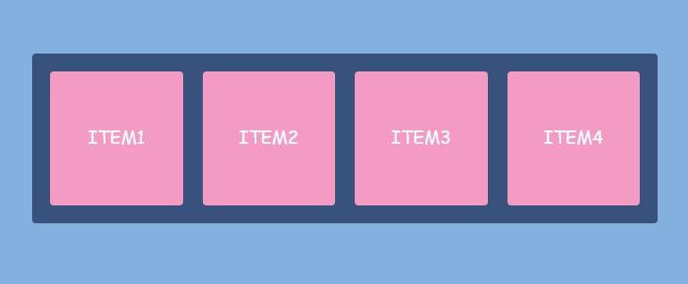
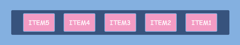
The flex-direction: row; property will make a horizontal row. The row is the default value.
.container {
  flex-direction: row;
}
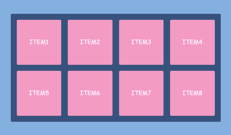
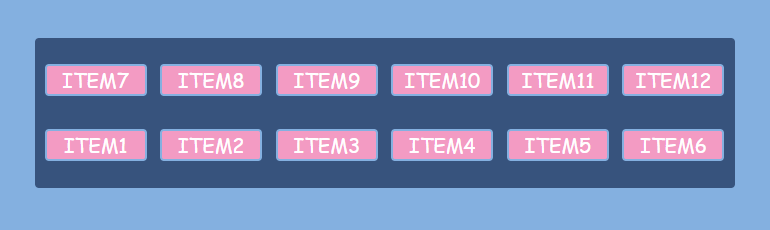
If you have more items that can fit in one row and you still want a horizontal layout, the flex-wrap: wrap; property will come in handy. This way, the flex items will wrap onto multiple lines inside the flex container. The default value is flex-wrap: nowrap;.
.container {
  display: flex;
  flex-direction: row;
  flex-wrap: wrap;
}
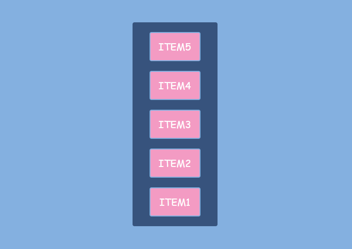
To make a vertical column, apply the flex-direction: column; to the container.
.container {
  flex-direction: column;
}
There’s a shorthand for the flex-direction and flex-wrap properties — flex-flow. The default value is row nowrap.
.container {
  flex-flow: row wrap; // flex-direction + flex-wrap
}
How to Align Elements Horizontally
To define the horizontal alignment of items, use the justify-content property. It may have one of the following values:
- flex-start: items are packed toward the container’s left side (it’s the default value)
- flex-end: items are packed toward the container’s right side
- center: items are placed in the center
- space-between: items are evenly distributed in the line (the first item is on the left, the last item on the right)
- space-around: items are evenly distributed in the line with equal space on both sides of the items. Note that visually the spaces aren’t equal since all the items have equal space on both sides. The margins of adjacent flex items do not collapse. The first item will have one unit of space against the container edge, but two units of space between the next item because that next item has its own spacing that applies
- space-evenly: items are distributed so that the spacing between any two items (and the space to the edges) is equal
.container {
  justify-content: flex-start | flex-end | center | space-between | space-around | space-evenly;
}
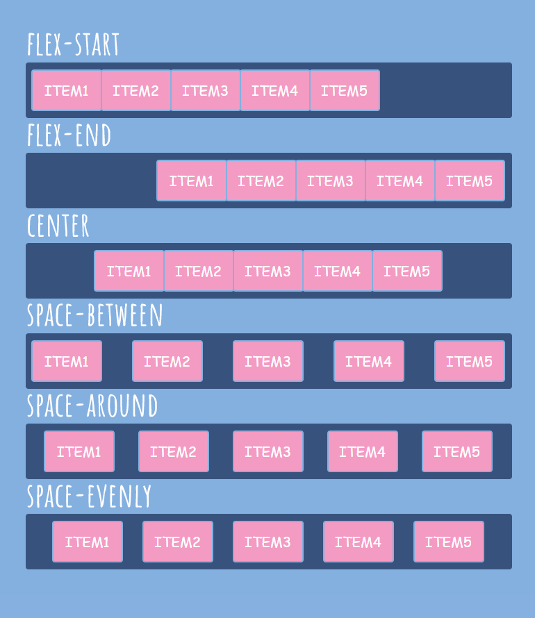
You can use auto-margins to divide flex items in the same container. Auto-margins eat up all the extra space in a flex container. For example, to move an item to the right side of the container, apply to it the margin-left: auto; property. However, if free space is distributed to auto-margins, the alignment properties will have no effect.
How to Align Elements Vertically
To align flex items vertically, use the align-items, align-content or align-self properties.
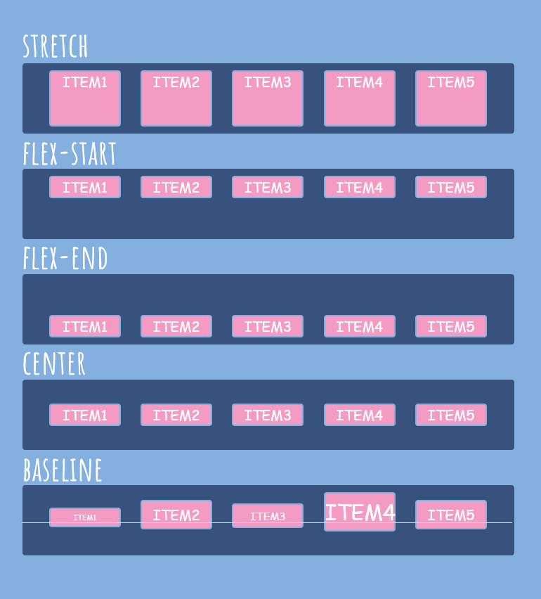
Align-items
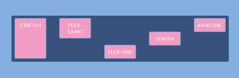
To define the vertical alignment of several items, apply the align-items property to the container. This property may have one of the following values:
- stretch: items are stretched to fill the container, still respecting min-width and max-width properties (it’s the default value)
- flex-start: items are placed in the top part of the container
- flex-end: items are placed in the bottom part of the container
- center: items are centered in the middle of the container
- baseline: items are aligned such as their baselines align
.container {
  align-items: stretch | flex-start | flex-end | center | baseline;
}
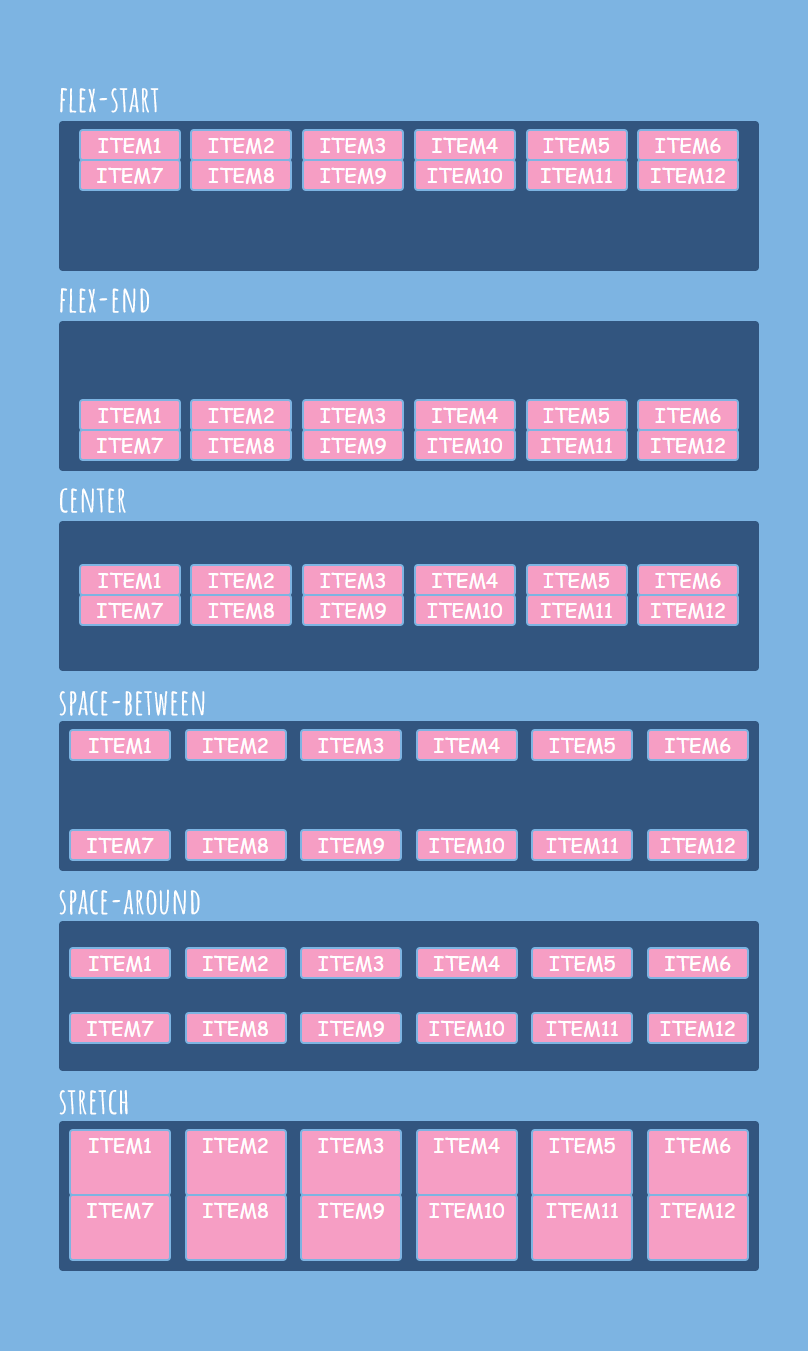
Align-content
To define the vertical alignment of several lines of items, use the align-content property. This property has no effect when there is only one line of flex items.
This property only works if two conditions are met:
- The wrap value should be applied to the flex container
- The flex container should be higher than the lines of the flex items
In other words, there must be additional vertical space inside the container, which should be larger than the sum of all the heights of the rows of elements.
This property may have one of the following values:
- stretch: lines stretch to take up all the available space in the container (it’s the default value)
- flex-start: lines are placed in the top part of the container
- flex-end: lines are placed in the bottom part of the container
- center: lines are centered in the middle of the container
- space-between: lines are evenly distributed in the container
- space-around: lines are evenly distributed with equal space around each line
.container {
  align-content: flex-start | flex-end | center | space-between | space-around | stretch;
}
Align-self
To vertically align individual items, use the align-self property. It applies to the flex items, not to the flex container. It is useful to override the alignment specified for the flex container with the help of the align-items property.
The align-self property may have one of the following values (the same ones as in the case of the align-items property plus auto):
- auto: equals to the value specified in the align-items property for the flex container (it’s the default value)
- stretch: items are stretched to fill the container, still respecting min-width and max-width properties
- flex-start: items are placed in the top part of the container
- flex-end: items are placed in the bottom part of the container
- center: items are centered in the middle of the container
- baseline: items are aligned such as their baselines align
.item {
  align-self: auto | stretch | flex-start | flex-end | center | baseline;
}
How to Change the Order of the Elements
Several properties allow determining the order of the flex items: order, row-reverse, column-reverse, wrap-reverse.
Order
To customize the order of individual flex items, use the order property. It applies to the flex items.
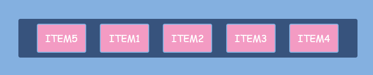
By default, all flex items have the order: 0; value. If you specify the value -1 for an element, it moves toward the start of the line, and the value 1 places it in the end. If multiple flex items have the same order value, they will be displayed according to the original order.
.item {
  order: <integer>;
}
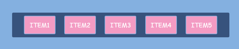
The default order:
To make the last item first:
.item5 {
  order: -1;
}
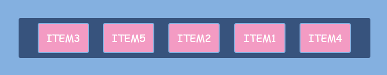
To change the order of individual items:
.item1 { order: 4; }
.item2 { order: 3; }
.item3 { order: 1; }
.item4 { order: 5; }
.item5 { order: 2; }
Row-reverse, column-reverse
You can reverse the item order. To arrange flex items in a row right to left, apply the flex-direction: row-reverse; property to the flex container.
.container {
  flex-direction: row-reverse;
}
To arrange flex items in a column bottom to top, use the flex-direction: column-reverse; property.
.container {
  flex-direction: column-reverse;
}
Instead of flex-direction, you can choose the shorter flex-flow property to apply those values:
.container {
  flex-flow: row-reverse wrap;
}

.container {
  flex-flow: column-reverse nowrap;
}
Wrap-reverse
There is also the flex-wrap: wrap-reverse; property that allows wrapping flex items onto multiple lines from bottom to top.
.container {
  flex-wrap: wrap-reverse;
}
How to Make the Elements Grow or Shrink
The flexibility of flex items is determined by the flex-basis, flex-grow, and flex-shrink properties.
Flex-basis
The flex-basis property defines the default size of the flex item before the available space is distributed. You can set an absolute value (e. g. 200px or 10em), a percentage value (e. g. 50%) or a keyword (auto, content).
.item {
  flex-basis: <length> | auto | content;
}
The flex-basis property can be interpreted as the minimum width of the flex item. If you specify a flex-basis value, it will set the width for the specific item, but depending on other flex parameters the flex item may become wider (or narrower) than the flex-basis value.
The default value is auto. It retrieves the value of the width property. And the content value is based on the flex item’s content.
If you do not set a flex-basis value and set the flex-grow value to 0, the element will be compressed to its minimum size.
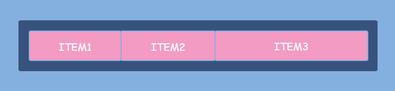
Flex-grow
The flex-grow property applies to individual flex items and defines the ability of a flex item to grow. It dictates what amount of the available space inside the flex container the item should take up. It accepts a unitless value that serves as a proportion. The default value is 0. Negative numbers are invalid.
If all items have flex-grow set to 1, the remaining space in the container will be distributed equally to all children. If the flex-grow value of an item is set to 2, it will get 2 times more pixels to the original width than other items with the flex-grow value 1.
.item1 { flex-grow: 1; }
.item2 { flex-grow: 1; }
.item3 { flex-grow: 2; }
Flex-shrink
The flex-shrink property applies to the flex items and indicates how much each element will be reduced if there is not enough available space. It accepts a unitless value that serves as a proportion. The default value is 1. The value 0 allows keeping the item’s original size. Negative numbers are invalid.
.container { width: 700px; padding: 20px; }

.item1 { flex-basis: 150px; flex-shrink: 1; } // actual width: 133.5px
.item2 { flex-basis: 250px; flex-shrink: 2; } // actual width: 204px
.item3 { flex-basis: 350px; flex-shrink: 3; } // actual width: 316.5px
The flex-shrink property won’t work if the flex container has the flex-wrap: wrap; property.
Flex
The flex property is the shorthand for flex-grow, flex-shrink, and flex-basis combined. The second and third parameters (flex-shrink and flex-basis) are optional.
It may have several values:
- flex-grow flex-shrink flex-basis: values of the three properties combined
- none: same as 0 0 auto (makes the flex items fully inflexible)
- initial: same as 0 1 auto (the default value; it is based on the width and height properties)
- auto: same as 1 1 auto (it is based on the width and height properties, but makes the flex items fully flexible)
- <positive number>: same as <positive number> 1 0 (makes the flex item flexible and sets the flex basis to zero)
You can make one item flexible by applying the flex: 1; property and make other ones static by applying flex: initial; width: 300px; (or another value for the fixed width).
For example, flex: 1 1 300px; is identical to the code below:
flex-grow: 1;
flex-shrink: 1;
flex-basis: 300px;
And flex: 1; is identical to the code below:
flex-grow: 1;
flex-shrink: 1;
flex-basis: 0%;
In the example above, the width of a flex item will not be defined by its content but by the flex-grow property.
You can use the flexbox layout to make the footer stick to the bottom of the page. See the code below.
body {
  display: flex;
  flex-direction: column;
  min-height: 100vh;
}

main {
  flex: 1;
}
Checklist
- Create a flex container (e. g. div .container) and put flex items inside (e. g. div .item).
- Apply display: flex; to the container.
- Set flex-flow: row wrap; or flex-flow: column nowrap; for the .container.
- To determine the horizontal alignment, use the justify-content property (flex-start, center, flex-end, space-around, space-between).
- To determine the vertical alignment, use the align-items property (flex-start, center, flex-end, stretch, baseline). To align individual items vertically, use align-self (flex-start, center, flex-end, stretch, baseline).
- To change the order of the flex items, apply the order property or flex-direction: row-reverse; or flex-direction: column-reverse;.
- To make one element wider than the other one inside the container (for example, to make it twice as wide), apply flex: 2; to one element and flex: 1; to the others.