HTML <form> Tag
Elements of a form, including all inputs, checkboxes, buttons, etc., should be nested inside the <form> tag:
<form action="process.html" method="post">
    <!-- Here go your inputs and buttons -->
</form>
The <form> tag usually has two attributes — action and method.
The HTML form action attribute specifies where to send the data when the form is submitted. The value of the action attribute can be:
- Path to a PHP file: action="form.php"
- Path to an HTML page that is shown after the form is submitted: action="process.html"
- URL of the CGI (Common Gateway Interface) program, for instance: <form action="https://sharkcoder.com/cgi/test.cgi"></form>
- Your email address starting with the mailto: keyword. When a user will submit the form, the default mail program will be launched. To ensure that the data will be interpreted correctly, use the enctype="text/plain" attribute: <form action="mailto:shark@sharkcoder.com" enctype="text/plain"></form>
- Empty: action="#"
The method attribute can have one of the two values — post or get.
The HTML form post method (method="post"):
- Is used to send files (photos, archives, programs, etc.) to a server, as well as send, add, and edit comments on forums, in blogs, etc.
- Post requests are never cached: they don’t remain in the browser history and can’t be bookmarked
- Post requests have no restrictions on data length
- The data sent to the server with the post method is stored in the request body of the HTTP request
The get method (method="get"):
- Is used to send small text data to a server and to enable search through the website
- Get requests can be cached: they remain in the browser history and can be bookmarked
- Get requests have length restrictions (4 kB)
- Get requests are only used to request data (not to modify data)
- The query string (name/value pairs) is sent in the URL of a get request, for example: https://sharkcoder.com/test/demo_form.php?name1=value1&name2=value2. The link can be shared, send by email, posted on a forum, etc.
HTML Form Input Types
To make an input, use the <input> tag. There is also a number of attributes that can be placed inside this tag.
Attributes
Always use the type attribute (email, tel, etc.) for the <input> tag. When you fill out form fields from your phone, the type attribute triggers a special keyboard for entering email or phone number.
The type attribute is useful to ensure the correct validation and work of inputs. This attribute can take different values:
- type="checkbox" — for making checkboxes
- type="color" — for capturing RGB colors in hexadecimal notation, such as #aabbcc (some browsers provide a color picker)
- type="email" — for email addresses (the multiple attribute can be added to email fields to select an email from a list of multiple email addresses)
- type="file" — to upload files (you can also use it with the multiple attribute to enable sending multiple files)
- type="hidden" — defines a hidden input field (a mix of <input disabled> and <input type="hidden"> ensure that the value cannot be changed)
- type="number" — for any numbers apart from phone numbers. The following attributes can be added to number fields: min (the minimum value), max (the maximum value), and step (a valid value is divisible by the step value)
- type="password" — for making inputs for passwords
- type="radio" — for making radio inputs
- type="range" — this input will be displayed as a graphical slider (there can be additional min, max, and step attributes)
- type="search" — for search fields
- type="submit" — defines a submit button which submits a form
- type="tel" — for entering phone numbers
- type="text" — for entering any text data
- type="time" — for entering time in the hh:mm format
- type="url" — for capturing absolute URLs
The placeholder attribute specifies a short hint that describes the expected value of an input field.
The name attribute specifies the name of an <input> element. It’s used to reference elements in JavaScript, to reference form data after a form is submitted, and to ensure the correct work of radio inputs. Only form elements with the name attribute will have their values passed when submitting a form.
The aria-label attribute is used to define a string that labels the current element. Use it in cases where a text label is not visible on the screen. If there is visible text labeling the element, use aria-labelledby instead.
Below are some examples.
Name input:
<input name="name" type="text" placeholder="Name" aria-label="Name" />
Phone input:
<input name="phone" type="tel" placeholder="Phone number" aria-label="Phone number" />
Email input:
<input name="email" type="email" placeholder="Email" aria-label="Email" multiple />
Address input:
<input name="address" type="text" placeholder="Your address" aria-label="Address" />
Number input:
<input name="number" type="number" min="10" max="40" step="10">
Valid input for the above field would be 10, 20, 30, and 40 with any other value being rejected.
If you don’t want the form to be submitted without an input being filled out, include the required attribute in that input: <input type="text" placeholder="Name" required />.If you want to put focus on the first element of the form, include the autofocus attribute in a <input> or <textarea> element: <input type="text" placeholder="Name" autofocus />. Note that there could be only one focused element per form.
Label
The <input> element is usually accompanied with the <label> tag that represents a caption for the input. To associate the <label> with an <input> element, you need to give the <input> an ID. The <label> then needs the for attribute whose value is the same as the input’s ID.
<label for="name">Name</label>
<input name="name" id="name" type="text" aria-label="Name" />
Alternatively, you can nest the <input> inside the <label>. In this case, the for and id attributes are not required because the association is implicit:
<label>Name
    <input name="name" type="text" aria-label="Name" />
</label>
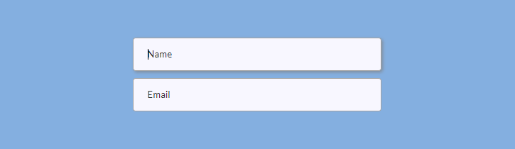
Basic Input Styling
All browsers apply their own styles to inputs. To reset those styles, you need to add these rules:
input {
  outline: none;
  user-select: none;
}
The outline: none; property removes the default outline of the input. And the user-select: none; property prevents the element to be highlighted if you click on it.
Next, you can apply your own styles: border, background, color, etc., as well as add pseudo-classes to control inputs styles in response to user actions. Here is an example:
input {
  ...
  border: 1px solid #a4a4a4;
  padding: 15px 20px;
  border-radius: 4px;
  width: 100%; // set width relatively to the parent container with fixed width
  margin-bottom: 10px;
  background: #f8f8ff;

  &:active, &:hover, &:focus {
    box-shadow: 2px 2px 5px 0px rgba(128,128,128,.7);
    transition: box-shadow .3s linear;
  }
}
Here is the result:
Form elements in focus
You can remove unnecessary outline for elements in focus for mouse/touch/stylus users while keeping the outline for keyboard users.
Here’s what you need to do: define regular focus styles for non-supporting browsers and then overwrite them for browsers that support :focus-visible:
button:focus {
  outline: 2px solid blue;
}

button:focus:not(:focus-visible) {
  outline: 0;
}

button:focus-visible {
  outline: 2px solid blue;
}
On this image, the first button shows how the button in focus will look like for mouse users and the second one shows how the button in focus will look like for keyboard users:

You can apply the same CSS rules for inputs or other elements of the form.
You can also set additional rules for form elements in focus. For example, you can use focus-within: to style any parent of an input currently receiving focus (e.g. <form> or <label>). In the example below, the form element will get the white background when the user clicks on an input (when the input is in focus):
form:focus-within,
label:focus-within {
  background: #fff;
}
Placeholders
You can also style placeholders. However, each browser requires separate styles. Make sure you’re using right prefixes or make sure Autoprefixer doesn’t miss them. Here is an example showing how to change the color and font of a placeholder:
input {
  // Chrome, Opera
  &::placeholder {
    color: #333;
    font-family: $font_main;
  }

  // Firefox
  &::-moz-placeholder {
    color: #333;
    opacity: 1;
    font-family: $font_main;
  }

  // IE (watch for the single colon!)
  &:-ms-input-placeholder {
    color: #333;
    font-family: $font_main;
  }

  // Edge
  &::-ms-input-placeholder {
    color: #333;
    font-family: $font_main;
  }
}
Validation of Inputs
Before doing HTML form validation, you need to style invalid inputs. If you have inputs with the required attribute, you may want to create special styles that appear after users try to submit the form without filling out required fields. For instance, you may want to add a pink border to invalid inputs with the help of an additional class (.required):
input.required {
  border: 2px solid #f69ec4;
}
These styles will apply after the user clicks on the submit button. To make them appear, use this jQuery code that adds the .required class:
$('button[type=submit]').on('click', function() {
    var inputVal = $('input:required').val();
    if (inputVal == '') {
        $('input:required').addClass('required');
    }
});
Here are examples of input validation:
<input required> <!-- Input value is required -->
<form required> <!-- All values in the form are required -->
<input type="email" required> <!-- Must be a valid email address -->

<!-- Text-based inputs -->
<input type="text" minlength="8"> <!-- Blank or min 8 characters -->
<input type="text" maxlength="32"> <!-- Blank or max 32 characters -->
<input type="text" maxlength="32" required> <!-- Max 32 characters -->
<input type="text" pattern="[a-z]{8,12}"> <-- 8 to 12 lowercase letters -->

<!-- Numeric-based inputs -->
<input type="date" min="mm-dd-yyyy"> <!-- Min date -->
<input type="number" max="64" required> <!-- Max number -->
<input name="tel" type="tel" pattern="[0-9]{7}"/> <!-- 7 digits -->
Range Input
A type="range" input will be displayed as a graphical slider. You can generate cross-browser compatible range inputs with custom styles.
First, prepare some basic markup:
<p>Set the range<span class="range-data">60%</span></p>
<input type="range" />
To override basic browser styles, you need to make your input “invisible”:
input[type="range"] {
  -webkit-appearance: none;
  -moz-appearance: none;
  -ms-appearance: none;
  width: 100%;
  border: none;
  padding: 0;
  background: transparent;

  &:focus {
    outline: none;
  }
}
Next, you need to style your range input’s thumb and track. The thumb is the thing that you drag along the track, and the track is the line that the thumb moves across. You need to add different styles for different browsers. Set the background (it can be an image), size, border-radius, etc.
input[type="range"] {
  ...
  // Chrome, Opera
  &::-webkit-slider-thumb {
    -webkit-appearance: none;
    border: none;
    height: 24px; width: 24px;
    border-radius: 3px;
    background: url(images/range-thumb.png) no-repeat;
    cursor: pointer;
    margin-top: -10px;
  }

  // Firefox
  &::-moz-range-thumb {
    border: none;
    height: 24px; width: 24px;
    border-radius: 12px;
    background: #32557f;
    cursor: pointer;
    margin-top: -10px;
  }

 // IE
  &::-ms-thumb {
    border: none;
    height: 24px; width: 24px;
    background: #32557f;
    cursor: pointer;
    margin-top: 0;
  }
}
To style the track, you can also add styles for different browsers.
input[type="range"] {
  ...
  // Chrome, Opera
  &::-webkit-slider-runnable-track {
    width: 100%; height: 6px;
    border: 1px solid #FFF;
    border-radius: 3px;
    cursor: pointer;
    background: #a4a4a4;
  }

  // Firefox
  &::-moz-range-track {
    width: 100%; height: 6px;
    border: 1px solid #FFF;
    border-radius: 3px;
    cursor: pointer;
    background: #a4a4a4;
  }

  // IE
  &::-ms-track {
    width: 99%; height: 6px;
    cursor: pointer;
    border-color: transparent;
    color: transparent;
    border: 1px solid #FFF;
    border-radius: 3px;
    background: #a4a4a4;;
  }
}
If you apply those styles, your range input will look basically like this in Chrome and Opera (don’t forget to upload an image for the thumb):

Finally, you need to allow changing the digits in HTML (<span class="range-data">60%</span>) when users drag the thumb. Here is the jQuery code for getting range input value and putting it inside HTML:
$('input[type=range]').val(60); // To set initial value
$('.range-data').html( $('input[type=range]').val() + '%' ); // To change HTML

$('input[type=range]').on('input', function() {
    $('.range-data').html( $(this).val() + '%' );
});
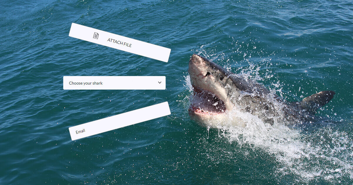
File Input
File inputs (type="file") are useful to upload files.
Here is the markup:
<input type="file" id="file" />
<label for="file"><span>Attach file</span></label>
To apply custom styles, you need to make the input invisible and style its label. This way, you will keep your input functioning as a file input but it will have your own styles.
// To hide the input
input[type="file"] {
  display: none;
}

// To style the label as a custom file input
label[for="file"] {
  display: block;
  cursor: pointer;
  position: relative;

  // To hide the browser’s styling for the label
  &::-webkit-file-upload-button {
    visibility: hidden;
  }

  // To position the text
  span {
    text-align: center;
    position: absolute;
    top: 2px; right: 0;

    // To add an icon to your file input
    &::before {
      content: url(img/icon-file.png);
      position: absolute;
      top: 12px; left: 80px;
      z-index: 2;
    }
  }
}
You can take rules for the border, padding, border-radius, width, and other properties from the Basic Input Styling section. In the end, your file input will look somewhat like this:

Checkbox Inputs
The type="checkbox" attribute will change your input into a checkbox.
Here is the markup:
<input type="checkbox" id="whale-shark" autofocus />
<label for="whale-shark">Whale Shark</label>

<input type="checkbox" id="basking-shark" checked />
<label for="basking-shark">Basking Shark</label>

<input type="checkbox" id="bull-shark" disabled />
<label for="bull-shark">Bull Shark</label>

<input type="checkbox" id="blue-shark" checked disabled />
<label for="blue-shark">Blue Shark</label>
Autofocus, checked, and disabled are attributes that allow styling checkboxes in different states (focus, checked, and disabled).
Now let’s make custom checkboxes. First, apply the display: block; property to your label elements if you want to make the checkboxes appear as a column. You can add the line-height property to determine the distance between the lines of checkboxes.
label {
  display: block;
  line-height: 1.8;
}
To visually hide browser styling of checkboxes, you can add position and clip properties to your checkbox inputs.
input[type="checkbox"] {
  position: absolute;
  clip: rect(0,0,0,0);
}
Now we will make our custom rectangular checkboxes with the help of width, height, and background properties. The text-indent property is required for the checkbox mark’s horizontal position, and the line-height is for the checkbox mark’s vertical align.
input[type="checkbox"] + label::before {
  content: '\a0';
  display: inline-block;
  width: 1.2em;
  height: 1.2em;
  margin-right: .5em;
  border-radius: .2em;
  background: #f8f8ff;
  text-indent: .25em;
  line-height: 1.4;
  border: 1px solid #555;
}
\2713 is a CSS symbol for the checkbox mark that will appear when the checkbox is checked:
input[type="checkbox"]:checked + label::before {
  content: '\2713';
  background: #32557f;
  color: #fff;
  transition: background .05s ease-out;
}
And here are other rules for focus and disabled states:
input[type="checkbox"]:focus + label::before {
  box-shadow: 0 0 .1em .1em #7eb4e2;
}

input[type="checkbox"]:disabled + label {
  color: #555;

  &::before {
    background: #a4a4a4;
    box-shadow: none;
    color: #555;
    cursor: not-allowed;
  }
}
This is how the final checkboxes will look like in different states (unchecked, checked, disabled, and checked-disabled):

To disable or enable elements of the form, add these lines to your JS file:
$ ('.class').on('click', function() {
    $('.anotherClass').prop('disabled', true);
}); // To disable an element

$ ('.class').on('click', function() {
    $('.anotherClass').prop('disabled', false);
}); //To enable an element
.class is an element which clicking event enables the disabled state of .anotherClass element.
You can allow users to select or unselect all checkboxes at once. Let’s suppose you have two buttons: the #tick button that allows ticking all checkboxes, and the #untick button that unticks all checkboxes. Here is the jQuery code that does that:
$('#tick').on('click', function() {
    $('input[type=checkbox]').prop('checked', true);
});

$('#untick').on('click', function() {
    $('input[type=checkbox]').prop('checked', false);
});
Animated Checkbox
You can create CSS checkboxes with a fancy animated effect that appears on click. Below is an example from Alyssa Nicoll’s article.
The main steps:
1. Create markup. Build a checkbox with a label inside a .center container that will be used to center elements. You’ll also need 12 spans with the .expression-line class. These elements will be used to create an animated effect when the user clicks on the checkbox — 12 lines spreading out evenly around the checkbox.
2. Hide the checkbox to be able to create custom styles later. Give the checkbox opacity: 0; and pointer-events: none;. Note that visibility: hidden; would not allow keyboard events (spacebar) to work so don’t use this property.
3. Position expression lines. You can do this with changing $distance, $height, and $offset variables as you like. Give each span with the .expression-line class a height of 20 px in ems for scalability.
4. Animate the checkbox on click. The expression lines need to start off invisible, so add opacity: 0;. Then, you’ll animate the position of the expression lines to get the spring effect (using keyframes).
Radio Inputs
Unlike checkboxes, only one radio input may be selected at a time. To make a radio input, add the type="radio" and name="anyname" attributes to the <input> tag. Choose whatever name you like, but remember that the name attribute should be the same for each radio input that is not disabled. Otherwise, your radio inputs will be acting like checkboxes.
Here is the markup (<i> is added to style the radio circle):
<label>
    <input name="radio" type="radio" />
    <i></i><span>Whale Shark</span>
</label>

<label>
    <input name="radio" type="radio" checked />
    <i></i><span>Basking Shark</span>
</label>

<label>
    <input name="radio" type="radio" disabled />
    <i></i><span>Bull Shark</span>
</label>

<label>
    <input type="radio" checked disabled />
    <i></i><span>Blue Shark</span>
</label>
First, organize your radio inputs as a column with the margin-bottom: 5px (or whatever margin you like):
.radio {
  display: flex;
  flex-flow: column wrap;
}

label {
  margin-bottom: 5px;
}
Next, add rules for different states of the radio inputs (checked and disabled). And don’t forget the position:absolute; property for your input.
input[type="radio"] {
  position: absolute;
  opacity: 0;

  &:checked + i::before {
    top: 5px;
    opacity: 1;
  }

  &:checked + i::after {
    top: 1px;
    right: 1px;
    bottom: 1px;
    left: 1px;
    background: #f8f8ff;
  }

  &:disabled + i {
    cursor: not-allowed;
  }

  &:disabled + i::before {
    background: #555;
  }

  &:disabled + i::after {
    background: #a4a4a4;
  }

  &:disabled ~ span {
    color: #555;
  }
}
Finally, do some styling for radio circles and dot marks (this is where your <i> element comes in handy).
i {
  position: relative;
  display: block;
  float: left;
  margin-right: 10px;
  width: 18px;
  height: 18px;
  cursor: pointer;
  background: #4a4a4a;
  outline: none;
  border-radius: 50%;
  z-index: 0;

  &::after,
  &::before {
    content: "";
    position: absolute;
    display: block;
  }

  &::before {
    width: 8px;
    height: 8px;
    border-radius: 50%;
    background-color: #32557f;
    top: 5px;
    right: 5px;
    bottom: 5px;
    left: 5px;
    opacity: 0;
    z-index: 2;
  }

  &::after {
    top: 1px;
    right: 1px;
    bottom: 1px;
    left: 1px;
    background: #f8f8ff;
    border-radius: 50%;
    z-index: 1;
  }
}
Here is the result for radio inputs in different states (unchecked, checked, disabled, and checked-disabled):

Select Element
To make a select element, you can create the <select> tag and nest your options inside it. And don’t forget to add value attributes to <option> tag.
<select name="shark">
    <option value="Whale Shark">Whale Shark</option>
    <option value="Basking Shark">Basking Shark</option>
    <option value="Shortfin Mako Shark">Shortfin Mako Shark</option>
</select>
An alternative to the <select> element is the <datalist> tag that provides an “autocomplete“ feature for <input> elements. (Note that the list attribute in the <input> tag and the datalist id should have the same values).

<input list="fishes" name="fishes" id="fish" placeholder="Select your fish">
<datalist id="fishes">
  <option value="Shark">
  <option value="Salmon">
  <option value="Tuna">
  <option value="Goldfish">
</datalist>
However, if you wish to apply really fancy styling, it would be easier to do without <select> and <option> tags. In this case, you can use simple <div> tags to style your select element.
Create a wrapper element (.select-wrap) and nest your select element with options inside. You can add .select and .options classes to divs intended for the select element and options. You can create an additional element to style a select arrow (.arrow). Also, you can wrap options with an additional <div> if you want to style the scrollbar (.options-container).
<div class="select-wrap">
    <div class="select">
        <span>Choose your shark</span><i class="arrow"></i>
    </div>
    <div class="options">
        <div class="options-container">
            <p>Whale Shark</p>
            <p>Basking Shark</p>
            <p>Shortfin Mako Shark</p>
            <p>Thresher Sharks</p>
            <p>Bull Shark</p>
            <p>Tiger Shark</p>
            <p>White Shark</p>
            <p>Oceanic Whitetip Shark</p>
            <p>Blue Shark</p>
            <p>Hammerhead Shark</p>
        </div>
   </div>
</div>
First, you should position your wrapper and select divs relatively. Also, you may want to add other styles such as width or height. Choose the fixed width for your wrapper div and 100% width for your .select div.
.select-wrap {
  position: relative;
  width: 100%;
}

.select {
  position: relative;
  width: 100%;
  height: 48px;
  cursor: pointer;
}
You can also add to .select other rules for the border, padding, border-radius, width, and other properties from the Basic Input Styling section.
Next, you need to position your options absolutely and determine the top and left properties relatively to the .select div. The top property should correspond to the height of your .select div. After you finish styling, don’t forget to make your .options div invisible — it should open when you click on the .select div (we’ll be able to do it with the help of jQuery later). You can put this property inside comments for the time being to be able to see the result.
.options {
  // display: none;
  width: 100%;
  position: absolute;
  top: 48px; // = height of your .select div
  left: 0;
}
And here are other unimportant rules that you are free to change as you wish:
.options {
  ...
  width: 100%;
  border: 1px solid #32557f;
  border-radius: 0 0 4px 4px;
  background-color: rgba(39, 39, 51, .9);
  padding: 2px 3px 2px 16px;
  cursor: pointer;

  p {
    line-height: 1.9;
    color: #FFF;

    &:first-of-type {
      padding-top: 3px;
    }

    &:last-of-type {
      padding-bottom: 8px;
    }

    &:active,
    &:hover {
      color: #7eb4e2;
      transition: color .3s linear;
    }
  }
}
To make your div look like the true select element, you need to add an arrow to indicate that the div contains options. You can use the rules below to make a down-pointing arrow. The border and border-width properties will form the arrow shape, the position, top, and right properties will position the arrow inside the .select div, and the transform property will help to set the right direction for the arrow (down-pointing) by turning it by 45 degrees.
.arrow {
  display: inline-block;
  border: solid #555;
  border-width: 0 2px 2px 0;
  padding: 3px;
  position: absolute;
  top: 16px;
  right: 16px;
  transform: rotate(45deg);
}
After that, you need to style your .select div when it’s open with the options showing. You can add a new class (e. g. .select-open) and change the background-color, color, and other properties if you wish. You may also want to transform your down-pointing arrow into an up-pointing arrow by turning it by 135 degrees and slightly changing its positioning to make it look better.
.select-open {
  background-color: #32557f;
  border: 1px solid #32557f;
  border-radius: 4px 4px 0 0;
  color: #FFF;

  .arrow {
    // the first 5 properties don’t change
    border: solid #fff;
    border-width: 0 2px 2px 0;
    display: inline-block;
    padding: 3px;
    position: absolute;

    top: 20px; right: 16px; // to change the positioning
    transform: rotate(-135deg); // to make an up-pointing arrow
  }
}
If you want a triangle instead of an arrow, apply these rules to the .select::after div (for a down-pointing triangle):
.select::after {
  content: "";
  width: 0;
  height: 0;
  border-left: 4px solid transparent;
  border-right: 4px solid transparent;
  border-top: 4px solid #555;
  position: absolute;
  top: 20px;
  right: 16px;
}
Change border-top: 4px solid #555; to border-bottom: 4px solid #555; if you want to transform a down-pointing triangle to an up-pointing triangle.
Finally, you need to add a jQuery scenario to make your .select and .options divs behave like the true select and options. Add the following code to your JS file:
// To toggle options by clicking on .select div (show/hide options)
$('.select').click(function(e) {
    $('.options').toggle();
    $('.select').toggleClass('select-open'); // To add the class .select-open
    e.stopPropagation();
});

// To hide options when clicking on the document outside the .select div
$(document).click(function(e) {
    var $filter = $('.options');
    if (!$filter.is(e.target) && $filter.has(e.target).length === 0)    {
        $filter.hide();
        $('.select').removeClass('select-open');
    }
});

// To get options’ values and put them into .select div
$('.options p').click(function() {
    var optionVal = $(this).html();
    $('.select span').html(optionVal);
    $('.options').hide();
    $('.select').removeClass('select-open');
});
Optionally, you can style the scrollbar to make your options look better if there are too many of them. The important thing is to add the overflow-y: auto; property to the div containing the options (.options-container). You may need to add different styles for different browsers.
Note that ::-webkit-scrollbar-track is the empty space below the progress bar and ::-webkit-scrollbar-thumb is the draggable scrolling element.
.options {
  scrollbar-color: #7eb4e2 #32557f;
  scrollbar-width: thin;

  // For IE
  scrollbar-base-color: #32557f;
  scrollbar-face-color: #7eb4e2;
  scrollbar-track-color: #32557f;
  scrollbar-arrow-color: #32557f;
  scrollbar-shadow-color: #7eb4e2;

  &-container {
    max-height: 180px;
    overflow-y: auto;

    &::-webkit-scrollbar {
      width: 9px;
      background-color: transparent;

      &-track {
        border-radius: 3px;
        background-color: #32557f;
        margin: 2px 0 2px;
      }

      &-thumb {
        border-radius: 3px;
        background-color: #7eb4e2;
      }
    }
  }
}
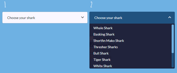
Below is an example of how your final select element may look like (#1 is the select element before clicking and #2 is the select element with open options after clicking):
Text Area
The HTML <textarea> element is useful when you want to allow users to enter a comment. This element can have several attributes: autofocus, disabled, placeholder, required, and some others. One of the most useful attributes is maxlength that specifies a maximum number of characters that the <textarea> is allowed to contain.
<textarea name="comment" maxlength="200" placeholder="Type your comment of a maximum of 200 characters"></textarea>
In most browsers, <textarea>s are resizable. There is the drag handle in the right bottom corner, which can be used to alter the size of the element. Resizing is enabled by default, but you can disable it using a resize value of none:
textarea {
  resize: none;
}
You can allow resizing of the width (resize: horizontal;) or of the height of the text area (resize: vertical;).
You can also apply other rules similarly to text inputs (width, height, border, padding, border-radius, etc.) — see the details in the Basic Input Styling section.
Connecting the Form
There are many endpoint services that allow connecting your form to an endpoint and receive email submissions. Basin, Formcarry, and FormKeep are few among many. My personal favorite is Formspree — it’s simple, free, and doesn’t require PHP or JavaScript.
To connect your form, point the action attribute of your form to Formspree’s URL. Put your email instead of shark@sharkcoder.com.
<form action="https://formspree.io/shark@sharkcoder.com" method="post" />
Then, include a name attribute in all form elements (i. e. <input>, <select>, and <textarea>) to receive the submission data:
<input id="name" type="text" name="name" placeholder="Name" />
<input id="email" type="email" name="_replyto" placeholder="Email" />
Finally, submit the form once. This first-time-use will trigger an email requesting confirmation. That’s all you need to connect the form.
→ You can also read the article about CSS buttons.