We’ll create Google maps depicting rental prices in Minsk, Belarus. First, we’ll scrape data from a website, clean the data, and then generate three maps of different kinds.
All the code from this tutorial is available on GitHub.
Prerequisites
To create a custom Google Map with Python, we’ll need the following:
- Python installed on your machine
- Pip: package management system (it comes with Python)
- Jupyter Notebook: an online editor for data visualization
- Pandas: a library to prepare data for plotting
- BeautifulSoup: a library for scraping websites
- Gmaps: a Jupyter plugin for embedding Google Maps in Jupyter notebooks
- Google API key: an individual key starting with “AI” we’ll need to create a custom Google Map
You can download the latest version of Python for Windows on the official website.
To get Jupyter Notebook and Pandas, you’ll need to install recommended Scientific Python Distributions. Type this in your terminal:
pip install numpy scipy matplotlib ipython jupyter pandas sympy nose
To install BeautifulSoup:
pip install beautifulsoup4
And to install gmaps, type this:
jupyter nbextension enable --py --sys-prefix widgetsnbextension
pip install gmaps
jupyter nbextension enable --py --sys-prefix gmaps
Finally, follow instructions to create a Google API key. Don’t share it with anyone!
Note that you might need to turn on billing in Google Console. Otherwise, your map will have the “For development purposes only” watermark.
Data Preparation
First of all, we need to prepare data for mapping. We’ll do this in 4 steps.
1. Scraping website
For this tutorial, I scraped the Realt.by website, namely about 4,000 rental listings in Minsk, Belarus.
First, I scraped listings’ IDs (scrape-ids.py in my GitHub repository) and then individual listings corresponding to each ID (scrape-listings.py). The result is a data set (realt-listings.csv) that includes coordinates, address, district, metro station, number of rooms, total area, living area, and rental price (BYN per month) for each listing.
To create maps, we’ll need only coordinates and rental prices. We scraped the coordinates (latitudes and longitudes or x and y) from the website’s HTML map element:
<div class="object-map ">
  <div id="map">
    <div id="map-center" data-center="{"distance":"1000","position.":{"x":"27.648321","y":"53.925517"},"image":"<img src=\"fileadmin\/realt.adaptive\/images\/map-icons\/home.svg\">","name":"г. Минск, Жасминовая ул., 2-Б"}"
    </div>
  </div>
</div>
Here’s how we access the coordinates while scraping:
import json
data_center = json.loads(soup.select_one('div#map-center')['data-center'])
x_coord = data_center['position.']['x']
y_coord = data_center['position.']['y']
2. Cleaning data
Next, create a folder that will contain your notebook (e.g. “maps-gmaps”) and open Jupyter Notebook by typing this command in your terminal (don’t forget to change the path):
cd C:\Users\Shark\Documents\code\maps-gmaps
py -m notebook
This will automatically open the Jupyter home page at http://localhost:8888/tree. Click on the “New” button in the top right corner, select the Python version installed on your machine, and a notebook will open in a new browser window.
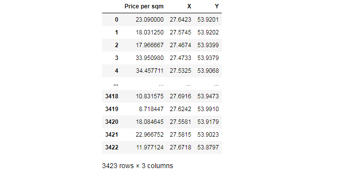
In the new notebook, we clean the data: select columns, drop NaN values, convert values to numeric, and delete values that are too small or too large:
import pandas as pd

df = pd.read_csv('realt-listings.csv', encoding='utf-16', names=['A','B'], skiprows=1)
df_a = df['A'].str.split('\t', expand=True)
df_b = df['B'].str.split('\t', expand=True)

df_new = pd.concat([df_a, df_b], axis=1, sort=False, join='outer')
df_new = df_new.iloc[:, [1, 2, 3, 14]]
df_new.dropna(inplace=True)
df_new[4] = df_new[4].str.split().str.get(0)
df_new.columns = ['Price', 'X', 'Y', 'Area']
df_new = (df_new.drop(df_new[['Price', 'X', 'Y', 'Area']], axis=1) .join(df_new[['Price', 'X', 'Y', 'Area']].apply(pd.to_numeric, errors='coerce')))
df_new = df_new[df_new[['Price', 'X', 'Y', 'Area']].notnull().all(axis=1)]
df_new['Price per sqm'] = df_new['Price'].div(df_new['Area'].values,axis=0)
df_new = df_new[(df_new['Price'] >= 500) & (df_new['Price'] <= 10000)]
df_new = df_new[['Price per sqm', 'X', 'Y']]
df_new
We save this result as data.csv:
filename = 'data'
df_new.to_csv(filename + '.csv')
3. Binning
To create maps of some types, it’s also useful to know the categories of data. We can use the binning method to divide our data into categories and count values for each of them:
data = pd.read_csv('data.csv')
prices = data['Price per sqm']
bins = [5, 10, 15, 20, 25, 30, 35, 40, 45, 50, 55, 60, 65, 70, 75, 80]
cats = pd.cut(prices, bins)
pd.value_counts(cats)
Out:

(15, 20]    927
(20, 25]    775
(10, 15]    545
(25, 30]    512
(30, 35]    256
(5, 10]     147
(35, 40]    134
(40, 45]     61
(45, 50]     32
(55, 60]     13
(50, 55]     12
(65, 70]      3
(75, 80]      2
(60, 65]      1
(70, 75]      0
Name: Price per sqm, dtype: int64
This shows us that the majority of values fall into the BYN 15–20 category and that BYN 60–80 is almost non-existent.
Find more tips on data manipulation with the Pandas library in our article 50+ Pandas Tricks.
4. Editing datasets.py
Next, we upload the data.csv file on GitHub, open it as a raw file, and get the link (https://raw.githubusercontent.com/jukuznets/jupyter-notebooks/main/data.csv). If you upload your .csv file on GitHub, be sure to click on the “Raw” button to get the link to the raw downloadable .csv file. Also, your repository should be public.
After that, find and edit the file called datasets.py in gmaps package. It should be located at an address like this:
C:\Python38\Lib\site-packages\gmaps\datasets
Once found, add the following code in the METADATA object of datasets.py:
"PROJECT_NAME": {
        "url": "YOUR_PUBLIC_URL_OF_.CSV_FILE",
        "description": "ANY_DESCRIPTION_YOU_WANT",
        "source": "YOUR_WEBSITE",
        "headers": ["latitude", "longitude", "weights"],
        "types": [float, float, float]
    },
I edited my file like this:
# datasets.py

METADATA = {
        "belarus_rent": {
            "url": "https://raw.githubusercontent.com/jukuznets/jupyter-notebooks/main/data.csv",
            "description": "Rent prices in Belarus, BYN/sqm/month, January 2021",
            "source": "https://github.com/jukuznets/",
            "headers": ["latitude", "longitude", "rent"],
            "types": [float, float, float]
      },
}
headers correspond to the data set’s columns, and types correspond to each column’s data type.
Once done, save this file and open your Jupyter Notebook.
Creating Maps
Open a new notebook and import all the necessary libraries in the first line:
import pandas as pd
import gmaps
import gmaps.datasets
from ipywidgets.embed import embed_minimal_html
We’ll need the last line to export an HTML file with the finished map.
After importing all the necessary libraries and plugins, insert your Google API key:
gmaps.configure(api_key='AI*************************************')
Next, we’ll create 3 maps:
- Heatmap depicting data density
- Map with multicolored dots depicting rental prices from the lowest ones to the highest ones
- Map with icons representing the most expensive rentals
Here are the lines of codes that are common for each of the three maps:
# load the data set from datasets.py
data = gmaps.datasets.load_dataset_as_df('belarus_rent')
data.head()

# set figure layout for our future HTML file
figure_layout = {
    'width': '100%',
    'height': '75vh',
    'border': '2px solid white',
    'padding': '2px'
}
# set coordinates (the geographic center of Minsk)
coordinates = (53.91, 27.55)
1. Heatmap
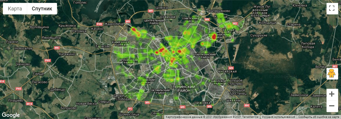
The first map we’ll create is a weighted heatmap to show data density, with the locations painted in gradient colors ranging from green to red.
For this type of map, we’ll need 3 variables: latitude, longitude, and weights. The weight represents how frequent or important the event is in one place.
locations = data[['latitude', 'longitude']]
weights = data['rent']

fig = gmaps.figure(center=coordinates,
                   zoom_level=11,
                   map_type='HYBRID',
                   layout=figure_layout)

fig.add_layer(gmaps.heatmap_layer(locations,
                                  weights=weights,
                                  point_radius=10,
                                  max_intensity=900))
fig
center=coordinates should come together with zoom_level. Increase zoom_level to zoom in the map.
map_type is the type of map: 'ROADMAP' (default; the classic Google Maps style), 'SATELLITE' (satellite tiles with no overlay), 'HYBRID' (satellite base tiles with roads and cities overlaid), or 'TERRAIN' (map showing terrain features).
point_radius is the number of pixels for each point passed in the data. This determines the “radius of influence” of each data point.
max_intensity is a strictly positive floating-point number indicating the numeric value that corresponds to the hottest color in the heatmap gradient. Any density of points greater than that value will get mapped to the hottest color.
Open the map in an interactive mode in a new window.
2. Map with dots
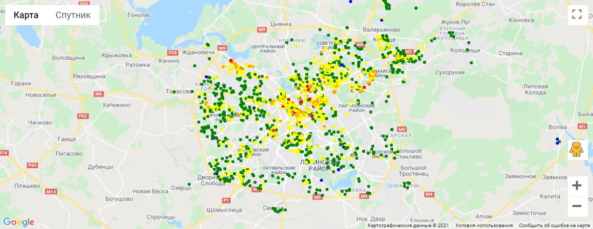
Our second map, a map width dots, will show data variation or, in our example, the variety of rental prices ranging from BYN 5 to BYN 80 per sqm per month. Locations will be marked with multicolored dots (blue, green, yellow, orange, and red) depending on the price.
Our selection of price ranges is based on categories selected in the Data Preparation section (Step 3 — Binning).
We’ll create this map in several steps:
1. Divide the data set in several categories:
data_1 = data[(data['rent'] >= 5) & (data['rent'] < 10)][['latitude', 'longitude']]
data_2 = data[(data['rent'] >= 10) & (data['rent'] < 20)][['latitude', 'longitude']]
data_3 = data[(data['rent'] >= 20) & (data['rent'] < 35)][['latitude', 'longitude']]
data_4 = data[(data['rent'] >= 35) & (data['rent'] < 50)][['latitude', 'longitude']]
data_5 = data[(data['rent'] >= 50) & (data['rent'] < 80)][['latitude', 'longitude']]
2. Use the symbol_layer function to draw dots. Symbols represent each latitude, longitude pair with a circle whose color and size you can customize. You can have several layers of markers.
layer_1 = gmaps.symbol_layer(
    data_1, fill_color='blue', stroke_color='blue', scale=2
)
layer_2 = gmaps.symbol_layer(
    data_2, fill_color='green', stroke_color='green', scale=2
)
layer_3 = gmaps.symbol_layer(
    data_3, fill_color='yellow', stroke_color='yellow', scale=2
)
layer_4 = gmaps.symbol_layer(
    data_4, fill_color='#FFA500', stroke_color='#FFA500', scale=2
)
layer_5 = gmaps.symbol_layer(
    data_5, fill_color='red', stroke_color='red', scale=2
)
gmaps documentation states that Google Maps may become very slow if you try to represent more than a few thousand symbols or markers. If you have a larger data set, you should either consider subsampling or use heatmaps.
3. Create a map figure.
fig = gmaps.figure(center=coordinates,
                   zoom_level=11,
                   layout=figure_layout)
4. Add layers.
fig.add_layer(layer_1)
fig.add_layer(layer_2)
fig.add_layer(layer_3)
fig.add_layer(layer_4)
fig.add_layer(layer_5)
fig
Open the map in an interactive mode in a new window.
3. Map with icons
For our third map, we’ll add a layer of markers/icons to a Google map. Each marker will represent an individual data point. Markers are currently limited to the Google maps style drop icon.
1. Create a dictionary with coordinates presented as tuples and add any other key/value pairs you need.
flats = [
    {'location': (53.9102, 27.5572), 'rent': 77},
    {'location': (53.9102, 27.5572), 'rent': 75},
    {'location': (53.901929, 27.54778), 'rent': 68},
    {'location': (53.9069, 27.5739), 'rent': 67},
    {'location': (53.910162, 27.556926), 'rent': 67},
    {'location': (53.910542, 27.556749), 'rent': 64},
    {'location': (53.9068, 27.5325), 'rent': 59},
    {'location': (53.9122, 27.5845), 'rent': 59},
    {'location': (53.9199, 27.5671), 'rent': 57},
    {'location': (53.9119, 27.5402), 'rent': 57},
    {'location': (53.9123, 27.5688), 'rent': 57},
    {'location': (53.9068, 27.5325), 'rent': 56},
    {'location': (53.8988, 27.5715), 'rent': 56},
    {'location': (53.9102, 27.5572), 'rent': 55}
]
2. Create a template. We can attach a pop-up box to each marker. Clicking on the marker will bring up the infobox. The content of the box can be either plain text or HTML.
info_box_template = """
<dl>
<dt>Rent</dt><dd>{rent}, BYN/sqm per month</dd>
</dl>
"""
The <dl> tag defines a description list, <dt> defines terms/names, and the <dd> tag is used to describe a term/name in a description list.
3. Use the marker_layer function to place icons.
flat_locations = [flat['location'] for flat in flats]
flat_info = [info_box_template.format(**flat) for flat in flats]

marker_layer = gmaps.marker_layer(flat_locations, info_box_content=flat_info)
4. Create a map figure.
fig = gmaps.figure(center=coordinates,
                   zoom_level=13,
                   layout=figure_layout)
5. Add a layer.
fig.add_layer(marker_layer)
fig
Open the map in an interactive mode in a new window.
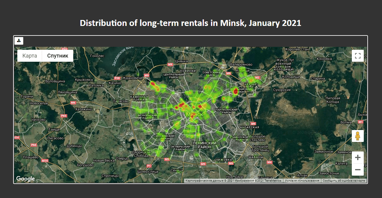
Exporting Maps
You can save maps to PNG by clicking the Download button in the toolbar. This will download a static copy of the map. The low quality of the rendering is still an issue, though.
Alternatively, you can export interactive maps to HTML using the infrastructure provided by ipywidgets. Here’s how we export a map to HTML:
embed_minimal_html('export.html', views=[fig])
Next, we can edit the export.html file the way we like. For example, we can add a title, change the text color, background, etc.
<style>
  * { box-sizing: border-box; }

  body {
    background: #333;
    width: 100%;
    padding: 50px;
    margin: 0 auto;
    font-family: Calibri;
    color: white;
  }

  h1 { text-align: center; }

  .widget-subarea { width: 100%; }
  .widget-container { border-radius: 4px; }
</style>

<body>
  <h1>Distribution of long-term rentals in Minsk, January 2021</h1>
  ...
For our map with multicolored dots, we can also add a legend:
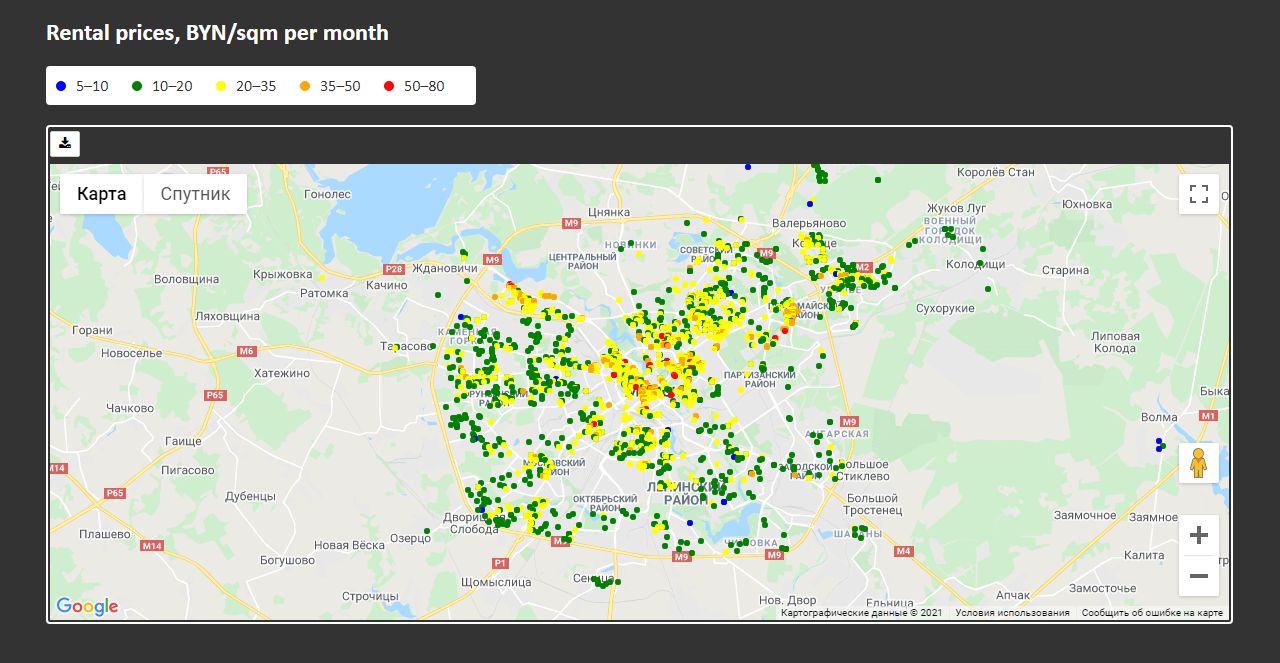
<style>
  .legend ul {
    background: white;
    color: #333;
    border-radius: 4px;
    margin: 20px 0;
    padding: 10px;
    max-width: 430px;
  }

  li {
    display: inline;
    position: relative;
    list-style: none;
    padding: 0 0 0 20px;
    margin-right: 20px;
  }
  li::before {
    content: "";
    position: absolute;
    left: 0;
    top: 5px;
    width: 10px;
    height: 10px;
    border-radius: 50%
  }

  .blue::before { background-color: blue }
  .green::before { background-color: green }
  .yellow::before { background-color: yellow }
  .orange::before { background-color: orange }
  .red::before { background-color: red }
</style>

<body>
  <h1>Distribution of long-term rentals in Minsk, January 2021</h1>

  <div class="legend">
    <h2>Rental prices, BYN/sqm per month</h2>
    <ul>
      <li class="blue">5–10</li>
      <li class="green">10–20</li>
      <li class="yellow">20–35</li>
      <li class="orange">35–50</li>
      <li class="red">50–80</li>
    </ul>
  </div>
Once again, all the code from this tutorial is available on GitHub.
You can also read other tutorials on visualizing data with maps: