A heatmap is a color-coded table where numbers are replaced with colors or are complemented with colors according to a color bar. Heatmaps are useful to visualize patterns and variations.
This tutorial was inspired by Thiago Carvalho’s article published on Medium.
Prerequisites
To create a heatmap, we’ll need the following:
- Python installed on your machine
- Pip: package management system (it comes with Python)
- Jupyter Notebook: an online editor for data visualization
- Pandas: a library to create data frames from data sets and prepare data for plotting
- Numpy: a library for multi-dimensional arrays
- Matplotlib: a plotting library
- Seaborn: a plotting library
You can download the latest version of Python for Windows on the official website.
To get other tools, you’ll need to install recommended Scientific Python Distributions. Type this in your terminal:
pip install numpy scipy matplotlib ipython jupyter pandas sympy nose seaborn
Getting Started
Create a folder that will contain your notebook (e.g. “sns-heatmap”). And open Jupyter Notebook by typing this command in your terminal (change the pathway):
cd C:\Users\Shark\Documents\code\sns-heatmap
py -m notebook
This will automatically open the Jupyter home page at http://localhost:8888/tree. Click on the “New” button in the top right corner, select the Python version installed on your machine, and a notebook will open in a new browser window.
In the first line of the notebook, import all the necessary libraries:
import matplotlib.pyplot as plt
import matplotlib as mpl
import pandas as pd
import seaborn as sns
import numpy as np
%matplotlib notebook
You need the last line (%matplotlib notebook) to display charts in input cells.
Data Preparation
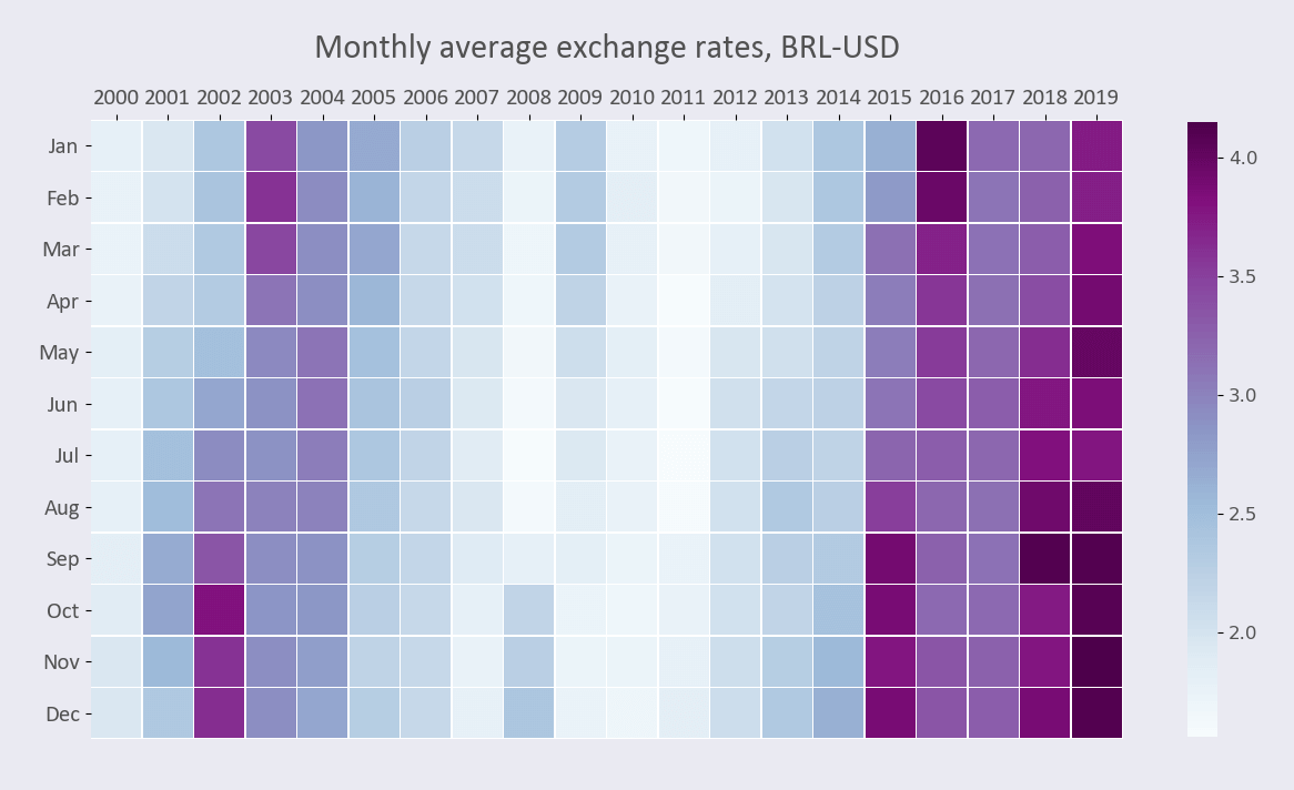
We’ll create a heatmap showing Brazilian real (BRL) / USD exchange rates, with months as rows and years as columns. You can download the Foreign Exchange Rates 2000–2019 dataset on Kaggle (Foreign_Exchange_Rates.csv).
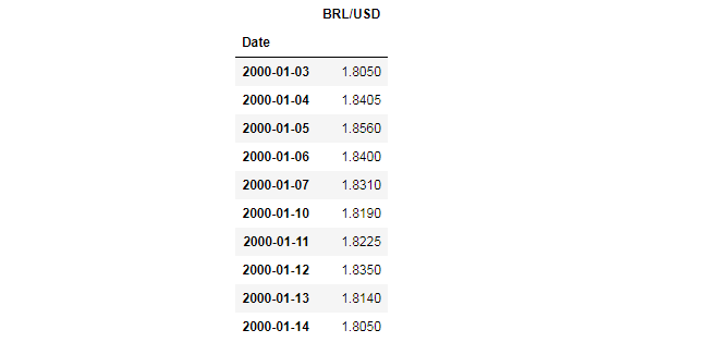
We’ll use columns 1 and 6, which are the “Time Series” and “BRAZIL - REAL/US$”, respectively. We’ll rename those columns as “Date” and “BRL/USD”. We’ll also skip the header, which is the first row of the .csv file.
We also need to parse the first column (former “Time Series”, our new “Date”) so that the values would be in a DateTime format, and then we’ll make the date our index. In addition, we’ll make sure all our values are numbers and will remove rows with NaN values.
df = pd.read_csv('Foreign_Exchange_Rates.csv',
                 usecols=[1,6], names=['Date', 'BRL/USD'],
                 skiprows=1, index_col=0, parse_dates=[0])
df['BRL/USD'] = pd.to_numeric(df['BRL/USD'], errors='coerce')
df.dropna(inplace=True)
df.head(10)
Here are the first 10 rows:
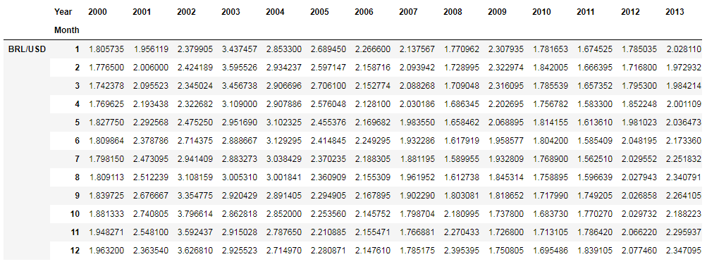
Next, we’ll create a copy of the dataframe, add columns for months and years, group values by month and year, get the average, and transpose the table:
df_m = df.copy()
df_m['Month'] = [i.month for i in df_m.index]
df_m['Year'] = [i.year for i in df_m.index]
df_m = df_m.groupby(['Month', 'Year']).mean()
df_m = df_m.unstack(level=0)
df_m = df_m.T
df_m
Here’s the output we’ll use for plotting:
Plotting
Here are font and color variables we’ll use in our code:
font_color = '#525252'
hfont = {'fontname':'Calibri'}
facecolor = '#eaeaf2'
We’ll create a heatmap in 6 steps. All the code snippets below should be placed inside one cell in your Jupyter Notebook.
1. Create a figure and a subplot
fig, ax = plt.subplots(figsize=(15, 10), facecolor=facecolor)
figsize=(15, 10) would create a 1500 × 1000 px figure.
2. Create a heatmap
sns.heatmap() would create a heatmap:
sns.heatmap(df_m,
            cmap='BuPu',
            vmin=1.56,
            vmax=4.15,
            square=True,
            linewidth=0.3,
            cbar_kws={'shrink': .72},
#           annot=True,
#           fmt='.1f'
           )
Here’s some more about sns.heatmap’s parameters:
- cmap is a colormap; you can read about them in Matplotlib documentation
- vmin and vmax are the minimum and maximum values that will be used for the color bar. You can use df_m.describe() to display these and other useful values (or use Python’s min() and max() functions instead)
- square=True would create square cells
- linewidth defines the size of the line between the boxes
- cbar_kws={'shrink': .72} sets colorbar-to-chart ratio. Using this parameter, you can decrease or increase the color bar’s height
- annot=True would turn on the annotations
- fmt='.1f' would allow you to format numbers as digits with one decimal
This is how our heatmap would look like with annot=True:

3. Set ticks and labels
Our y-axis labels would by now look like BRL/USD-1, BRL/USD-2, etc. instead of January, February, etc. We need to rename them and also place the x-axis ticks on top of the heatmap.
yticks_labels = ['Jan', 'Feb', 'Mar', 'Apr', 'May', 'Jun',
                'Jul', 'Aug', 'Sep', 'Oct', 'Nov', 'Dec']
plt.yticks(np.arange(12) + .5, labels=yticks_labels)
ax.xaxis.tick_top()
We can also remove the x- and y-axis labels and set tick labels’ font size, font color, and font family.
plt.xlabel('')
plt.ylabel('')
for label in (ax.get_xticklabels() + ax.get_yticklabels()):
    label.set(fontsize=15, color=font_color, **hfont)
4. Create a title
title = 'Monthly average exchange rates, BRL-USD'
plt.title(title, fontsize=22, pad=20, color=font_color, **hfont)
pad=20 would create padding under the title.
5. Edit color bar
You can use this code to change the color bar’s font size and font color:
cbar = ax.collections[0].colorbar
cbar.ax.tick_params(labelsize=12, labelcolor=font_color)
6. Save the chart as an image
filename = 'sns-heatmap'
plt.savefig(filename+'.png', facecolor=facecolor)
You might need to repeat facecolor in savefig(). Otherwise, plt.savefig might ignore it.
That’s it, our Seaborn heatmap is ready. You can download the notebook on GitHub to get the full code.
Read also: