A carousel or slider is a compact representation of visual or textual elements. It allows cycling through elements.
There are many ways to create a slider.
Slider with jQuery and JavaScript
This method is useful when you have more than one carousel on the page.
1. Create a container with photos (.photos) and nest images as well as buttons for navigation.
<!-- Slider main container -->
<div class="slider slider-1">
    <!-- Your content -->
    <div class="photos">
        <img src="img/skate.jpg" class="shown">
        <img src="img/shark.jpg">
        <img src="img/fish1.jpg">
        <img src="img/fish2.jpg">
        <!-- Prev/next buttons -->
        <div class="buttons">
            <div class="prev"></div>
            <div class="next"></div>
        </div>
    </div>
</div>

<div class="slider slider-2">
    <div class="photos">
        <img src="img/skate.jpg" class="shown">
        <img src="img/shark.jpg">
        <img src="img/fish1.jpg">
        <img src="img/fish2.jpg">
        <div class="buttons">
            <div class="prev"></div>
            <div class="next"></div>
        </div>
    </div>
</div>
2. Add CSS rules to align galleries and photos.
.slider {
  width: 700px;
  margin: 0 auto 20px;
  text-align: center;
}

.slider .photos {
  position: relative;
  height: 433px;
}
Next, set the opacity value to 0 to hide photos and add transition to create a smoother effect.
.slider .photos img {
  width: 100%;
  position: absolute;
  left: 0;
  opacity: 0;
  transition: opacity 1s;
}
Add the .shown class with the opacity value set to 1 to show photos when needed.
.slider .photos img.shown {
  opacity: 1;
}
Finally, add some CSS rules to style your “Previous” and “Next” buttons.
.prev:before,
.next:before {
  color: #fff;
  font-size: 100px;
  position: absolute;
  top: 35%;
  cursor: pointer;
}

.prev:before {
  content: '<';
  left: 0;
}

.next:before {
  content: '>';
  right: 0;
}
3. To avoid repeating code, it’s recommended to create a JavaScript Object for each slider: create an individual object with the keyword new and an object definition with any changeable values you need. For instance, your first slider can be controlled manually, and your second slider will show images automatically at a speed of 2000ms.
$(function() {
    new Slider({
        images: '.slider-1 img',
        btnPrev: '.slider-1 .buttons .prev',
        btnNext: '.slider-1 .buttons .next',
        auto: false
    });

	new Slider({
        images: '.slider-2 img',
        btnPrev: '.slider-2 .buttons .prev',
        btnNext: '.slider-2 .buttons .next',
        auto: true,
        rate: 2000
    });
});
After that, create a function that will handle your sliders by using parameters of your JavaScript Objects. This function contains common parameters of all your carousels. These parameters are not supposed to be changed as opposed to those in the Objects definitions.
function Slider(obj) {
	this.images = $(obj.images);
	this.auto = obj.auto;
	this.btnPrev = obj.btnPrev;
	this.btnNext = obj.btnNext;
     this.rate = obj.rate || 1000;

	var i = 0;
     var slider = this;

    // The "Previous" button: to remove the class .shown, to show the previous image and to add the .shown class
	this.prev = function () {
		slider.images.eq(i).removeClass('shown');
		i--;

		if (i < 0) {
			i = slider.images.length - 1;
		}

		slider.images.eq(i).addClass('shown');
	}

    // The "Next" button: to remove the class .shown, to show the next image and to add the .shown class
	this.next = function () {
		slider.images.eq(i).removeClass('shown');
		i++;

		if (i >= slider.images.length) {
			i = 0;
		}

		slider.images.eq(i).addClass('shown');
	}

    // To add next and prev functions when clicking on the corresponding buttons
    $(slider.btnPrev).on('click', function(){ slider.prev();});
    $(slider.btnNext).on('click', function(){ slider.next();});

    // For the automatic slider: this method calls the next function at the set rate
	if (slider.auto)	{
        setInterval(slider.next, slider.rate);
    }
};
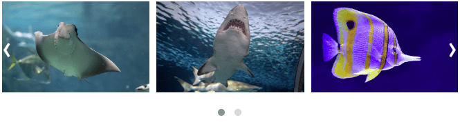
Demo:
Another method of creating a slider with jQuery:
If you want a pure JavaScript slider, use the code below (it does the same thing as the one above):
window.onload = function() {

    var slider1 = new Slider({
        images: '.slider-1 img',
        btnPrev: '.slider-1 .buttons .prev',
        btnNext: '.slider-1 .buttons .next',
        auto: false
    });

	 var slider2 = new Slider({
        images: '.slider-2 img',
        btnPrev: '.slider-2 .buttons .prev',
        btnNext: '.slider-2 .buttons .next',
        auto: true,
        rate: 2000
    });
}

function Slider(obj) {

	this.images = document.querySelectorAll(obj.images);
	this.auto = obj.auto;
	this.btnPrev = obj.btnPrev;
	this.btnNext = obj.btnNext;
     this.rate = obj.rate || 1000;

	var i = 0;
     var slider = this;

	this.prev = function () {
		slider.images[i].classList.remove('shown');
		i--;

		if (i < 0) {
			i = slider.images.length - 1;
		}

		slider.images[i].classList.add('shown');
	}

	this.next = function () {
		slider.images[i].classList.remove('shown');
		i++;

		if (i >= slider.images.length) {
			i = 0;
		}

		slider.images[i].classList.add('shown');
	}

    document.querySelector(slider.btnPrev).onclick = slider.prev;
    document.querySelector(slider.btnNext).onclick = slider.next;

	if (slider.auto)	{
        setInterval(slider.next, slider.rate);
    }
};
Demo:
Swiper Slider
If you need something more complicated, you can use a framework. Swiper is one of the most popular frameworks to create carousels. It offers a lot of options.
1. Download Swiper files from Swiper GitHub repository. You need swiper.css and swiper.js files. If you’re not planning to make any changes to them, you can use minified versions.
2. Embed swiper.css file in the <head> tag before your other CSS files so that you will be able to override Swiper CSS rules if needed.
<link href="css/swiper.css" rel="stylesheet">
<link href="css/styles.css" rel="stylesheet">
3. Put the path to the Swiper JS file before the closing </body> tag and before your other JS files.
<script src="https://code.jquery.com/jquery-3.3.1.min.js' integrity='sha256-FgpCb/KJQlLNfOu91ta32o/NMZxltwRo8QtmkMRdAu8=" crossorigin="anonymous"></script>
<script src="js/swiper.js"></script>
<script src="js/script.js"></script>
4. To create a Swiper slider, your HTML should look like the one below. Add your content, but keep the structure and all the classes as they are:
<!-- Slider main container -->
<div class="swiper-container">
    <!-- Additional required wrapper -->
    <div class="swiper-wrapper">
        <!-- Slides -->
        <div class="swiper-slide">Slide 1</div>
        <div class="swiper-slide">Slide 2</div>
        <div class="swiper-slide">Slide 3</div>
        ...
    </div>
    <!-- If you need pagination -->
    <div class="swiper-pagination"></div>

    <!-- If you need navigation buttons -->
    <div class="swiper-button-prev"></div>
    <div class="swiper-button-next"></div>

    <!-- If you need scrollbar -->
    <div class="swiper-scrollbar"></div>
</div>
5. Initialize Swiper in your JS file using the following code:
$(function() {
    // Initialize swiper when document ready
    var mySwiper = new Swiper('.swiper-container', {
        // Optional parameters
        direction: 'horizontal',
        loop: true,

        // If you need pagination
        pagination: {
            el: '.swiper-pagination',
        },

        // Navigation arrows
        navigation: {
            nextEl: '.swiper-button-next',
            prevEl: '.swiper-button-prev',
        },

        // If you need scrollbar
        scrollbar: {
            el: '.swiper-scrollbar',
        },
    })
});

That’s the simplest version of a slider. If you need more, here’s the full list of Swiper parameters: idangero.us/swiper/api. For example, you can create several slides per view and make your slider responsive by using breakpoints with a different number of slides per view.
slidesPerView: 3,
centeredSlides: true,

breakpoints: {
    768: {
        slidesPerView: 'auto',
        centeredSlides: true,
        spaceBetween: 40
    },
    1024: {
        slidesPerView: 2,
        spaceBetween: 20
    },
    1366: {
        spaceBetween: 15
    }
}
Breakpoints mark the maximum width of the viewport. You can use any breakpoints you like. slidesPerView is the number of visible slides in one moment, and spaceBetween is the space (in px) between individual slides.
You may need to set Swiper size in your CSS file (not in swiper.css file), for example:
.swiper-container {
  width: 700px;
  height: 433px;
}
You may also want to change the color of buttons and pagination. If you want your buttons white, add the .swiper-button-white class in your HTML:
<div class="swiper-button-prev swiper-button-white"></div>
<div class="swiper-button-next swiper-button-white"></div>
And if you want them black, add the .swiper-button-black class:
<div class="swiper-button-prev swiper-button-black"></div>
<div class="swiper-button-next swiper-button-black"></div>
If you want to alter the color of the active pagination bullet, make the changes in your CSS file:
.swiper-pagination-bullet-active {
  background: #fff;
}

Owl Carousel
Owl Carousel is another framework to create sliders. It’s very popular because of its simplicity and a variety of options.
1. Download Owl Carousel files from Owl Carousel GitHub repository. You need owl.carousel.css and owl.carousel.min.js files. If you’re not planning to make any changes to them, you can use minified versions.
2. Embed owl.carousel.css file in the <head> tag before your other CSS files so that you will be able to override Owl Carousel CSS rules if needed.
<link href="css/owl.carousel.css" rel="stylesheet">
<link href="css/styles.css" rel="stylesheet">
3. Put the path to the Owl Carousel JS file before the closing </body> tag and before your other JS files.
<script src="https://code.jquery.com/jquery-3.3.1.min.js' integrity='sha256-FgpCb/KJQlLNfOu91ta32o/NMZxltwRo8QtmkMRdAu8=" crossorigin="anonymous"></script>
<script src="js/owl.carousel.min.js"></script>
<script src="js/script.js"></script>
4. To create an Owl Carousel slider, your HTML should look like the one below. You don’t need any special markup. All you need is to wrap your divs inside the container element (.owl-carousel). This class is mandatory to apply proper styles that come from owl.carousel.css file.
<div class="owl-carousel">
    <div>Slide 1</div>
    <div>Slide 2</div>
    <div>Slide 3</div>
    ...
</div>
5. Add CSS rules to style buttons and pagination in your CSS file.
Prev/next buttons:
.owl-prev span,
.owl-next span {
  color: #fff;
  font-size: 50px;
  position: absolute;
  top: 35%;
  cursor: pointer;
}

.owl-prev span {
  content: '<';
  left: 0;
}

.owl-next span {
  content: '>';
  right: 0;
}
Pagination:
.owl-dots {
  text-align: center;
}

.owl-dots .owl-dot span {
  width: 10px;
  height: 10px;
  margin: 5px 7px;
  background: #D6D6D6;
  display: block;
  -webkit-backface-visibility: visible;
  transition: opacity .2s ease;
  border-radius: 30px;
}

.owl-dots .owl-dot.active span,
.owl-dots .owl-dot:hover span {
  background: #869791;
}
6. Initialize Swiper in your JS file using the following code:
$(function() {
    $('.owl-carousel').owlCarousel({
        loop: true,
        margin: 0,
        nav: true,
        dots: true,
        items: 1
    })
});
- loop: infinity loop; duplicates last and first items to get loop illusion
- margin: sets margin-right(px) on slides
- nav: shows prev/next buttons
- dots: shows pagination
- items: sets the number of visible slides per view

That’s the simplest version of a slider. If you need more, here’s the full list of Owl Carousel options: owlcarousel2.github.io.
You can create several slides per view and make your slider responsive by using breakpoints with a different number of slides per view.
$(function(){
    $('.owl-carousel').owlCarousel({
        loop: true,
        margin: 10,
        nav: true,
        dots: true,
        responsive: {
            0: {
                items: 1
            },
            1000: {
                items: 3
            }
        }
    })
});