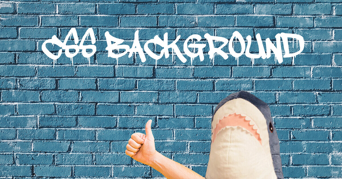
Background Property
To put an image on a web page, you can use the <image> HTML tag with a link to a picture (<img src="shark.jpg" />) or apply CSS rules to an element with the help of the background property.
background is a shorthand for several other properties:
- background-image: applies an image (.gif, .jpg, .png, ,svg, .webp) or gradient to the background of an element, e. g. url('shark.jpg') or linear-gradient(blue, green)
- background-position: allows moving a background image or gradient within its container, e. g. 120px 10px or bottom 10px right 20px
- background-size: sets the width and height of the background image or gradient, e. g. 250px 100px or cover (resizes the image to cover the entire container) or contain (resizes the image to make sure it is fully visible)
- background-repeat: allows repeating the image horizontally (repeat-x), vertically (repeat-y), both vertically and horizontally (repeat), to repeat as much as possible without clipping (space), to repeat and squish or stretch to fill the space (round) or not to repeat the image (no-repeat)
- background-attachment: allows scrolling the image with the main view (scroll), makes the image stay fixed inside the local view (fixed) or makes the image scroll both with the main view and the local view (local)
- background-origin: specifies the origin position of the image that can start from the upper left corner of the padding edge (padding-box), of the border (border-box) or of the content (content-box)
- background-clip: allows controlling how far a background image or color extends beyond an element’s border (border-box), padding (padding-box) or content (content-box)
- background-color: applies colors as background on an element, e. g. #000
You can use them in the recommended order as indicated above (IPSRABC) using the shorthand background property. Some values may be missing, for example:
background: url('shark.jpg') top left no-repeat blue;
Always add background-color as a backup for background-image. Otherwise, if the website loads slowly, the user won’t see your background and maybe even some text written on that background would stay invisible for some time.
However, if you put specific background properties before the background property, like this:
body {
  background-color: blue;
  background: url('shark.jpg');
}
...the background will be transparent, instead of blue. To fix it, define background-color after background, or use the shorthand: e. g. background: url(...) blue;.
Here’s the right method:
body {
  background: url('shark.jpg');
  background-color: blue;
}
Flexible Background Positioning
You can use the background property to apply several background images to one element at a certain distance from the element’s edges. There are several methods to do it.
Method #1
You need to cancel the repeating of the images with no-repeat and set their positions. If you apply bottom 20px and right 10px to the element, it will create a 20px margin on the bottom and a 10px margin on the right.
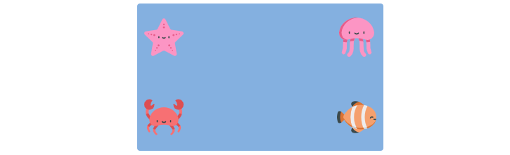
max-width: 25em;
min-height: 15em;
background: url(clown-fish.svg) no-repeat bottom 20px right 10px,
            url(crab.svg) no-repeat bottom 20px left 10px,
            url(jellyfish.svg) no-repeat top 20px right 10px,
            url(starfish.svg) no-repeat top 20px left 10px;
background-size: 4em 4em;
background-color: #7eb4e2;
Method #2
The same effect can be achieved by using padding and background-origin:
padding: 20px 10px;
background-image: url(clown-fish.svg),
                  url(crab.svg),
                  url(jellyfish.svg),
                  url(starfish.svg);
background-position: bottom right,
                     bottom left,
                     top right,
                     top left;
background-size: 4em 4em;
background-repeat: no-repeat;
background-origin: content-box;
background-color: #7eb4e2;
Method #3
Also, you can use the calc() function to calculate the distance from the element’s edges.
background-image: url(clown-fish.svg),
                  url(crab.svg),
                  url(jellyfish.svg),
                  url(starfish.svg);
background-position: top calc(100% - 20px) left calc(100% - 10px),
                     top calc(100% - 20px) right calc(100% - 10px),
                     bottom calc(100% - 20px) left calc(100% - 10px),
                     bottom calc(100% - 20px) right calc(100% - 10px);
background-size: 4em 4em;
background-repeat: no-repeat;
background-color: #7eb4e2;
Fluid Background
You can create a flexible background that always stays in the center of the page, on all devices, no matter how wide or narrow the viewport is.
To center the background image, use background-position: center;. To make sure the image is fully visible, use background-size: contain;. Set the height of the container at 100vh — it means that the height will be equal to that of the viewport. Images in .svg format are best fit for this purpose.
.div {
  background-color: #7eb4e2;
  background-image: url(starfish.svg);
  background-repeat: no-repeat;
  background-position: center;
  background-size: contain;
  height: 100vh;
}
This way, your background image is constantly centered in full height and width of the browser window.
To add some responsive text to your responsive background, apply position: relative; to the container and position: absolute; to the text. The margin-left: auto; margin-right: auto; and text-align: center; will help center the text. You can also add media queries to make the text smaller on mobile devices.
<div class="div">
    <p>Look, I'm a star!</p>
</div>
.div {
  ...
  position: relative;
}

.div p {
  position: absolute;
  top: 50%;
  left: 0;
  right: 0;
  margin-left: auto;
  margin-right: auto;
  text-align: center;
}
This way, your text will always be in the center of your responsive background.
Parallax Scrolling
Parallax scrolling is an effect of the background image moving at a different speed than the text content of the page while scrolling.
Create a container element (e. g. .parallax) and add a background image with a specific height (px, %, vh, etc.) to the container. Then apply background-attachment: fixed; to create the actual parallax effect. The other background properties are used to center and scale the image.
<div class="parallax"></div>
<div class="text">Some text</div>
.parallax {
  height: 450px;
  background-image: url('shark.jpg');
  background-position: center;
  background-size: cover;
  background-repeat: no-repeat;
  background-attachment: fixed;
}
Parallax scrolling doesn’t always work on mobile devices which may have a problem with background-attachment: fixed. You can use media queries to turn off the effect on mobile devices:
@media only screen and (max-device-width: 1366px) {
  .parallax {
    background-attachment: scroll;
  }
}
Patterns
The background property lets you create different patterns, such as striped, checkered and polka dot backgrounds.
Striped Background
CSS stripes are created with the help of the linear-gradient() function. Generally, it creates an image consisting of a progressive transition between two or more colors along a straight line. However, when applied together with the background properties it allows creating non-gradient stripes.
1. Horizontal stripes of equal height. To create horizontal stripes, use a gradient background with two colors and set the limits of color spreading with the help of percentage values (50%). To create several stripes, add background-size where 20px is the height of two stripes (each stripe will have the 10px height):
background: linear-gradient(#7eb4e2 50%, #f69ec4 50%);
background-size: 100% 20px;

2. Horizontal stripes of different height. Set 30% for blue and 0 for pink. 30% will be allocated for blue (30% * 20px = 6px) and the rest of the background-size property value (20px - 6 px = 14px) for pink.
background: linear-gradient(#7eb4e2 30%, #f69ec4 0);
background-size: 100% 20px;

3. Three horizontal stripes. Set 33.3% for blue and leave the rest for pink. Then, set 66.6% for pink and leave the rest for yellow. The result will be three colors, each with the height 33.3% of the background-size (40px).
background: linear-gradient(#7eb4e2 33.3%, #f69ec4 0, #f69ec4 66.6%, #f9dd94 0);
background-size: 100% 40px;

4. Vertical stripes of equal width. Vertical stripes are created almost in the same way as horizontal ones. Only there should be a keyword (to right or 90deg (90°)) inside the linear-gradient() function. You should also change the order of percentage and pixel values of the background-size property.
background: linear-gradient(to right, #7eb4e2 50%, #f69ec4 0);
background-size: 20px 100%;

5. Vertical stripes of random width. You can create vertical stripes of four different colors and seemingly random width with the help of the linear-gradient() function and different background sizes.
background: #d5d5d5;
background-image: linear-gradient(90deg, #7eb4e2 10px, transparent 0),
                  linear-gradient(90deg, #f69ec4 22px, transparent 0),
                  linear-gradient(90deg, #f9dd94 40px, transparent 0);
background-size: 40px 100%, 60px 100%, 82px 100%;

6. Diagonal stripes (45°). To create diagonal stripes, use the repeating-linear-gradient() function. If you want your stripes to have the width of 15px, set the background size at 42px × 42px.
background: repeating-linear-gradient(45deg, #7eb4e2, #7eb4e2 15px, #f69ec4 0, #f69ec4 30px);
background-size: 42px 42px;

Why 42px? The background is made of squares, and any square consists of two isosceles triangles (triangles with two equal sides). According to the Pythagorean theorem, the square of the hypotenuse (the side opposite the right angle) is equal to the sum of the squares of the other two sides (a² + b² = c²). If your stripes have the width of 15px, then √2 * 15*2 = 42.
7. Diagonal stripes (60°). To create 60° diagonal stripes, specify 60deg inside the repeating-linear-gradient() function.
background: repeating-linear-gradient(60deg, #7eb4e2, #7eb4e2 15px, #f69ec4 0, #f69ec4 30px);

8. Gradient diagonal stripes. To create gradient diagonal 45° stripes:
background: repeating-linear-gradient(45deg, #7eb4e2, #f69ec4 30px);

9. Diagonal stripes of dark and light shades of the same color. To make them, use the hsla() function where the fourth value is opacity.
background: #7eb4e2;
background-image: repeating-linear-gradient(30deg,
                  hsla(0,0%,100%,.1),
                  hsla(0,0%,100%,.1) 15px,
                  transparent 0, transparent 30px);

Checkered Background
If you combine the horizontal and vertical stripes, you’ll get a checkered background.
1. ‘Tablecloth’. Put gradients separated by a comma inside the background-image property and you’ll create a background-size of repeating squares. background-size: 26px 26px; is the size of four individual repeating squares (13px 13px each).
background: #7eb4e2;
background-image: linear-gradient(90deg, rgba(50, 85, 127, .5) 50%, transparent 0),
                  linear-gradient(rgba(50, 85, 127, .5) 50%, transparent 0);
background-size: 26px 26px;

2. ‘Grid’. To create 29px × 29px repeating squares with the 1px border, use the CSS rules below. You can choose any other values instead of 29px and 1 px.
background: #32557f;
background-image: linear-gradient(#7eb4e2 1px, transparent 0),
                  linear-gradient(90deg, #7eb4e2 1px, transparent 0);
background-size: 29px 29px;

3. ‘Blueprint’. To create a background resembling a photographic print that is used for copying maps, mechanical drawings, and architects' plans, use the code below:
background: #7eb4e2;
background-image: linear-gradient(white 2px, transparent 0),
                  linear-gradient(90deg, white 2px, transparent 0),
                  linear-gradient(hsla(0,0%,100%,.3) 1px, transparent 0),
                  linear-gradient(90deg, hsla(0,0%,100%,.3) 1px, transparent 0);
background-size: 70px 70px, 70px 70px, 10px 10px, 10px 10px;

4. ‘Chequerboard’. To create a checkerboard background, combine linear gradients with transparent backgrounds. The size of individual squares should be specified in the background-position property that should be twice smaller than background-size.
background: #eee;
background-image: linear-gradient(45deg, rgba(0,0,0,.25) 25%,
                  transparent 0, transparent 75%, rgba(0,0,0,.25) 0),
                  linear-gradient(45deg, rgba(0,0,0,.25) 25%,
                  transparent 0, transparent 75%, rgba(0,0,0,.25) 0);
background-position: 0 0, 25px 25px;
background-size: 50px 50px;

5. Squares surrounded by empty space. The size of individual squares should be specified in the background-position property that should be twice smaller than background-size.
background: #7eb4e2;
background-image: linear-gradient(45deg, #32557f 25%, transparent 0),
                  linear-gradient(45deg, transparent 75%, #32557f 0);
background-position: 0 0, 16px 16px;
background-size: 32px 32px;

Polka Dot
The size of individual circles should be specified in the background-position property that should be twice smaller than background-size.
background: #7eb4e2;
background-image: radial-gradient(#32557f 30%, transparent 0),
                  radial-gradient(#32557f 30%, transparent 0);
background-position: 0 0, 15px 15px;
background-size: 30px 30px;

Check Lea Verou Patterns Gallery and 51 CSS Background Patterns for more CSS patterns.
You can also use Zig-zag Gradient Lab to create zig-zag CSS patterns.
Blending Content and Colors
You can blend the content (images or text) and colors or color effects with the help of the background-blend-mode, mix-blend-mode, and filter properties.
Background-blend-mode
You can mix a background image with a color with the help of the background-blend-mode property. You need to apply this property to an element with a background color and image. There are 16 blend mode values:
- color: keeps hue and saturation of background-image and the luminosity of the background-color
- color-burn: the background-color is inverted, divided by the background-image and inverted again
- color-dodge: the background-color is divided by the inverse of the background-image
- darken: if the background-image is darker than the background-color then the image is replaced, otherwise, it is left as it was
- difference: the result by subtracting the darker color of the background-image and the background-color from the lightest one
- exclusion: the result is similar to difference yet with a lower contrast
- hard-light: if the background-image is lighter than the background-color, the result is multiply; if it is lighter, the result is screen
- hue: the result is the hue of the background-image combined with the luminosity and saturation of the background-color
- lighten: if the background-image is lighter than the background-color, the image is replaced; otherwise, it is left as it was
- luminosity: luminosity of the top color is preserved whilst using the saturation and hue of the background-color
- multiply: the background-image and background-color are multiplied; typically this creates a darker image than before
- normal: sets the blending mode to normal (default)
- overlay : the background-color is mixed with the background-image to reflect the lightness or darkness of the backdrop
- saturation: keeps the saturation of the background-image whilst mixing the hue and luminosity of the background-color
- screen: both image and color is inverted, multiplied and then inverted again
- soft-light: the final result is similar to hard-light but softer in that it looks like a diffused spotlight has been placed on the image
Here is an example:
width: 500px;
height: 500px;
background: url(shark.jpg') no-repeat;
background-size: cover;
background-color: #f69ec4;
background-blend-mode: luminosity;
The background-color property sets the tint and background-blend-mode sets the effect. You should always specify the width and height of the element.
You can remove the tint on hover to create an animated effect:
div:hover {
  background-color: transparent;
  transition: .5s background-color;
}
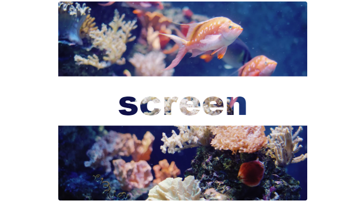
Mix-blend-mode
The mix-blend-mode property defines how an element’s content should blend with the content or background of its direct parent. This means that any images or text, borders or headings will be influenced by this property. This works especially well on overlapped lettering.
This property has the same values as background-blend-mode property plus unset which removes the current blend mode from an element.
The mix-blend-mode property does not work in Internet Explorer or Edge.
Here’s an example of the mix-blend-mode: screen; property:
<div><span>screen</span></div>
div {
  width: 500px;
  height: 400px;
  background: url('fishes.jpg') no-repeat;
  background-size: cover;
  position: relative;
}

span {
  width: 100%;
  position: absolute;
  top: 50%; left: 50%;
  transform: translate(-50%, -50%);
  background-color: #fff;
  color: #000;
  mix-blend-mode: screen;
}
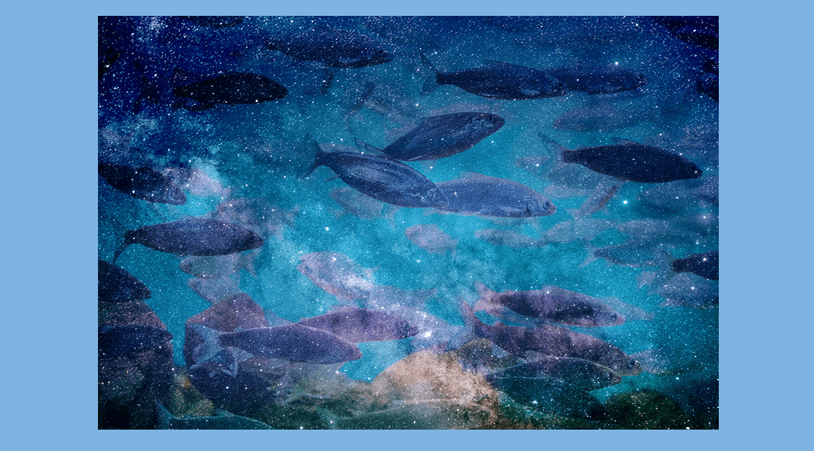
You can also place one image over another and apply mix-blend-mode to the image on top.
Let’s take these two images:
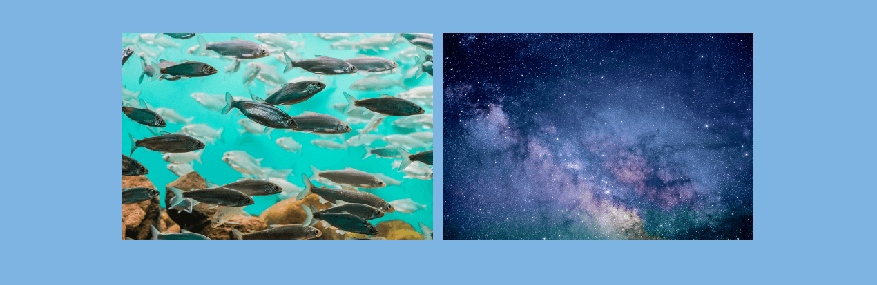
<img src="img/fishes.jpg" />
<img src="img/space.jpg" />
And now let’s add the following CSS rules:
img {
  width: 900px;
  height: 600px;
}

img:first-child {
  position: absolute;
  mix-blend-mode: soft-light;
}
The result would be the following:
Filter
The filter property applies visual effects (like blur, brightness, grayscale, saturation, and others) to an image.
- blur(px): applies a blur effect to the image (a larger value will create more blur)
- brightness(%): adjusts the brightness of the image (0% will make the image completely black; 100% (1) is the default and represents the original image; values over 100% will make the image brighter)
- contrast(%): adjusts the contrast of the image (0% will make the image completely black; 100% (1) is the default and represents the original image; values over 100% will make the image with more contrast)
- drop-shadow: applies a drop shadow effect (e. g. drop-shadow(6px 6px 8px blue); will create a shadow with the 6px horizontal shadow, 6px vertical shadow, 8px blur of the blue color)
- grayscale(%): converts the image to grayscale (0% is the default and represents the original image; 100% will make the image black and white)
- hue-rotate(deg): defines the number of degrees around the color circle the image samples will be adjusted (0deg is the default, and the maximum value is 360deg)
- invert(%): inverts the samples in the image (0% is the default and represents the original image; 100% will make the image completely inverted)
- none: specifies no effects (default)
- opacity(%): sets the transparency level (0% is completely transparent; 100% (1) is default (no transparency))
- saturate(%): saturates the image (0% will make the image completely un-saturated; 100% is the default and represents the original image)
- sepia(%): converts the image to sepia (0% is the default and represents the original image; 100% will make the image completely sepia)
- url(): takes the location of an XML file that specifies an SVG filter, and may include an anchor to a specific filter element (e. g. filter: url(#filter-blur); referencing to the element defined in HTML code in <svg> element)
You can apply several filters at once. For example: filter: brightness(150%) drop-shadow(6px 6px 8px blue) hue-rotate(45deg) saturate(150%);.
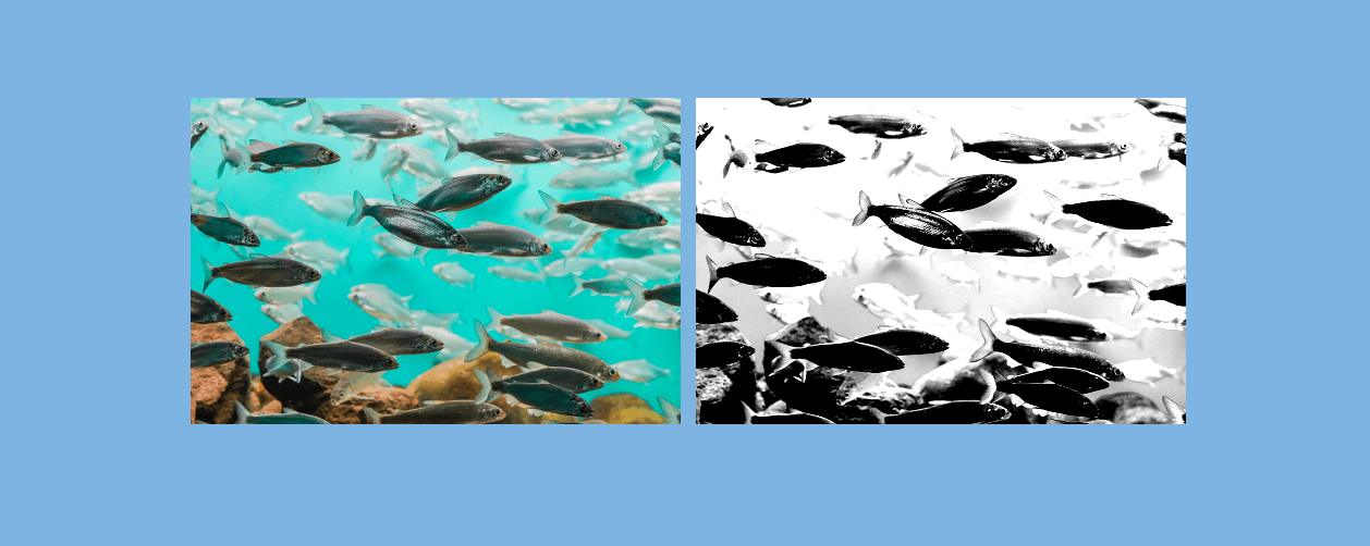
To create a black-and-white image, use the filter property to convert the image to a grayscale and (optionally) also set a contrast value. For example:
img {
  width: 450px;
  height: 300px;
}

img:nth-of-type(2) {
  filter: grayscale(1) contrast(3);
}
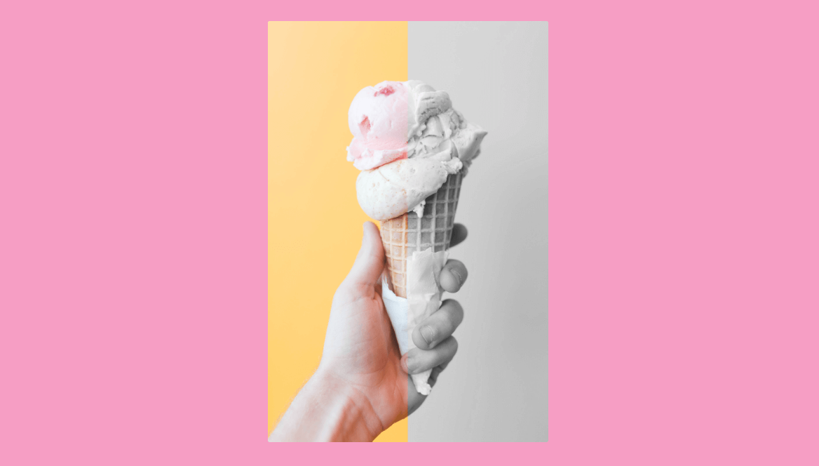
With the filter property, you can also apply different effects to two sides of an image thus creating a before/after effect. For this, you’ll need to use two identical images.
<div class="img-container">
  <img src="img/icecream.jpg" class="before" />
  <img src="img/icecream.jpg" class="after" />
</div>
img {
  max-width: 100%;
}

.img-container {
  display: flex;
  width: 70vw;
  margin: 0 auto;
}

.before {
  clip-path: polygon(50% 0, 50% 100%, 0 100%, 0 0);
  z-index: 1;
}

.after {
  margin-left: -100%;
  filter: grayscale(1) contrast(1);
}
(You can read about the clip-path property in the section “Clipped Images” of this article below).
Here’s the result:
It’s also possible to invert colors on a web page with just one CSS property — filter:invert(100%). You can set a lower value to make colors less saturated. Here’s an example:
body {
  background: $color-yellow;
  color: $color-grey;
}

button {
  outline: none;
  border: none;
  padding: 20px 30px;
}
When we apply the filter property to the :root element, we can see the following result:
:root {
  filter:invert(90%);
}
Tinted Glass Effect
The tinted glass effect allows creating beautiful blocks of quotes resembling opaque glass. It can only be applied to images with the background-attachment: fixed; property — they cannot be scrolled with the page.
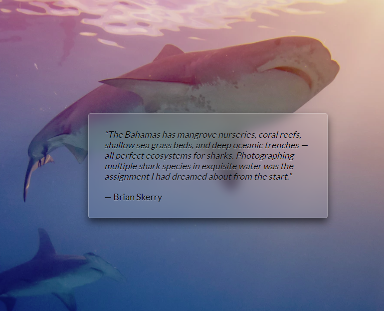
<main>
    <blockquote>“The Bahamas has mangrove nurseries, coral reefs, shallow sea grass beds, and deep oceanic trenches — all perfect ecosystems for sharks. Photographing multiple shark species in exquisite water was the assignment I had dreamed about
        from the start.”
        <cite>— Brian Skerry</cite>
    </blockquote>
</main>
body {
  min-height: 100vh;
  box-sizing: border-box;
  margin: 0;
  padding-top: calc(50vh - 6em);
}

body, main::before {
  background: url('shark.gpg') 0 / cover fixed;
}

main {
  position: relative;
  margin: 0 auto;
  padding: 2em;
  max-width: 30em;
  background: hsla(0,0%,100%,.1) border-box;
  overflow: hidden;
  border-radius: .3em;
  box-shadow: 0 0 0 1px hsla(0,0%,100%,.3) inset,
	         0 .5em 1em rgba(0, 0, 0, 0.6);
  text-shadow: 0 1px 1px hsla(0,0%,100%,.3);
}

main::before {
  content: '';
  position: absolute;
  top: 0; right: 0; bottom: 0; left: 0;
  margin: -20px;
  z-index: -1;
  filter: blur(10px);
}
Animated Backgrounds
You can create a background animation that is running smoothly on hover or a background image that scales and rotates on hover.
Smooth Animation of Panoramic Background
If you have a panoramic image and want to add some animation, animate the background-position with the help of keyframes. The animation will be running when the background has the focus or hover states.
.panoramic {
  width: 300px;
  height: 300px;
  background: url('shark.jpeg');
  background-size: auto 100%;
  border-radius: 50%;
  animation: panoramic 10s linear infinite alternate;
  animation-play-state: paused;
}

.panoramic:focus,
.panoramic:hover {
  animation-play-state: running;
}

@keyframes panoramic {
    to { background-position: 100% 0; }
}
Background Image Scale and Rotate
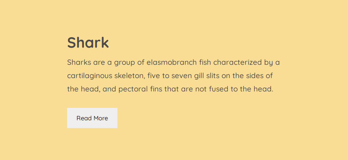
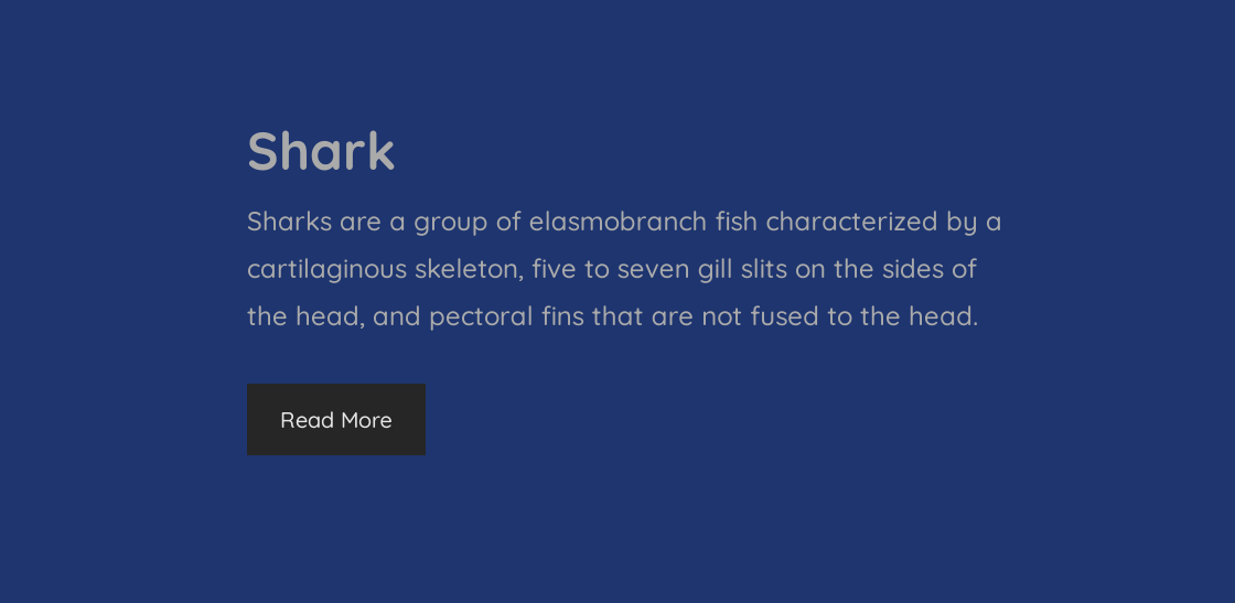
To make a CSS background image scale and rotate on hover, you’ll need at least two divs, one for the container (.item), and others for content (image, heading, description, etc.). This kind of elements is great to create section previews or navigation previews with links to other web pages. That’s why you may want to wrap the content with the <a> element.
<div class="item">
    <a href="#">
        <div class="img"></div>
        <p class="title">Shark</p>
        <p class="description">The shark sharks the sharking shark sharkingly sharkable. Shark your own shark by sharking the shark today.</p>
    </a>
</div>
There has to be a set value for either height or width, and the image should be somewhat larger. The overflow value hides anything outside the bounds of the outer div.
When the container is on hover, the background gets a transform value that zooms in 30% and rotates 3 degrees right.
Clipped Images
Images can be displayed in the form of diamonds, hearts, ellipses, and other shapes.
To “clip” the image and make it diamond- or heart-shaped, you need to use the clip-path CSS property. It creates a region called a clipping that tells what part of an element is shown on screen. It can accept the following values:
- Shape values: inset, circle, polygon, ellipse, path
- Source value: for example, clip-path: url(#myPath); referencing an SVG <clipPath> element
- Geometry-box values: margin-box, border-box, padding-box, content-box, fill-box, stroke-box, view-box (they define the reference box for the basic shape)
- Combined values: for example, clip-path: padding-box circle(25px at 0 50px);
- Global values: inherit, initial, unset
The clip-path element applies to an <img> HTML element, for example:
<img src="img/fishes.jpg" alt="Fishes">
Here are several examples of clipped images.
Diamond images
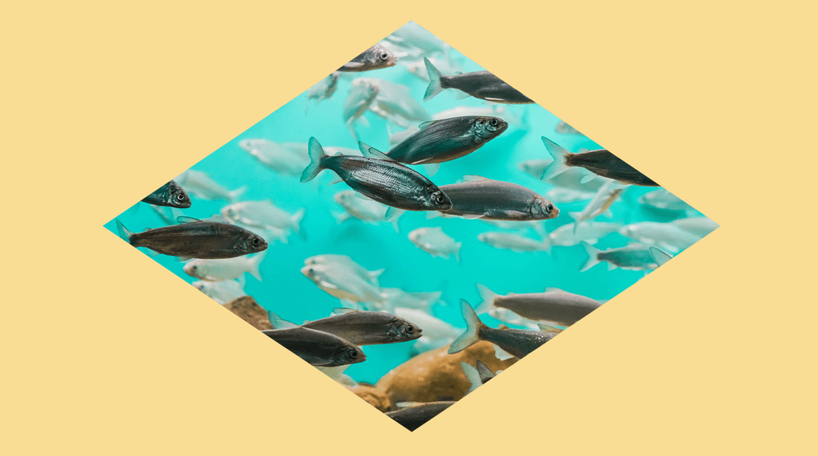
img {
  clip-path: polygon(50% 0, 100% 50%, 50% 100%, 0 50%);
}
Here the coordinates are given in a clockwise manner. First, move 50% along the x-axis — this will align at the center. While the top x-axis is at 100%, move 50% on the right y-axis — this will take us to the middle of the right y-axis. Then move to 50% of the bottom x-axis — this will be the center of the bottom x-axis. Finally, move back to the center of the left y-axis at 50%.
Heart-shaped images
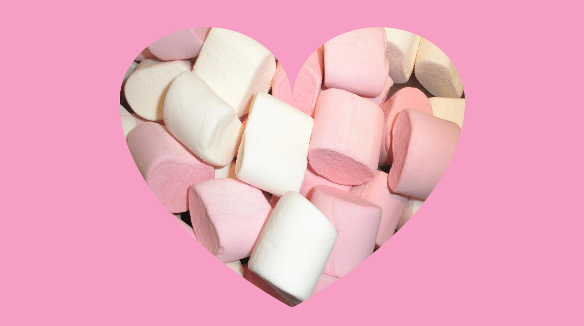
Here we use SVG:
<svg>
<clipPath id="myPath" clipPathUnits="objectBoundingBox">
  <path d="M0.5,1
    C 0.5,1,0,0.7,0,0.3
    A 0.25,0.25,1,1,1,0.5,0.3
    A 0.25,0.25,1,1,1,1,0.3
    C 1,0.7,0.5,1,0.5,1 Z" />
  </clipPath>
</svg>
<img src="img/marshmallow.jpg" alt="Marshmallow">
img {
  width: 700px;
  height: 600px;
  clip-path: url(#myPath);
}
Star-shaped images
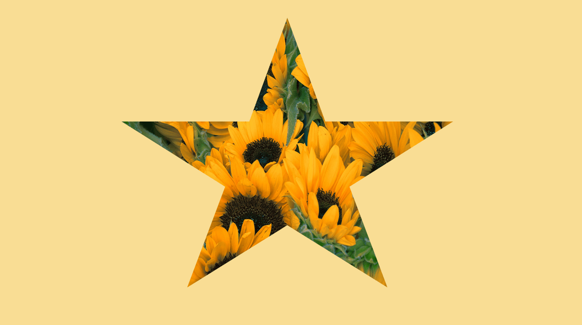
img {
  clip-path: polygon(50% 0%, 61% 35%, 98% 35%, 68% 57%, 79% 91%, 50% 70%, 21% 91%, 32% 57%, 2% 35%, 39% 35%);
}
You can use an online instrument — Clippy CSS clip-path maker — to design CSS images of various shapes.
Images with clipped corners
img {
  max-width: 100%;
  clip-path: polygon(20px 0,
                      calc(100% - 20px) 0,
                      100% 20px,
                      100% calc(100% - 20px),
                      calc(100% - 20px) 100%,
                      20px 100%,
                      0 calc(100% - 20px),
                      0 20px);
}
In this example, the calc() function is used to calculate the parts that will be clipped along the top x-axis and the bottom x-axis. Since the axis is equal to 100% and we start clipping on the x-axis at 20 px, the clip-path property is used to deduct 20 px on each side of the top x-axis and bottom x-axis.
Images with rounded corners
The border-radius property will allow you to create images with rounded corners. You can read more about this property in our article CSS Shapes.
Here’s an example:
img {
  border-radius: 120px 160px 90px 220px;
}
The article has been inspired by CSS Secrets by Lea Verou and by many other sources, including CSS Tricks, CodePen, Tympanus, Dev.to, and more.