→ See the interactive chart in a new window
D3 (or D3.js) is a JavaScript library for visualizing data using Scalable Vector Graphics (SVG) and HTML. D3 stands for “data-driven documents”, which are interactive dashboards and all sorts of dynamically driven web applications.
This is not just a library for building chart layouts. It’s useful when you need to work with the Document Object Model (DOM), dynamically update data, use animation techniques, and operate with different states of data entities.
Getting Started
First, we need to install D3, create files, and prepare data.
D3 installation
First of all, you need to install D3. Download the latest version d3.zip on GitHub. Then install D3 via npm:
npm install d3
Creating files
As this tutorial will be using Vanilla JavaScript, we’ll be getting along without any JS frameworks such as React, Vue.js, or Angular.
We’ll work with three files:
- index.html — will contain the root HTML element to which we’ll append our SVG element with the help of D3
- chart.js — will contain the D3/JS code
- chart.css — will contain CSS rules
Now let’s prepare our HTML file:
<!DOCTYPE html>
<html>
  <head>
    <meta http-equiv="Content-Type" content="text/html;charset=utf-8" />
    <title>Line chart from CSV using d3.js</title>
    <script type="text/javascript" src="https://d3js.org/d3.v6.min.js"></script>
    <link rel="stylesheet" href="chart.css" />
  </head>
  <body>
    <div id="root"></div>
    <script src="chart.js" type="text/javascript"></script>
  </body>
</html>
The <head> element should contain the links to the D3 library and the CSS file. Note that we’re using D3.js v.6. We also put the link to our JS file before the </body> tag.
The #root element will contain the SVG element with the chart. As we want our chart to be dynamically updated to show data for various years, we also want to create radio buttons. They will be used to trigger the data updates on our chart.
<div id="root">
  <div id="options">
    <label>
      <input name="radio" type="radio" />
        2018
    </label>
    <label>
        <input name="radio" type="radio" />
        2019
    </label>
    <label>
        <input name="radio" type="radio" checked />
        2020
    </label>
  </div>
</div>
You can read more about radio buttons and other form elements in my article HTML Forms.
Data preparation
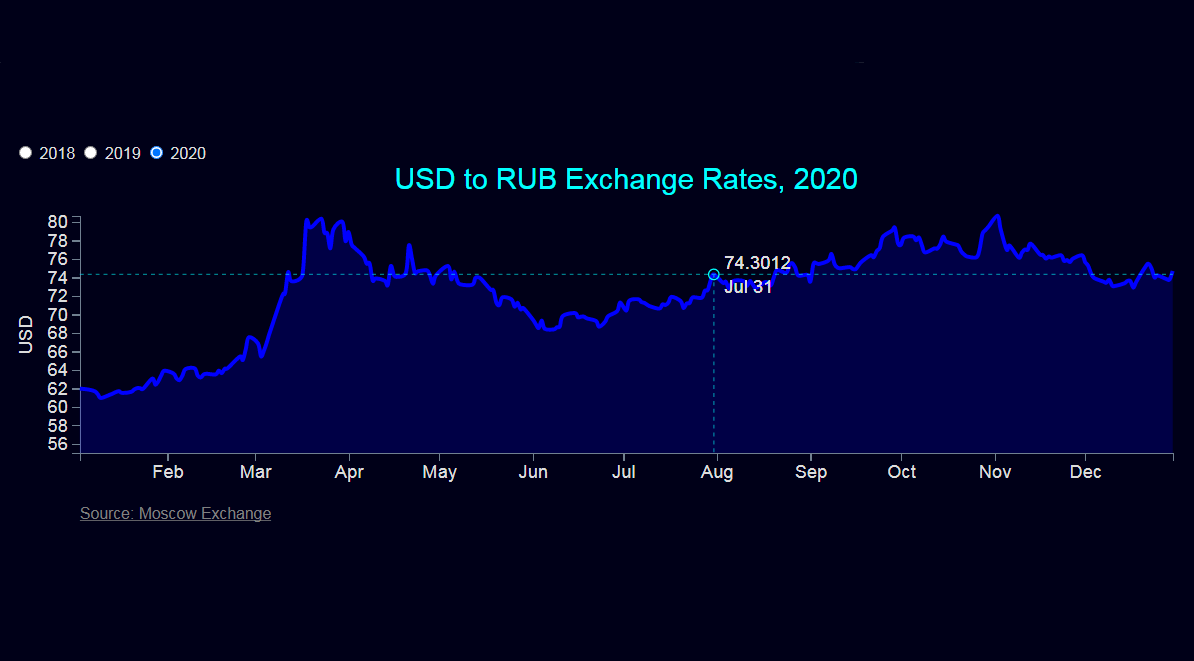
We’ll use three datasets to create our chart: usd-2018.csv, usd-2019.csv, and usd-2020.csv. They would help us show USD to RUB exchange rates for 2018, 2019, and 2020, respectively.
Note that if you try to access your file using the local file system, you’ll be running into a cross-origin resource sharing (CORS) error. So you must make sure that the file with data is served by your server, and the path to your file should not be just a filesystem path. If you’re not using React or similar tools, you need to upload your files to GitHub to another hosting website and get links to raw CSV files.
For example, the links to the files uploaded to GitHub will look like this:
https://raw.githubusercontent.com/jukuznets/datasets/main/usd-2018.csv
https://raw.githubusercontent.com/jukuznets/datasets/main/usd-2019.csv
https://raw.githubusercontent.com/jukuznets/datasets/main/usd-2020.csv
Inside, each CSV file has the following structure:
date,price
12/30/2020,74.6769
12/29/2020,73.7651
12/28/2020,73.7895
12/25/2020,74.1945
…
In our D3 code, we’ll refer to values as d.date or d.price.
Creating Chart
Next, create the chart.js file. It will have the following structure:
// set the basic chart parameters
const margin, width, height, x, y, area, valueline…;

// create an SVG element
const svg = …;

// create a function that adds data to the SVG element
function appendData(year) {
    …
    // create a function for the mousemove event
    function mouseMove(event) {
    }
}

// call the main function
appendData(2020);
By default, D3 will use the data from the usd-2020.csv file — for this, we use 2020 as the appendData function’s argument. When we’ll click on radio buttons, the data will change to 2018, 2019, or back to 2020. For this, we need to call the appendData function from radio buttons in our HTML file:
<div id="root">
  <div id="options">
    <label>
      <input name="radio" type="radio" onclick="appendData(2018)" />
        2018
    </label>
    <label>
        <input name="radio" type="radio" onclick="appendData(2019)" />
        2019
    </label>
    <label>
        <input name="radio" type="radio" checked onclick="appendData(2020)" />
        2020
    </label>
  </div>
</div>
Now we get back to the chart.js file.
Set the basic chart parameters
1. Set the dimensions and margins of the graph:
const margin = { top: 40, right: 80, bottom: 60, left: 50 },
    width = 960 - margin.left - margin.right,
    height = 280 - margin.top - margin.bottom;
960 and 280 are not the chart’s size in pixels but its aspect ratio. Although our chart will be responsive, its aspect ratio will stay the same. Margins will be used to create space for labels and titles.
2. Parse and format the dates. Our datasets have dates in m/d/y format (e.g. 01/02/2020), so we need to parse dates as "%m/%d/%Y". Dates that will be shown in tooltip boxes, meanwhile, we’ll be formatted as Aug 01, so we need to format them with "%b %d". We’ll also format month names on the x-axis: e.g. August will be represented as Aug. For this, we format months with "%b". You can read about the D3 time format on GitHub.
const parseDate = d3.timeParse("%m/%d/%Y"),
    formatDate = d3.timeFormat("%b %d"),
    formatMonth = d3.timeFormat("%b");
3. Set the ranges. The d3.scaleTime() function is used to create and return a new time scale on the x-axis. And the d3.scaleLinear() function is used to create scale points on the y-axis. These scales will help us find the positions/coordinates on the graph for each data item.
const x = d3.scaleTime().range([0, width]);
const y = d3.scaleLinear().range([height, 0]);
4. Define the chart’s area and line. area() and line() are D3 helper functions. The area function transforms each data point into information that describes the shape, and the line function draws a line according to data values. curveCardinal is the type of line/area curve (check D3 curve explorer for more).
const area = d3
    .area()
    .x((d) => { return x(d.date); })
    .y0(height)
    .y1((d) => { return y(d.price); })
    .curve(d3.curveCardinal);

const valueline = d3
    .line()
    .x((d) => { return x(d.date); })
    .y((d) => { return y(d.price); })
    .curve(d3.curveCardinal);
As you can see, D3 uses method chaining to apply functions, styles, attributes, and properties to elements.
5. Append the SVG object to the #root element of the HTML page: select the <div> element with the ID “root”, append SVG, and add attributes.
const svg = d3
    .select("#root")
    .append("svg")
    .attr(
    "viewBox",
    `0 0 ${width + margin.left + margin.right} ${
    height + margin.top + margin.bottom}`)
    .append("g")
    .attr("transform", "translate(" + margin.left + "," + margin.top + ")");
SVG is a canvas on which everything is drawn. The top-left corner is 0,0, and the canvas clips anything drawn beyond its defined height and width of 280, 960.
The <svg> element can be dynamically resized using the viewBox attribute — this makes our chart responsive as it can stretch or shrink with the browser window. The value of the viewBox attribute is a list of four numbers: min-x, min-y, width, and height.
Alternatively, you can set the exact width/height attributes by adding these attributes:
.attr("width", width + margin.left + margin.right)
.attr("height", height + margin.top + margin.bottom)
We also append the <g> element (“group”) to SVG and add the transform attribute to <g> to move the “group” element to the top left margin.
<g> is a logical grouping of graphical elements that are made up of several shapes and text. To move <g> around the canvas, you need to adjust the transform attribute of this element. For example, if you want to move <g> 100 pixels to the right and 40 pixels down, you need to set its transform attribute to transform="translate(100,40)".
6. Add the x- and y-axes. The d3.axisBottom() function in D3.js is used to create a bottom horizontal axis (X), and the d3.axisLeft() function in D3.js creates a left vertical axis (Y).
svg
    .append("g")
    .attr("class", "x axis")
    .attr("transform", "translate(0," + height + ")")
    .call(d3.axisBottom(x).tickFormat(formatMonth)); // format January as Jan etc.

svg.append("g").attr("class", "y axis").call(d3.axisLeft(y));
7. Create a text label for the y-axis. The <text> element is used to create text labels inside SVG elements. "rotate(-90)" would turn the text 90 degrees. The dy attribute indicates a shift along the y-axis on the position of an element.
svg
    .append("text")
    .attr("transform", "rotate(-90)")
    .attr("y", 0 - margin.left)
    .attr("x", 0 - height / 2)
    .attr("dy", "1em")
    .style("text-anchor", "middle")
    .text("USD");
8. Add a subtitle with a link to the data source.
svg
    .append("a")
    .attr("xlink:href", (d) => {
        return "https://www.moex.com/ru/index/rtsusdcur.aspx?tid=2552";
    })
    .attr("class", "subtitle")
    .attr("target", "_blank")
    .append("text")
    .attr("x", 0)
    .attr("y", height + 50)
    .text("Source: Moscow Exchange");
Append data
To append data to our chart, we’ll create the appendData() function.
function appendData(year) {
)
year is the argument that corresponds to 2018, 2019, or 2020. This argument will allow us to dynamically change the data. That’s why we define the file name as follows:
filename = "https://raw.githubusercontent.com/jukuznets/datasets/main/usd-" + year + ".csv";
1. Get the data. Inside the appendData() function, we create another function that reads the CSV file and uses the then() method that returns a Promise.
function appendData(year) {
    d3.csv(filename).then((data) => {
    });
)
D3 uses data in XML, CSV, or JSON formats. To read CSV files, it uses the following functions: d3.csv() for comma-delimited files, d3.tsv() for tab-delimited files, and d3.dsv() that allows you to declare the delimiter.
The rest of the code goes inside d3.csv(filename).then((data) => {}.
First of all, it’s very important to reverse the lines in our dataset. Otherwise, this code may not work properly. (Although, some datasets don't require reversing).
data = data.reverse();
Next, we need to format the data. We use the forEach() function to iterate through the lines to get values. parseDate() is the function we defined earlier. Number() makes sure all the values are numbers.
data.forEach((d) => {
    d.date = parseDate(d.date);
    d.price = Number(d.price);
});
If your numbers are accompanied with the $ symbol, you can format them the following way: d.price = Number(d.price.trim().slice(1));.
2. Scale the range and set the X and Y axes. We set y.domain at 55 as we want our y-axis to start from 55. Alternatively, you can set it at 0. transition() and duration() are responsible for animation.
x.domain(
    d3.extent(data, (d) => { return d.date; })
);
y.domain([
    55,
    d3.max(data, (d) => { return d.price; }),
]);

svg
    .select(".x.axis") // set the x-axis
    .transition()
    .duration(750)
    .call(d3.axisBottom(x).tickFormat(d3.timeFormat("%b")));
svg
    .select(".y.axis") // set the y-axis
    .transition()
    .duration(750)
    .call(d3.axisLeft(y));
3. Add the area path. <path> elements are SVG drawing instructions for complex shapes. A <path> element is determined by its d attribute. We add transition, duration, and the transform element to create an animated effect.
const areaPath = svg
    .append("path")
    .data([data])
    .attr("class", "area")
    .attr("d", area)
    .attr("transform", "translate(0,300)")
    .transition()
    .duration(1000)
    .attr("transform", "translate(0,0)");
4. Add the valueline path. Similarly to the area path, we add the valueline path. The getTotalLength() method returns the computed value for the total length of the path.
const linePath = svg
    .append("path")
    .data([data])
    .attr("class", "line")
    .attr("d", valueline)

const pathLength = linePath.node().getTotalLength();

linePath
    .attr("stroke-dasharray", pathLength)
    .attr("stroke-dashoffset", pathLength)
    .attr("stroke-width", 3)
    .transition()
    .duration(1000)
    .attr("stroke-width", 0)
    .attr("stroke-dashoffset", 0);
5. Add a title.
svg
    .append("text")
    .attr("class", "title")
    .attr("x", width / 2)
    .attr("y", 0 - margin.top / 2)
    .attr("text-anchor", "middle")
    .text("USD to RUB Exchange Rates, " + year);
6. Create the focus/tooltip element. Here we’re creating a circle marker for the point we’re hovering over and a tooltip box (an info tip or a hovering tip). For this, we create the focus element with the X and Y lines, and a circle at the intersection of the lines. Then we add the value (price) and the date at the intersection.
const focus = svg
    .append("g")
    .attr("class", "focus")
    .style("display", "none");

// append the x line
focus
    .append("line")
    .attr("class", "x")
    .style("stroke-dasharray", "3,3")
    .style("opacity", 0.5)
    .attr("y1", 0)
    .attr("y2", height);

// append the y line
focus
    .append("line")
    .attr("class", "y")
    .style("stroke-dasharray", "3,3")
    .style("opacity", 0.5)
    .attr("x1", width)
    .attr("x2", width);

// append the circle at the intersection
focus
    .append("circle")
    .attr("class", "y")
    .style("fill", "none")
    .attr("r", 4); // radius

// place the value at the intersection
focus.append("text").attr("class", "y1").attr("dx", 8).attr("dy", "-.3em");
focus.append("text").attr("class", "y2").attr("dx", 8).attr("dy", "-.3em");

// place the date at the intersection
focus.append("text").attr("class", "y3").attr("dx", 8).attr("dy", "1em");
focus.append("text").attr("class", "y4").attr("dx", 8).attr("dy", "1em");
7. Create the mouseMove function. When we move the mouse over the chart, the mouseMove() function will be responsible for finding out the position of the cursor, figuring out the nearest plot point, and translating the tooltip as well as the circle marker to the nearest point.
We need to recover the closest X coordinate in the dataset. We can do this thanks to the d3.bisector() function. Once we have this position, we need to use it to update the circle and text position on the chart. x.invert takes a number from the scale’s range (i.e., the width of the chart) and maps it to the scale’s domain (i.e., a number between the values on the x-axis). bisect helps us in finding the nearest point to the left of this invert point.
function mouseMove(event) {
    const bisect = d3.bisector((d) => d.date).left,
    x0 = x.invert(d3.pointer(event, this)[0]),
    i = bisect(data, x0, 1),
    d0 = data[i - 1],
    d1 = data[i],
    d = x0 - d0.date > d1.date - x0 ? d1 : d0;

    focus
        .select("circle.y")
        .attr("transform", "translate(" + x(d.date) + "," + y(d.price) + ")");

    focus
        .select("text.y1")
        .attr("transform", "translate(" + x(d.date) + "," + y(d.price) + ")")
        .text(d.price);

    focus
        .select("text.y2")
        .attr("transform", "translate(" + x(d.date) + "," + y(d.price) + ")")
        .text(d.price);

    focus
        .select("text.y3")
        .attr("transform", "translate(" + x(d.date) + "," + y(d.price) + ")")
        .text(formatDate(d.date));

    focus
        .select("text.y4")
        .attr("transform", "translate(" + x(d.date) + "," + y(d.price) + ")")
        .text(formatDate(d.date));

    focus
        .select(".x")
        .attr("transform", "translate(" + x(d.date) + "," + y(d.price) + ")")
        .attr("y2", height - y(d.price));

    focus
        .select(".y")
        .attr("transform", "translate(" + width * -1 + "," + y(d.price) + ")")
        .attr("x2", width + width);
}
8. Append the rectangle to capture the mouse. We add a rectangle on top of the SVG area that will track the mouse position thanks to style("pointer-events", "all"). We append the mouseover, mouseout, and touchmove/mousemove events to this rectangle.
svg
    .append("rect")
    .attr("width", width)
    .attr("height", height)
    .style("fill", "none")
    .style("pointer-events", "all")
    .on("mouseover", () => {
        focus.style("display", null);
    })
    .on("mouseout", () => {
        focus.style("display", "none");
    })
    .on("touchmove mousemove", mouseMove);
9. Clear the function’s previous result. Lastly, we want to make sure we wipe off the old chart before plotting the new one with the updated data. For this, we need to remove the path.area, path.line and .title elements so that they would not be visible when the data gets updated. Place these three remove() methods at the beginning of the appendData() function:
d3.selectAll("path.area").remove();
d3.selectAll("path.line").remove();
d3.selectAll(".title").remove();
10. Call the function. Also, don’t forget to call the appendData() function outside the function itself:
appendData(2020);
Adding Styles
Finally, we can add some styles in the chart.css file:
html,
body {
  margin: 0;
  height: 100%;
  width: 100%;
  font-family: Helvetica;
  background: #000018;
  color: gainsboro;
}

#root {
  margin: 0 auto;
  padding: 80px 20px;
}

svg {
  text-align: center;
}

text {
  font-family: Helvetica;
  font-size: 14px;
  fill: gainsboro;
}

text.title {
  font-size: 22px;
  fill: Aqua;
}

.subtitle text {
  font-size: 12px;
  text-decoration: underline;
  fill: gray;
}

path.line {
  fill: none;
  stroke: blue;
  stroke-width: 3px;
}

path.area {
  fill: blue;
  opacity: 0.2;
}

.axis path,
.axis line {
  fill: none;
  stroke: slategray;
  shape-rendering: crispEdges;
}

line.x,
line.y,
circle.y {
  stroke: Aqua;
}
That’s it, our D3.js line chart is ready. You can get the full code on GitHub.
Read also: