Web browsers dictate how bulleted and numbered lists should look. Fortunately, you can style your lists by combining various CSS properties so that your lists look just the way you want them to. And this guide will help you achieve the maximum effect.
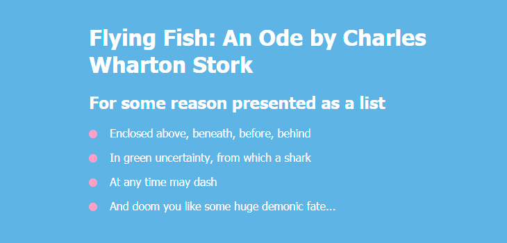
Unordered List
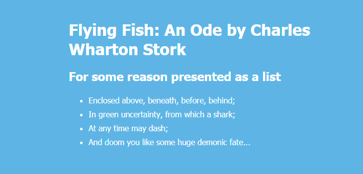
To create a list marked with bullets (an unordered list, UL), use the <ul> tag:
<ul class="list">
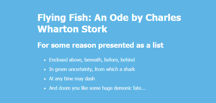
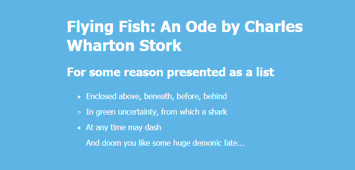
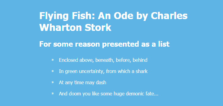
<li class="list-item one">Enclosed above, beneath, before, behind</li>
<li class="list-item two">In green uncertainty, from which a shark</li>
<li class="list-item three">At any time may dash</li>
<li class="list-item four">And doom you like some huge demonic fate...</li>
</ul>
Set List Item Markers
By default, your list marker will look like a small disc. You can change the way it looks and set different list item markers by applying the list-style-type property to the list (<ul>). By way of illustration, we’ll apply this rule to the each individual <li> element inside their parent <ul>:
.one { list-style-type: disc; }
.two { list-style-type: circle; }
.three { list-style-type: square; }
.four { list-style-type: none; }
Custom Bullets
You can also specify your own markers, such as “—”, “+”, “*”, “→”, “🌈”, “😎”, etc.:
ul {
  list-style-type: "*";
}
Here’s another solution if you want to use more options like positioning of the marker:
ul li {
  list-style: none;
  position: relative;
  padding: 3px 0 2px 25px;
}

ul li::before {
  content: '*';
  position: absolute;
  top: 6px;
  left: 0;
}
You can remove default settings by applying these rules:
ul {
  list-style-type: none;
  margin-left: 0;
  padding-right: 0;
}
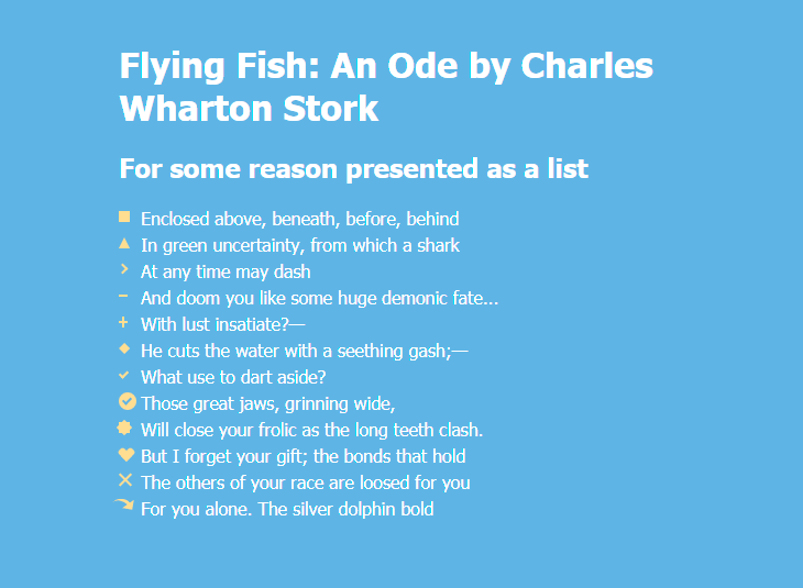
Here are more examples of custom bullets in square, triangular, arrow, heart, diamond and other shapes:
ul {
  line-height: 1.5em;
  margin: 5px 0 15px;
  padding: 0;
}

li {
  list-style: none;
  position: relative;
  padding: 0 0 0 20px;
}
li.square::before {
  content: "";
  position: absolute;
  left: 0;
  top: 5px;
  width: 10px;
  height: 10px;
  background-color: #f9dd94;
}
li.triangle::before {
  content: "";
  position: absolute;
  left: 0;
  top: 5px;
  width: 0;
  height: 0;
  border-left: 5px solid transparent;
  border-right: 5px solid transparent;
  border-bottom: 10px solid #f9dd94;
}
li.arrow::before {
  content: "";
  position: absolute;
  left: 0;
  top: 6px;
  height: 5px;
  width: 5px;
  border: 1px solid #f9dd94;
  border-width: 2px 2px 0 0;
  transform: rotate(45deg);
}
li.line::before {
  content: "";
  position: absolute;
  left: 0;
  top: 9px;
  width: 8px;
  display: block;
  border-top: 2px solid #f9dd94;
}
li.plus::before  {
  content: "";
  position: absolute;
  background: #f9dd94;
  left: 0;
  top: 9px;
  height: 2px;
  width: 8px;
}

li.plus::after {
  content: "";
  position: absolute;
  background: #f9dd94;
  left: 3px;
  top: 5px;
  height: 10px;
  width: 2px;
}
li.diamond::before {
  content: "";
  position: absolute;
  left: 0px;
  top: 0px;
  width: 0;
  height: 0;
  border: 5px solid transparent;
  border-bottom-color: #f9dd94;
}

li.diamond::after {
  content: "";
  position: absolute;
  left: 0px;
  top: 10px;
  width: 0;
  height: 0;
  border: 5px solid transparent;
  border-top-color: #f9dd94;
}
li.checkmark::before {
  content: "";
  position: absolute;
  left: 2px;
  top: 5px;
  width: 3px;
  height: 6px;
  border: solid #f9dd94;
  border-width: 0 2px 2px 0;
  transform: rotate(45deg);
}
li.circle-checkmark::before {
  content: "";
  position: absolute;
  left: 0;
  top: 2px;
  border: solid 8px #f9dd94;
  border-radius: 8px;
}

li.circle-checkmark::after {
  content: "";
  position: absolute;
  left: 5px;
  top: 5px;
  width: 3px;
  height: 6px;
  border: solid #7eb4e2;
  border-width: 0 2px 2px 0;
  transform: rotate(45deg);
}
li.star::before {
  content: "";
  position: absolute;
  left: 0;
  top: 5px;
  background: #f9dd94;
  width: 10px;
  height: 10px;
  text-align: center;
  transform: rotate(0deg);
}

li.star::after {
  content: "";
  position: absolute;
  top: 5px;
  left: 0;
  height: 10px;
  width: 10px;
  background: #f9dd94;
  transform: rotate(45deg);
}
li.heart::before, li.heart::after {
  content: "";
  position: absolute;
  left: 7px;
  top: 5px;
  width: 7px;
  height: 12px;
  background: #f9dd94;
  border-radius: 50px 50px 0 0;
  transform: rotate(-45deg);
  transform-origin: 0 100%;
}

li.heart::after {
  content: "";
  position: absolute;
  top: 5px;
  left: 0;
  transform: rotate(45deg);
  transform-origin: 100% 100%;
}
li.cross::before {
  content: "";
  position: absolute;
  height: 15px;
  border-left: 2px solid #f9dd94;
  transform: rotate(45deg);
  top: 2px;
  left: 5px;
}

li.cross::after {
  content: "";
  position: absolute;
  height: 15px;
  border-left: 2px solid #f9dd94;
  transform: rotate(-45deg);
  top: 2px;
  left: 5px;
}
li.curved-arrow::before {
  content: "";
  position: absolute;
  width: 0;
  height: 0;
  left: 4px;
  top: 3px;
  border-top: 9px solid transparent;
  border-right: 9px solid #f9dd94;
  transform: rotate(10deg);
}

li.curved-arrow::after {
  content: "";
  position: absolute;
  border: 0 solid transparent;
  border-top: 3px solid #f9dd94;
  border-radius: 20px 0 0 0;
  top: 0;
  left: -5px;
  width: 12px;
  height: 12px;
  transform: rotate(45deg);
}
Find more examples of creating different shapes with CSS:
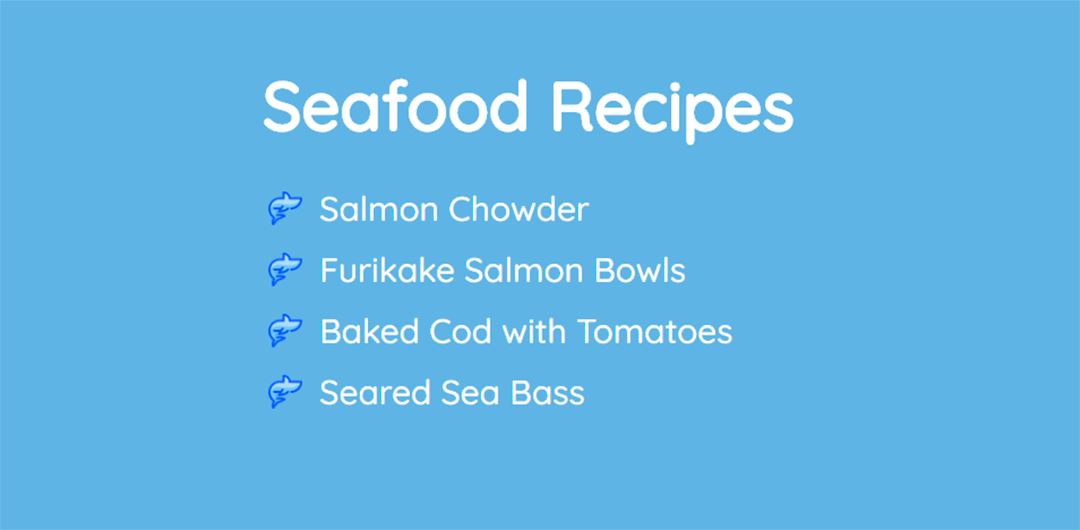
Set an Image as List Item Marker
You can also set an image as the list item marker using one of two ways.
Solution #1. You can apply the CSS list-style-image property to your <ul> element and indicate a path to your image. In this case, you need to resize your image manually in advance so it would fit in the list (e. g. 30 px × 30 px).
ul {
  list-style-image: url("images/shark-small.png");
}
Solution #2. You can apply background-image to li::before as a more flexible solution. You don’t need to resize your image manually and you can use different icons for each <li> element if you need.
ul li {
  list-style: none;
  padding-left: 50px;
  position: relative;
}

ul li:before {
  content: "";
  position: absolute;
  top: 12px;
  left: 5px;
  display: inline-block;
  height: 30px;
  width: 30px;
  background-size: contain;
  background-image: url("imgages/shark.png");
}
Learn more about CSS backgrounds:
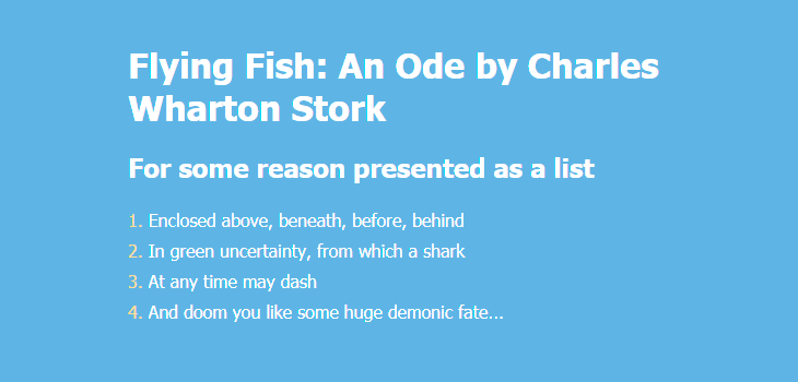
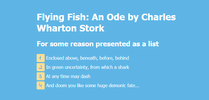
Ordered List
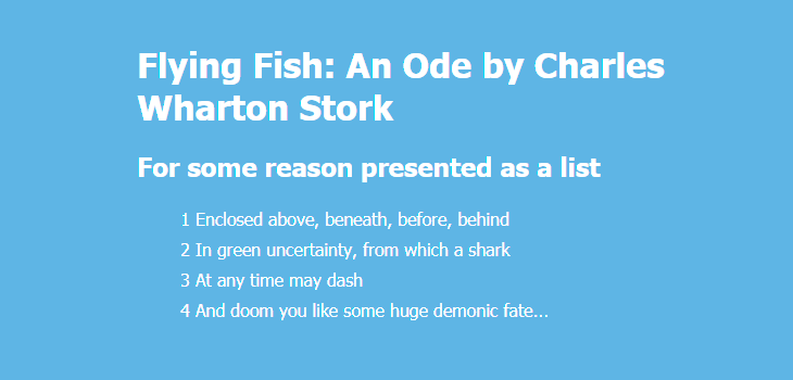
To create a list marked with numbers or letters (an ordered list, OL), use <ol>:
<ol class="list">
    <li class="list-item one">Enclosed above, beneath, before, behind</li>
    <li class="list-item two">In green uncertainty, from which a shark</li>
    <li class="list-item three">At any time may dash</li>
    <li class="list-item four">And doom you like some huge demonic fate...</li>
</ol>
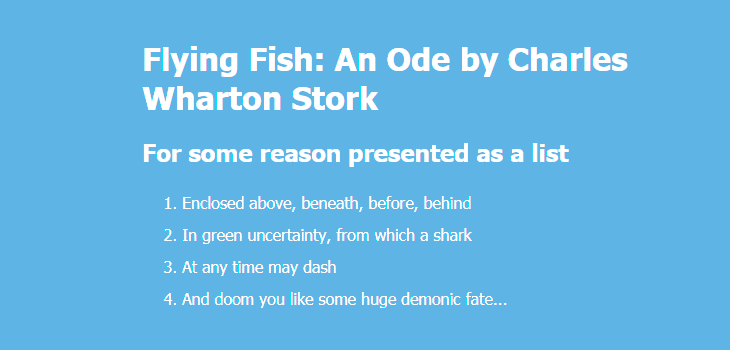
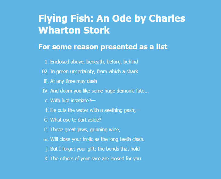
By default, your list will be marked by Arabic numerals. You can change this behavior by applying the list-style-type property to the list (<ol>). By way of illustration, we’ll apply this rule to the each individual <li> element inside their parent <ol>:
.one { list-style-type: decimal; }
.two { list-style-type: decimal-leading-zero; }
.three { list-style-type: lower-roman; }
.four { list-style-type: upper-roman; }
.five { list-style-type: lower-greek; }
.six { list-style-type: lower-latin; }
.seven { list-style-type: upper-latin; }
.eight { list-style-type: armenian; }
.nine { list-style-type: georgian; }
.ten { list-style-type: lower-alpha; }
.eleven { list-style-type: upper-alpha; }
Changing Punctuation in List Items
You can add a semicolon at the end of each list item or any other punctuation mark:
li:not(:last-child)::after {
  content: ";";
}
You can also remove a comma in an ordered list marker:
ol {
  counter-reset: item;
  list-style-type: none;
}

ol li {
  display: block;
}

ol li:before {
  content: counter(item) "  ";
  counter-increment: item;
}
Position the List Item Markers
Web browsers also dictate how CSS list items are positioned. You might want to change the default look.
First, you might want to remove the margin to the left of your list (apply margin-left with any value that suits you).
Second, you can add the list-style-position: inside; so that the bullet points would be inside the list item and part of the text. The result will be a CSS list indent.
Third, you can add margin-bottom to all <li> elements except for the last one so that your list would be more readable.
ul {
  line-height: 1.8;
  margin-left: -40px;
  list-style-position: inside;
}

ul li:not(:last-child) {
  margin-bottom: 20px;
}
If you want the text to be aligned along one line vertically, simply remove list-style-position: inside;:
ul {
  line-height: 1.8;
  margin-left: -20px;
  /* list-style-position: inside; */
}

ul li:not(:last-child) {
  margin-bottom: 20px;
}
You can use a shorthand property to set all the list properties in one declaration: ul {list-style: none inside url("images/shark-small.png");}
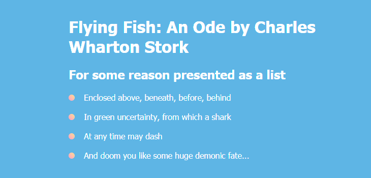
Colored Markers
By default, markers of unordered lists are round, small and have the same color as the text. You can set the color and size of markers the way you like. For example, let’s make them bigger and pink-colored:
ul {
  display: block;
  margin-left: -10px;
}

ul li {
  display: block;
  position: relative;
}

ul li:not(:last-child) {
  margin-bottom: 16px;
}

ul li:before {
  content: "";
  position: absolute;
  top: 1.2em;
  left: -30px;
  margin-top: -.9em;
  background: #f69ec4;
  height: 12px;
  width: 12px;
  border-radius: 50%;
}
Apply linear-gradient() instead of simple color, and you will get gradient markers:
ul li:before {
  …
  background: linear-gradient(45deg, #f69ec4, #f9dd94);
}
Find more examples of creating CSS gradients:
→ CSS Gradients: 7 Examples of Usage
If you only want to change the color, apply these rules:
ul li {
  list-style-type: none;
}

ul li:before {
  content: counter(item, disc) " ";
  color: pink;
}
Likewise, you can change the color of markers in an ordered list:
ol li {
  list-style-type: none;
  counter-increment: item;
}

ol li:before {
  content: counter(item) ". ";
  color: #f9dd94;
}
The counter-increment property allows you to assign a name to your counter. This provides a way to identify the counter when using the ::before pseudo-element. When you name the counter-increment “item” (or whatever you like), you’re telling the browser to use a counter for each list item.
Colored Markers with Background
You can go further and add even more visual effects. For example, you can create markers with numbers in colored squares:
ol li {
  list-style-type: none;
  counter-increment: item;
}

ol li:before {
  content: counter(item);
  margin-right: 5px;
  font-size: 80%;
  background-color: #f9dd94;
  color: #7eb4e2;
  font-weight: bold;
  padding: 3px 8px;
  border-radius: 3px;
}
You can also use a different font family for numbers in list item markers:
ol {
  line-height: 2;
}

ol li {
  list-style-type: none;
  counter-increment: item;
}

ol li:before {
  content: counter(item);
  display: inline-block;
  width: 12px;
  height: 20px;
  font-family: "Indie Flower", cursive;
  margin-right: 5px;
  background-color: #f9dd94;
  color: #7eb4e2;
  font-weight: bold;
  font-size: 140%;
  padding: 0 8px 8px;
  border-radius: 3px;
  line-height: 1.3;
}
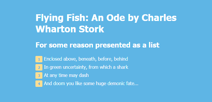
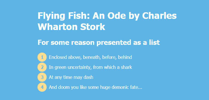
It is also possible to make round colored markers with numbers.
You need to nest <span> elements inside each <li> element:
<ol class="list">
    <li class="list-item one"><span>Enclosed above, beneath, before, behind</span></li>
    <li class="list-item two"><span>In green uncertainty, from which a shark</span></li>
    <li class="list-item three"><span>At any time may dash</span></li>
    <li class="list-item four"><span>And doom you like some huge demonic fate...</span></li>
</ol>
Here are CSS rules:
ol {
  counter-reset: item;
  list-style-type: none;
  line-height: 2.2;
  margin-left: -40px;
}

ol li {
  display: block;
  position: relative;
}

ol li span {
  margin-left: 40px;
}

ol li:before {
  content: counter(item) " ";
  counter-increment: item;
  color: #7eb4e2;
  position: absolute;
  top: 50%;
  margin-top: -1em;
  background: #f9dd94;
  height: 2em;
  width: 2em;
  line-height: 2em;
  text-align: center;
  border-radius: 2em;
  font-weight: 700;
}
The result will look like this:
Apply linear-gradient() instead of simple color, and you will get gradient markers:
ol li:before {
  ...
  background: linear-gradient(45deg, #f69ec4, #f9dd94);
}
Find more examples of creating CSS gradients:
→ CSS Gradients: 7 Examples of Usage
Examples of More Advanced Use
Below are three examples of more complicated CSS lists with fancy design and animation.
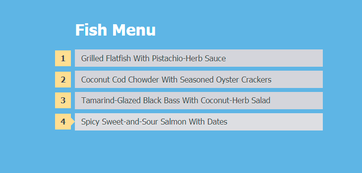
Example #1
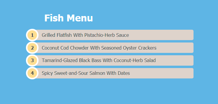
<ol>
    <li class=""><a href="#">Grilled Flatfish With Pistachio-Herb Sauce</a></li>
    <li class=""><a href="#">Coconut Cod Chowder With Seasoned Oyster Crackers</a></li>
    <li class=""><a href="#">Tamarind-Glazed Black Bass With Coconut-Herb Salad</a></li>
    <li class=""><a href="#">Spicy Sweet-and-Sour Salmon With Dates</a></li>
</ol>
ol {
  counter-reset: li;
  list-style: none;
  padding: 0;
  text-shadow: 0 1px 0 rgba(255,255,255,.5);
}

ol a {
  position: relative;
  display: block;
  padding: .4em .4em .4em 2em;
  margin: .5em 0;
  background: #DAD2CA;
  color: #444;
  text-decoration: none;
  border-radius: .3em;
  transition: .3s ease-out;
}

ol a:hover { background: #E9E4E0; }
ol a:hover:before { transform: rotate(360deg); }
ol a:before {
  content: counter(li);
  counter-increment: li;
  position: absolute;
  left: -1.3em;
  top: 50%;
  margin-top: -1.3em;
  background: #f9dd94;
  height: 2em;
  width: 2em;
  line-height: 2em;
  border: .3em solid #fff;
  text-align: center;
  font-weight: bold;
  border-radius: 2em;
  transition: all .3s ease-out;
}
Example #2
<ol>
    <li class=""><a href="#">Grilled Flatfish With Pistachio-Herb Sauce</a></li>
    <li class=""><a href="#">Coconut Cod Chowder With Seasoned Oyster Crackers</a></li>
    <li class=""><a href="#">Tamarind-Glazed Black Bass With Coconut-Herb Salad</a></li>
    <li class=""><a href="#">Spicy Sweet-and-Sour Salmon With Dates</a></li>
</ol>
ol {
  counter-reset: li;
  list-style: none;
  padding: 0;
  text-shadow: 0 1px 0 rgba(255,255,255,.5);
}

ol a {
  position: relative;
  display: block;
  padding: .4em .4em .4em .8em;
  margin: .5em 0 .5em 2.5em;
  background: #D3D4DA;
  color: #444;
  text-decoration: none;
  transition: all .3s ease-out;
}

ol a:hover {background: #DCDDE1;}
ol a:before {
  content: counter(li);
  counter-increment: li;
  position: absolute;
  left: -2.5em;
  top: 50%;
  margin-top: -1em;
  background: #f9dd94;
  height: 2em;
  width: 2em;
  line-height: 2em;
  text-align: center;
  font-weight: bold;
}

ol a:after {
  position: absolute;
  content: "";
  border: .5em solid transparent;
  left: -1em;
  top: 50%;
  margin-top: -.5em;
  transition: all .3s ease-out;
}

ol a:hover:after {
  left: -.5em;
  border-left-color: #f9dd94;
}
Example #3
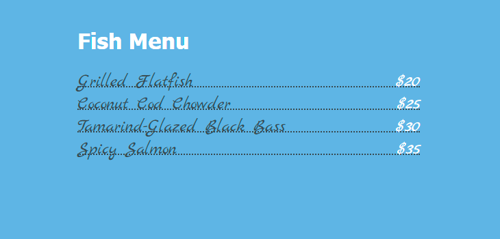
<ul>
    <li><span>Grilled Flatfish</span><span>$20</span></li>
    <li><span>Coconut Cod Chowder</span><span>$25</span></li>
    <li><span>Tamarind-Glazed Black Bass</span><span>$30</span></li>
    <li><span>Spicy Salmon</span><span>$35</span></li>
</ul>
ul {
  list-style: none;
  font-family: 'Marck Script', cursive;
}

ul li {
  margin-bottom: 5px;
  border-bottom: 2px #404B51 dotted;
  font-size: 26px;
  line-height: 1;
}

ul li span:nth-child(odd) {
  padding-right: 6px;
  color: #404B51;
}

ul li span:nth-child(even) {
  float: right;
  padding-left: 6px;
  color: #fff;
}

ul span {
  position: relative;
  bottom: -7px;
}
These three examples above are inspired by html5book.ru.
Read next: