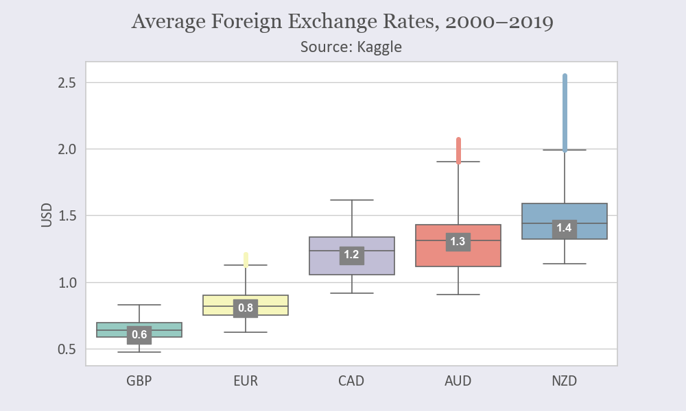
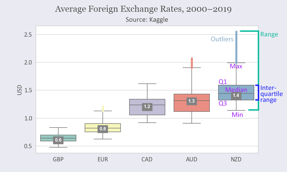
A box plot (or box-and-whisker plot) is useful to show the distribution of quantitative data and to compare variables. It shows the quartiles of the dataset while the whiskers extend to show the rest of the distribution (except for outliers):
Explanations:
- 1st quartile (Q1): the 25th percentile (the lower quarter of the values)
- 3rd quartile (Q3): the 75th percentile (the upper quarter of the values)
- Interquartile range (IQR): the width between the 3rd and 1st quantiles (IQR = Q3 − Q1)
- Median: the 50th percentile, the mid-point in the distribution
- Minimum (lower whisker): the minimum value in the dataset excluding outliers (Q1 − 1.5 × IQR)
- Maximum (upper whisker): the maximum value in the dataset, excluding outliers (Q3 + 1.5 × IQR)
- Outliers: extreme observations in the dataset, any data point lower than the minimum or greater than the maximum
Prerequisites
To create a box plot, we’ll need the following:
- Python installed on your machine
- Pip: a package management system (it comes with Python)
- Jupyter Notebook: an online editor for data visualization
- Pandas: a library to prepare data for plotting
- Matplotlib: a plotting library
- Seaborn: a plotting library
You can download the latest version of Python for Windows on the official website.
To get other tools, you’ll need to install recommended Scientific Python Distributions. Type this in your terminal:
pip install numpy scipy matplotlib ipython jupyter pandas sympy nose seaborn
Getting Started
Create a folder that will contain your notebook (e.g. “sns-boxplot”) and open Jupyter Notebook by typing this command in your terminal (don’t forget to change the path):
cd C:\Users\Shark\Documents\code\sns-boxplot
py -m notebook
This will automatically open the Jupyter home page at http://localhost:8888/tree. Click on the “New” button in the top right corner, select the Python version installed on your machine, and a notebook will open in a new browser window.
In the first line of the notebook, import all the necessary libraries:
import matplotlib.pyplot as plt
import pandas as pd
import seaborn as sns
%matplotlib notebook
You’ll need the last line (%matplotlib notebook) to display plots in input cells.
Data Preparation
We’ll create a box plot showing various currency exchange rates against USD. You can download the Foreign Exchange Rates 2000–2019 dataset on Kaggle (Foreign_Exchange_Rates.csv).
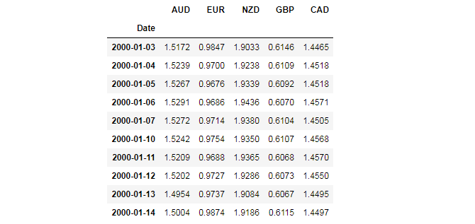
We’ll use 6 columns from this dataset (1–5 and 7). We’ll rename those columns while skipping the first row (which is the header) and setting the first column as the index. We’ll also make sure all our values are numbers and remove rows with NaN values.
df = pd.read_csv('Foreign_Exchange_Rates.csv',
                 usecols=[1,2,3,4,5,7], names=['Date', 'AUD', 'EUR', 'NZD', 'GBP', 'CAD'],
                 skiprows=1, index_col=0)
columns = ['AUD', 'EUR', 'NZD', 'GBP', 'CAD']
df[columns] = df[columns].apply(pd.to_numeric, errors='coerce', axis=1)
df.dropna(inplace=True)
df.head(10)
Here’s the output:
We’ll use this data frame for plotting.
Plotting
We’ll create a box plot in 7 steps. All the code snippets below should be placed inside one cell in your Jupyter Notebook.
1. Create a figure and a subplot
sns.set(style='whitegrid')
facecolor = '#eaeaf2'
fig, ax = plt.subplots(figsize=(10, 6), facecolor=facecolor)
style='whitegrid' sets a light-gray grid with white background and figsize=(10, 6) creates a 1000 × 600 px figure.
2. Create a box plot
sns.boxplot would create a box plot:
ax = sns.boxplot(data=df,
                 palette='Set3',
                 linewidth=1.2,
                 fliersize=2,
                 order=['GBP', 'EUR', 'CAD', 'AUD', 'NZD'],
                 flierprops=dict(marker='o', markersize=4))
Here’s some more about sns.boxplot’s parameters:
- palette: Seaborn colormap; you can read more in the documentation
- linewidth: width of the gray lines that frame the plot elements
- fliersize: size of the markers used to indicate outliers
- order: order of elements shown in the chart
- flierprops: outliers’ parameters
- orient='v' or orient='h': vertical or horizontal orientation of the plot
- showfliers=False would remove outliers from the plot
- showmeans=True would show markers indicating mean values
3. Set labels’ font parameters
font_color = '#525252'
csfont = {'fontname':'Georgia'}
hfont = {'fontname':'Calibri'}

ax.set_ylabel('USD', fontsize=16, color=font_color, **hfont)
for label in (ax.get_xticklabels() + ax.get_yticklabels()):
    label.set(fontsize=16, color=font_color, **hfont)
4. Create a title
title = 'Average Foreign Exchange Rates, 2000–2019'
fig.suptitle(title, y=.97, fontsize=22, color=font_color, **csfont)
subtitle = 'Source: Kaggle'
plt.title(subtitle, fontsize=18, pad=10, color=font_color, **hfont)
plt.subplots_adjust(top=0.85)
pad=10 would create padding under the title, and plt.subplots_adjust would make sure our title and subtitle fit in the figure.
5. Set color of the outlier points
By default, outlier points are gray. We can make them of the same color as the color of the corresponding box:
for i, box in enumerate(ax.artists):
    col = box.get_facecolor()
    plt.setp(ax.lines[i*6+5], mfc=col, mec=col)
Each box in a Seaborn boxplot is an artist object with 6 associated Line2D objects (to make whiskers, fliers, etc.). We’re iterating boxes and set colors of their outlier points based on the individual colors of the boxes.
6. Set labels for median values
To show median values on boxes, we can derive median values from the plot. Take into account that every 4th line at the interval of 6 is the median line (0 = 25th percentile, 1 = 75th percentile, 2 = lower whisker, 3 = upper whisker, 4 = 50th percentile, and 5 = upper extreme value).
lines = ax.get_lines()
categories = ax.get_xticks()

for cat in categories:
    y = round(lines[4+cat*6].get_ydata()[0],1)
    ax.text(
        cat,
        y,
        f'{y}',
        ha='center',
        va='center',
        fontweight='semibold',
        size=12,
        color='white',
        bbox=dict(facecolor='#828282', edgecolor='#828282')
    )
bbox would create boxes around median values; facecolor sets the background color and edgecolor the color of the border.
7. Save the chart as a picture
filename = 'sns-boxplot'
plt.savefig(filename+'.png', facecolor=facecolor)
You might need to repeat facecolor in savefig(). Otherwise, plt.savefig might ignore it.
That’s it, our Seaborn boxplot is ready. You can download the notebook on GitHub to get the full code.
Read also: