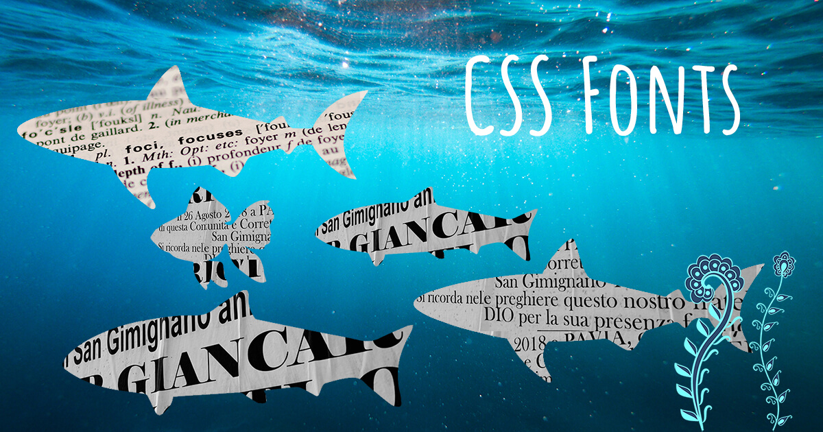
How to Install Fonts
To install fonts in your project, you can put a link in your HTML or download fonts and embed them inside a .css file.
If you choose to install fonts using a link (to use externally hosted fonts), you can do it this way:
1. Choose a font with the help of web services such as Google Fonts (free), Font Squirrel (free) or Fontspring (not free).
2. Put a link generated by one of those web services inside the <head> element in your HTML code, for example:
<link href="https://fonts.googleapis.com/css?family=Roboto&display=swap" rel="stylesheet">
3. Use CSS rules to specify a font family, like this:
font-family: 'Roboto', sans-serif;
It’s an easy way. However, you may want to download and install fonts inside your project (to use internally hosted fonts) for the sake of your project stability and better performance. To do this, follow these steps:
1. Choose a font with the help of web services listed above and download it.
2. You will have several font files for different font types, for instance, Roboto-Bold, Roboto-Italic, Roboto-Light, Roboto-Medium, Roboto-Regular, etc. Put those files in a separate subfolder, for example, _source/font/roboto.
3. Inside this subfolder, create a .css file which will be used to embed the font (for example _source/font/roboto/roboto.css).
4. It’s recommended to have the font at least in three different formats: *.ttf, *.woff, *.eot. If you miss some of them, you can convert the downloaded font files with the help of converters, such as Font2web (for all formats) and Everything Fonts (to convert specific formats).
Here is an example of files structure (files that are kept inside the subfolder _source/font/roboto):
roboto
|
|— roboto.css
|— Roboto-Bold.eot
|— Roboto-Bold.ttf
|— Roboto-Bold.woff
|— Roboto-Italic.eot
|— Roboto-Italic.ttf
|— Roboto-Italic.woff
5. You can embed the font in your stylesheet (e. g. in the roboto.css file) like this:
@font-face {
  font-family: 'Roboto';
  src: url('Roboto-Regular.eot');
  src: url('Roboto-Regular.eot?#iefix') format('embedded-opentype'),
  url('Roboto-Regular.woff') format('woff'),
  url('Roboto-Regular.ttf') format('truetype');
  font-weight: normal;
  font-style: normal;
}

@font-face {
  font-family: 'Roboto';
  src: url('Roboto-Bold.eot');
  src: url('Roboto-Bold.eot?#iefix') format('embedded-opentype'),
  url('Roboto-Bold.woff') format('woff'),
  url('Roboto-Bold.ttf') format('truetype');
  font-weight: bold;
  font-style: normal;
}

@font-face {
  font-family: 'Roboto';
  src: url('Roboto-Italic.eot');
  src: url('Roboto-Italic.eot?#iefix') format('embedded-opentype'),
  url('Roboto-Italic.woff') format('woff'),
  url('Roboto-Italic.ttf') format('truetype');
  font-weight: bold;
  font-style: italic;
}
6. Create a .scss file (for example: _source/css/_font.scss) and connect the font this way:
@import url('../font/roboto/roboto.css');
7. Use the font elsewhere in your stylesheet:
font-family: 'Roboto', sans-serif;
How to Optimize Google Fonts Performance
Google Fonts is a great tool. However, if you choose too many fonts of several types, you risk that your page performance will get worse, even though Google Fonts are already optimized.
Danny Cooper, a creator of the Google Fonts Plugin, gives advice on how to prevent this situation and further optimize Google Fonts. Here are some of his recommendations.
1. Combine fonts into a single request. For example, if you wanted to load two fonts (e. g. Lato and Amatic SC), you might do something like this:
<link href="https://fonts.googleapis.com/css?family=Lato:400,400i,700,700i&display=swap" rel="stylesheet">
<link href="https://fonts.googleapis.com/css?family=Amatic+SC&display=swap" rel="stylesheet">
It would result in the browser making two HTTP requests slowing down your page. You can optimize that by combining fonts into a single request like this:
<link href="https://fonts.googleapis.com/css?family=Amatic+SC|Lato:400,400i,700,700i&display=swap" rel="stylesheet">
2. Use resource hints. You can use one of two types of resource hints: DNS Prefetching or Preconnect. These are features that can boost website performance.
To use DNS Prefetching, put the line below inside the <head> element:
<link rel="dns-prefetch" href="//fonts.googleapis.com">
To use Preconnect, add this line:
<link rel="preconnect" href="https://fonts.gstatic.com/" crossorigin>
Just adding this line of code can reduce your page load time by 100ms.
3. Add the font-display property. To fight the FOIT (Flash of Invisible Text) effect, add font-display: swap; to the @font-face declaration (if you host the fonts locally). It will tell the browser to show the fallback font until the Google Font is available.
@font-face {
    font-family: 'Roboto';
    src: local('Roboto Thin Italic'),
         url(https://fonts.gstatic.com/s/roboto/v19/KFOiCnqEu92Fr1Mu51QrEz0dL-vwnYh2eg.woff2)
    format('woff2');
    font-display: swap;
}
When Google Fonts generates the link, display=swap is added automatically, for example:
<link href="https://fonts.googleapis.com/css?family=Amatic+SC|Lato:400,400i,700,700i&display=swap" rel="stylesheet">
4. Use the text parameter for the individual characters. The text parameter can cut down the font weight by up to 90% by allowing you to load only the characters you need, for example:
<link href="https://fonts.googleapis.com/css?family=Amatic+SC:400,700&text=Shark+Coder&display=swap" rel="stylesheet">
In this example, the Amatic SC font will render only 9 characters to display the logo “Shark Coder”.
Use the text parameter carefully. If it is added to the end of the link with multiple fonts, this parameter will apply to all fonts. In the example below, &text=S will apply not only to Amatic SC but also to Lato and Roboto Condensed. And the browser will render only the letters S, swapping the other characters with the fallback fonts. To prevent this situation, connect the font with the text parameter in a separate <link> element.
<link rel="stylesheet" href="https://fonts.googleapis.com/css?family=Lato:400,700|Roboto+Condensed:400,700|Amatic+SC:400,700&text=S&display=swap" crossorigin>
Responsive Font Size
For the sake of accessibility and better user experience, it’s also recommended not to use px everywhere. You may set the font size in px in the root and then scale it in rem anywhere else. The value of rem depends on the value of the font size set in the root. By default, it’s 16 px. But you can set your own value.
For example:
:root {
  font-size: 16px;
}

h1 {
  font-size: 1.5rem; // equals 24px
}
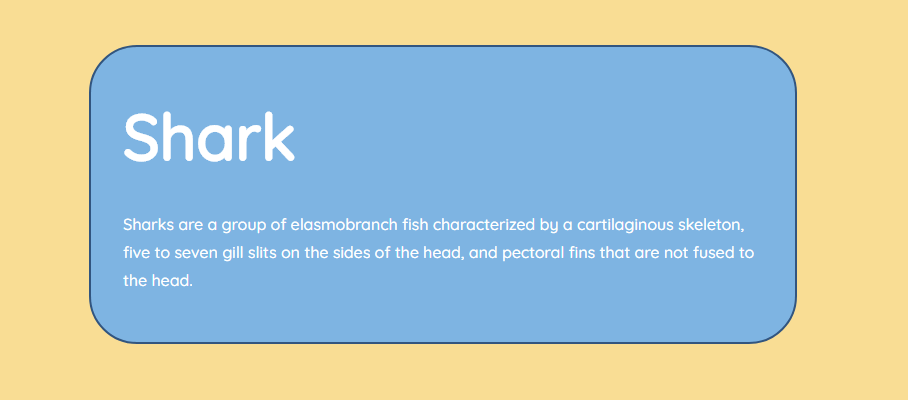
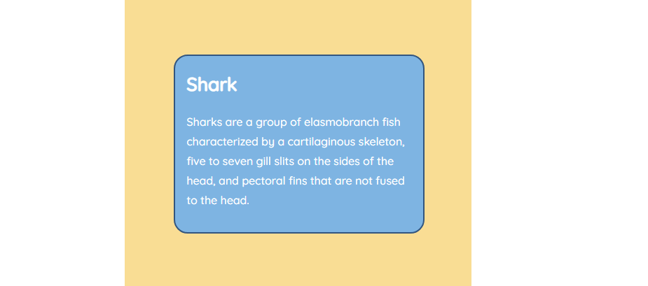
Now suppose you want to have larger fonts on desktop screens and smaller fonts on mobile devices. Jason Knight offers the following solution.
Let’s say you want to set 1 em font-size as the minimum, 4 em as the largest, and the scale to the largest size to be based on 75 rem. 75 rem is 1200 px for 16px / normal font users, 1500 px for 20 px / large font users, and 2400 px for 4K devices.
For example:
<section>
<h2>Shark</h2>
<p>
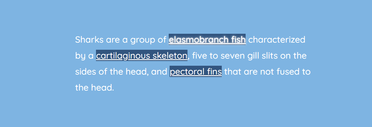
Sharks are a group of elasmobranch fish characterized by a cartilaginous skeleton, five to seven gill slits on the sides of the head, and pectoral fins that are not fused to the head.
</p>
</section>
:root {
 --base-scale: calc(100vw / 75);
 --h2-font-size: max(1em, min(4em, calc(var(--base-scale) * 4)));
 --padding-size: max(1em, min(2em, calc(var(--base-scale) * 2)));
 --margin-size: max(0.5em, min(2em, calc(var(--base-scale) * 2)));
 --border-radius: max(1em, min(3em, calc(var(--base-scale) * 3)));
}

section {
 max-width: 40em;
 padding: var(--padding-size);
 margin: var(--margin-size);
 border-radius: var(--border-radius);
 background: #7eb4e2;
 border: 2px solid #32557f;
 color: #fff;
}

h2 {
 font-size: var(--h2-font-size);
 margin: 0;
}
Here’s how it will look on desktop:
And here’s how it will look on smaller screens:
You can also create a responsive and fluid font with the clamp() CSS function. It makes your website attractive across many different screen sizes without using media queries.
Here’s the syntax: clamp([min], [calculated], [max]). Using this function, you set known suitable largest and smallest values and add a scaling range between them. You can apply it anywhere you’d use a number, percentage, or another length unit.
Example:
h1 {
  font-size: clamp(16px, 5vw, 34px);
}
In this example, the font-size value will be 5% of the viewport width — but no less than 16 px and no more than 34 px.
You can also use calc() and rem values with the clamp() function, for instance:
h1 {
  font-size: clamp(100%, calc(1rem + 2vw), 1.5rem);
}
In this example, 100% means “the current base size” which by default means 16 px for font-size. Next, calc(1rem + 2vw) uses 1 rem (16px by default) plus 2/100ths of the viewport width as the calculation. And 1.5 rem is a value for the maximum size of 24 px.
You can add a fallback for older browsers:
h1 {
  font-size: 16px;
}

@supports (font-size: clamp(16px, 5vw, 34px)) {
  h1 {
    font-size: clamp(16px, 5vw, 34px);
  }
}
Text Formatting
There are so many things you can do with fonts. I won’t go into details on how to align text or how to change the font size. Here are some simple but useful tricks concerning paragraph indents, as well as line and word breaks.
Paragraph Indents
To create paragraph indents, use the text-indent property. It defines the size of the first-line indent of the <p> element. The first paragraph after a heading should never be indented because it’s obvious that it’s a new paragraph.
p {
  text-indent: 1em;
  margin-bottom: 0;

  &:first-of-type {
    text-indent: 0;
  }
}
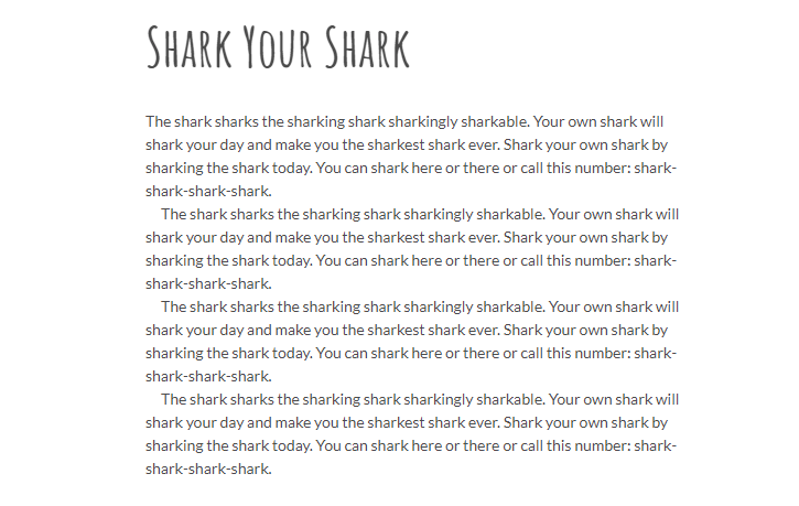
Line Breaks
To break a line, you can put a <br /> element in your HTML code. However, it’s recommended to apply CSS rules instead.
<p><span>The shark sharks the sharking shark sharkingly sharkable.</span> Your own shark will shark your day and make you the sharkest shark ever. Shark your own shark by sharking the shark today. You can shark here or there or call this number: shark-shark-shark-shark.</p>
p { text-align: center; }

p span::after {
  content: '\A';
  white-space: pre;
}
If you apply the content and white-space properties to the p span::after element, the first sentence (p span) will have a line break. And the next sentence will start with a new line.

Word Breaks (Hyphenation)
There are two main methods to specify how words should be hyphenated when text wraps across multiple lines:
- ­ is a soft hyphen, which is put in HTML inside a word, prompting the browser where the word can be broken.
- hyphens: auto; is a CSS property that adds hyphenation where necessary. You must specify a language using the lang HTML attribute in order to guarantee that automatic hyphenation is applied in the language of your choice.
CSS Text Effects
With the help of CSS, you can create different effects: text with shadows, stroked text, a letterpress effect, gradient text, and so forth. Below are several examples inspired by various sources.
Text with Shadows

background: linear-gradient(-45deg, #7eb4e2, #f69ec4);
color: #f4f4f4;
text-shadow: -1px -1px #ffffff,
             1px 1px gray,
             2px 2px #7a7a7a,
             3px 3px #757575,
             4px 4px #707070,
             5px 5px #6b6b6b,
             6px 6px #666666,
             7px 7px #616161,
             8px 8px #5c5c5c,
             9px 9px #575757,
             10px 10px #525252,
             11px 11px #4d4d4d,
             18px 18px 30px rgba(0, 0, 0, .4),
             18px 18px 10px rgba(0, 0, 0, .4);

background: #7eb4e2;
color: #fff;
text-shadow: 0 1px hsl(0,0%,85%),
             0 2px hsl(0,0%,80%),
             0 3px hsl(0,0%,75%),
             0 4px hsl(0,0%,70%),
             0 5px hsl(0,0%,65%),
             0 5px 10px #000;

background: #d5d5d5;
color: #7eb4e2;
letter-spacing: .1em;
text-shadow: 4px 4px #32557f, 7px 7px rgba(0, 0, 0, .4);

color: #32557f;
letter-spacing: .1em;
text-shadow: 4px 4px #fff, 6px 6px #7eb4e2;
There are more interesting examples of text shadows on the Freebiesupply.com website.
Stroked Text

background: #7eb4e2;
color: #fff;
text-shadow: 1px 1px #32557f,
            -1px -1px #32557f,
            1px -1px #32557f,
            -1px 1px #32557f;
Another way to draw a stroke around the individual characters is to use -webkit-text-stroke and -webkit-text-fill-color properties:
p {
  -webkit-text-stroke: 8px $color-pink;
  -webkit-text-fill-color: #fff;
  font-family: 'Holtwood One SC', serif;
}

Stroked Text with a Shadow

background: #7eb4e2;
color: #fff;
text-shadow: -2px -2px 0 #32557f,
             2px -2px 0 #32557f,
             -2px 2px 0 #32557f,
             2px 2px 0 #32557f,
             4px 4px 0 #fff,
             5px 5px 0 #fff,
             6px 6px 0 #fff;
letter-spacing: .1em;

color: #7eb4e2;
font-weight: 700;
text-shadow: -1px 0 1px #fff,
             0 -1px 1px #fff,
             0 1px 1px #fff,
             1px 0 1px #fff,
             0 0 8px #fff,
             0 0 8px #fff,
             0 0 8px #fff,
             2px 2px 3px #000;

color: #fff;
text-shadow: 1px 1px #32557f,
             1px -1px #32557f,
             -1px 1px #32557f,
             -1px -1px #32557f,
             3px 3px 6px rgba(0,0,0,.5);

color:#f69ec4;
font-weight: 700;
text-shadow: 1px 1px #fff,
             2px 2px #fff,
             -1px -1px #fff,
             -2px -2px #fff,
             -1px 1px #fff,
             1px -1px #fff,
             -2px 2px #fff,
             2px -2px #fff,
             -3px -3px 4px rgba(0,0,0,.3),
             -3px 3px 4px rgba(0,0,0,.3),
             3px 3px 4px rgba(0,0,0,.3),
             3px -3px 4px rgba(0,0,0,.3);
You can learn more about shadows in the article CSS Shadows.
Letterpress

background: #7eb4e2;
color: #7eb4e2;
letter-spacing: 2px;
text-shadow: 1px 1px #d5d5d5, -1px -1px #32557f;

background: hsl(210, 13%, 60%);
color: hsl(210, 13%, 30%);
text-shadow: 0 1px 1px hsla(0, 0%, 100%, .8);

background: hsl(210, 13%, 30%);
color: hsl(210, 13%, 60%);
text-shadow: 0 -1px 1px #000;
Gradient Text

background: linear-gradient(to left, #32557f, #7eb4e2);
-webkit-background-clip: text;
-webkit-text-fill-color: transparent;
Shimmering (Neon) Text

background: #32557f;
color: #fff;
text-shadow: 0 0 5px #fff,
             0 0 10px #fff,
             0 0 15px #fff,
             0 0 20px #f69ec4,
             0 0 35px #f69ec4,
             0 0 40px #f69ec4,
             0 0 50px #f69ec4,
             0 0 75px #f69ec4;

background: #32557f;
color: #fff;
font-weight: 700;
text-shadow: 0 0 .1em, 0 0 .3em;
You can apply a similar approach to create a shimmering or glowing links on hover:
a {
  background: #32557f;
  color: white;
  transition: 1s;
}

a:hover {
  text-shadow: 0 0 .1em, 0 0 .3em;
}
Read more about the text-shadow property in our article CSS Shadows.
Background Image for Font Color

You can create interesting text effects using images with background, background-clip, and text-fill-color properties, which clip the text, fill it with transparent color and set an image as a background. Remember to use a thick font for a better effect.
background: url("img/sunflowers.jpg") no-repeat;
-webkit-background-clip: text;
-webkit-text-fill-color: transparent;
font-size: 80px;
font-family: 'Holtwood One SC', serif;
Animated Text Effects
Check more examples of fancy animated text effects that appear on hover.