CSS tabs are perfect for displaying different subjects in a compact way on a single web page or for creating single page web applications. They also can be used for creating navigation bars.
For starters, let’s learn how to create various types of tabs using CSS and jQuery.
HTML
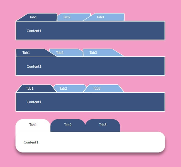
To make trapezoid-shaped tabs like the first three blocks in the picture above, use the markup below. The <nav> element with nested links will be used to display tabs, and <div> elements with the .content class will be used to display content that is shown when you click on the tab links.
<div class="tabs">
    <!-- Tab links -->
    <nav>
        <a href="#content1">Tab1</a>
        <a href="#content2">Tab2</a>
        <a href="#content3">Tab3</a>
    </nav>

    <!-- Tab content -->
    <div class="content" id="content1">Content1</div>
    <div class="content" id="content2">Content2</div>
    <div class="content" id="content3">Content3</div>
</div>
The <nav> element includes tabs with links to .content blocks. The href attributes of <nav> links should coincide with .content divs’ IDs.
CSS
Here are some basic, less important CSS rules to style your content and set the width:
nav,
.content {
  min-width: 600px;
}

.content {
  max-width: 600px;
  display: block;
  margin-bottom: 1em;
  background: #32557f;
  padding: 2em 3em;
  border-radius: .15em;
  border: .2em solid #fff;
  color: #fff;
}
Next, apply CSS rules to set a position of your tabs (<a> elements) relative to their parent element (<nav>) and apply main styles to make your elements look like tabs:
nav {
  position: relative;
  z-index: 1;

  & > a {
    position: relative;
    width: 10em;
    display: inline-block;
    padding: .7em 2em .5em;
    color: #fff;
    text-decoration: none;
    margin: 0 -.3em;
  }

  & > a::before {
    border: .2em solid #fff;
  }

  a::before {
    content: '';
    position: absolute;
    top: 0; right: 0; bottom: 0; left: 0;
    z-index: -1;
    border-bottom: none;
    border-radius: .4em .4em 0 0;
    background: #7eb4e2;
    transform: scale(1.2, 1.3) perspective(.5em) rotateX(5deg);
  }
}
And here are CSS rules that apply when your tabs are being clicked on or otherwise activated. Set z-index value that is bigger than your <nav> element’s z-index and (optionally) change the color to highlight the selected tab:
nav a.active {
  z-index: 2;

  &::before {
    background-color: #32557f;
    margin-bottom: -.08em;
  }
}
Next, style the buttons that are used to open the tab content.
When styling the trapezoid-shaped tabs, the most important property determining the form of the trapezoids is transform-origin:
- transform-origin: bottom right; will make a trapezoid with a beveled left corner;
- transform-origin: bottom left; will make a trapezoid with a beveled right corner;
- transform-origin: bottom; will make a trapezoid with two beveled corners.
You can also regulate the padding-left property to make the tabs look better.
A tab with the left beveled corner:
.tab-left {
  nav a::before { transform-origin: bottom right; }
  nav { padding-left: 2.3em; }
}
A tab with the right beveled corner:
.tab-right {
  nav a::before { transform-origin: bottom left; }
  nav { padding-left: .3em; }
}
A tab with two beveled corners:
.tab-left-right {
  nav a::before { transform-origin: bottom; }
  nav { padding-left: 1.3em; }
}
.tab-left, .tab-right, and .tab-left-right are classes applied to the parent element (<div> with the class .tabs) that contains elements with tab links and tab content.
If you want to create tabs with rounded corners, reset some of the previous styles:
.tab-round {
 a::before {
    border-bottom: none;
    border-radius: none;
    background: none;
    transform: none;
  }

  nav > a::before {
  	border: none;
  }

  nav a.active {
    &::before {
    	background-color: #fff;
    	margin-bottom: 0;
      border-radius: 30px;
    }
  }
}
And then apply the CSS rules below:
.tab-round {
  nav { padding-left: .3em; }
  nav a {
    padding-top: 13px;
    text-align: center;
    background: #32557f;
    color: #fff;
    border-radius: 30px;
    height: 100px;
    margin-right: 1px;
  }

  nav a::before {
    background-color: none;
    margin-bottom: 0;
  }

  nav a.active{
    background: #fff;
    color: #000;
  }

  .content{
    position: absolute;
    width: 450px;
    height: auto;
    margin-top: -50px;
    margin-bottom: 50px;
    background: #fff;
    color: #000;
    border-radius: 30px;
    z-index: 100;
    box-shadow: 0px 10px 10px rgba(0, 0, 0, .4);
    padding: 30px;
  }
}
JS
Finally, add this jQuery code to make your tabs open content blocks on click:
$(function() {
    $('nav').each(function() {
        var $active, $content, $links = $(this).find('a');

        $active = $($links.filter('[href="' + location.hash + '"]')[0] || $links[0]);
        $active.addClass('active');

        $content = $($active[0].hash);

        $links.not($active).each(function() {
            $(this.hash).hide();
        });

        $(this).on('click', 'a', function(e) {
            $active.removeClass('active');
            $content.hide();

            $active = $(this);
            $content = $(this.hash);

            $active.addClass('active');
            $content.show();

            e.preventDefault();
        });
    });
});
Here’s a demo with the final result:
Pure CSS Tabs
To create CSS tabs without JavaScript, use radio inputs for tab links and then show or hide content depending on which tab is clicked on.
Here’s a demo: