Prerequisites
To create a choropleth map, we’ll need the following:
- Python installed on your machine
- Pip: a package management system (it comes with Python)
- Jupyter Notebook: an online editor for data visualization
- Pandas: a library to prepare data for plotting
- Plotly: a data visualization library
You can download the latest version of Python for Windows on the official website.
To install other tools, type this in your terminal:
pip install jupyter pandas plotly
Getting Started
Create a folder that will contain your notebook (e.g. “plotly-map”) and open Jupyter Notebook by typing this command in your terminal (don’t forget to change the path):
cd C:\Users\Shark\Documents\code\plotly-map
py -m notebook
This will automatically open the Jupyter home page at http://localhost:8888/tree. Click on the “New” button in the top right corner, select the Python version installed on your machine, and a notebook will open in a new browser window.
In the first line of the notebook, import all the necessary libraries:
import plotly.graph_objects as go
import pandas as pd
Data Preparation
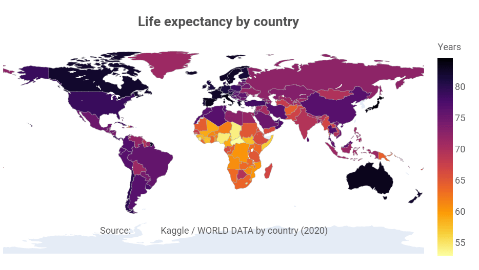
We’ll create a map that will show world countries filled with different colors depending on life expectancy in a specific country. We’ll use the WORLD DATA by country (2020) data set — you can download it on Kaggle. We’ll need a file named “Life expectancy.csv”.
In the second cell in your Jupyter notebook, type this code to read the .csv file and display the first five lines:
df = pd.read_csv('Life expectancy.csv')
df.head()
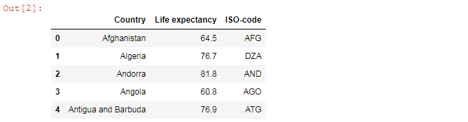
The column named “ISO-code” is essential to draw a map. The ISO codes are three-letter combination codes that designate every country.
Plotting
The map we’ll create with Plotly would be static when downloaded and interactive when viewed in the notebook — you’ll be able to see annotations if you hover over countries in Jupyter Notebook.
To create a figure, we’ll need two columns — “ISO-code” (to draw countries) and “Life expectancy” (to fill the map with data). The third column (“Country”) is needed only to show annotations on hover.
fig = go.Figure(data=go.Choropleth(
    locations = df['ISO-code'],
    z = df['Life expectancy'],
    text = df['Country'],
    colorscale = 'Inferno',
    autocolorscale=False,
    reversescale=True,
    marker_line_color='darkgray',
    marker_line_width=0.5,
    colorbar_title = 'Years',
))
colorscale = 'Inferno' sets the Inferno colorscale. Other Plotly colorscales are Blackbody, Bluered, Blues, Earth, Electric, Greens, Greys, Hot, Jet, Picnic, Portland, Rainbow, RdBu, Reds, Viridis, YlGnBu, and YlOrRd.
You can set reversescale to True if you want to reverse the order of colors. For example, we use reversescale=True so that countries with high life expectancy would be painted in dark and those with lower figures would be light. In addition, autocolorscale determines whether the colorscale is a default palette.
Use fig.update_layout() to set the figure size (1000 × 620 px in our example), the title, font parameters, and annotations:
fig.update_layout(
    width=1000,
    height=620,
    geo=dict(
        showframe=False,
        showcoastlines=False,
        projection_type='equirectangular'
    ),
    title={
        'text': '<b>Life expectancy by country</b>',
        'y':0.9,
        'x':0.5,
        'xanchor': 'center',
        'yanchor': 'top',
    },
    title_font_color='#525252',
    title_font_size=26,
    font=dict(
        family='Heebo',
        size=18,
        color='#525252'
    ),
    annotations = [dict(
        x=0.5,
        y=0.1,
        xref='paper',
        yref='paper',
        text='Source: <a href="https://www.kaggle.com/daniboy370/world-data-by-country-2020">\
            Kaggle / WORLD DATA by country (2020)</a>',
        showarrow = False
    )]
)
As you noticed, you can mix HTML and Python here, e.g. use the <b> tag to create the bold font or the <a> tag to insert a link.
Finally, add this line to show the plot inside the cell:
fig.show()
You can download the image created by Plotly by clicking on “Download plot as a png”:
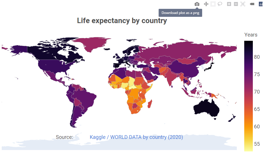
That’s it, our Plotly map is ready. Visit GitHub to download the notebook with the full code.
Read also: