Prerequisites
To create a map with Basemap, we’ll need the following:
- Python installed on your machine
- Pip: package management system (it comes with Python)
- Jupyter Notebook: an online editor for data visualization
- Pandas: a library to prepare data for plotting
- Numpy: a library for multi-dimensional arrays
- Matplotlib: a plotting library
- Seaborn: a plotting library (we’ll only use part of its functionally to improve Matplotlib design)
- Basemap: a toolkit extension for Matplotlib
You can download the latest version of Python for Windows on the official website.
To get other tools, you’ll need to install recommended Scientific Python Distributions. Type this in your terminal:
pip install numpy scipy matplotlib ipython jupyter pandas sympy nose seaborn
To install Basemap, follow the official guide or install unofficial .whl packages with pip install [package name].
Getting Started
Create a folder that will contain your notebook (e.g. “basemap”) and open Jupyter Notebook by typing this command in your terminal (don’t forget to change the path):
cd C:\Users\Shark\Documents\code\basemap
py -m notebook
This will automatically open the Jupyter home page at http://localhost:8888/tree. Click on the “New” button in the top right corner, select the Python version installed on your machine, and a notebook will open in a new browser window.
In the first line of the notebook, import all the necessary libraries:
import matplotlib.pyplot as plt
import matplotlib as mpl
import pandas as pd
import seaborn as sns
sns.set()
from mpl_toolkits.basemap import Basemap
%matplotlib notebook
You’ll need the last line (%matplotlib notebook) to display plots in input cells.
Data Preparation
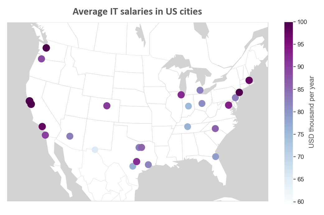
We’ll create a map that will show the average IT salaries in US cities. You can download the .csv file named “US-salaries.csv” on GitHub. Put this file into the folder you created before.
Run the following code to read the file and display the first five rows:
df = pd.read_csv('US-salaries.csv')
df.head()
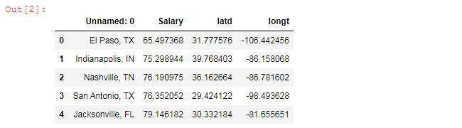
We’ll use “latd” and “longt” columns to set city coordinates on the map. The column named “Salary” will be needed to set colors to markers depending on how high the average salary is in a specific city.
Plotting
Here’s the list of variables we’ll use in our code:
lat = df['latd'].values
lon = df['longt'].values
values = df['Salary'].values

font_color = '#525252'
hfont = {'fontname':'Calibri'}
line_color = '#d3d3d3'
title = 'Average IT salaries in US cities'
label_name = 'USD thousand per year'
We’ll create a US map in several steps. All the code snippets below should be placed inside one cell in your Jupyter Notebook.
1. Create a figure
fig = plt.figure(figsize=(13.5,7.5))
figsize=(13.5,7.5) creates a 13,500 × 7,500 px figure.
2. Create a map
m = Basemap(llcrnrlon=-121, llcrnrlat=20,
            urcrnrlon=-62,urcrnrlat=51,
            projection='lcc',
            lat_1=32,lat_2=45,lon_0=-95)
Parameters:
- llcrnrlon: longitude of the lower left corner of the map (degrees)
- llcrnrlat: latitude of the lower left corner of the map (degrees)
- urcrnrlon: longitude of the upper right corner of the map (degrees)
- urcrnrlat: latitude of the upper right corner of the map (degrees)
- projection: map projection ('lcc', 'cyl', 'aeqd', 'tmerc', 'nsper', etc.)
- lat_1: first standard parallel for lambert conformal (degrees)
- lat_2: second standard parallel for lambert conformal (degrees)
- lon_0: center of the map (degrees)
Use this code to draw lines and fill figures with colors:
m.drawcoastlines(color=line_color)
m.drawcountries(color=line_color)
m.drawstates(color=line_color)
m.drawmapboundary(color=line_color, fill_color=line_color, zorder=0)
m.fillcontinents(color='w',lake_color=line_color, zorder=1)
3. Set markers
x, y = m(lon, lat)
m.scatter(x, y, s=values, c=values, cmap='BuPu', zorder=10, linewidths=7)
Set marker zorder to any value greater than zorder set for fillcontinents. Otherwise, our markers won’t be visible.
cmap sets the colormap. Here are examples of colormap names: 'Accent', 'Accent_r', 'Blues', 'Blues_r', 'BrBG', 'BrBG_r', 'BuGn', 'BuGn_r', 'BuPu', 'BuPu_r', 'CMRmap', 'CMRmap_r', 'Dark2', 'Dark2_r', 'GnBu', 'GnBu_r', 'Greens', 'Greens_r', 'Greys', 'Greys_r', 'OrRd', 'OrRd_r', 'Oranges', 'Oranges_r', 'PRGn', 'PRGn_r', 'Paired', 'Paired_r', 'Pastel1', 'Pastel1_r', 'Pastel2', 'Pastel2_r', 'PiYG', 'PiYG_r', 'PuBu', 'PuBuGn', 'PuBuGn_r', 'PuBu_r', 'PuOr', 'PuOr_r', 'PuRd', 'PuRd_r', 'Purples', 'Purples_r', 'RdBu', etc.
To decrease or increase marker size, change the linewidth value.
4. Create a title
plt.title(title,fontsize=24, pad=18, color=font_color, fontweight='bold', **hfont)
pad creates padding under the title.
5. Create a colorbar
Create a colorbar, set the label name, its font size, font color and font family, as well as set tick labels’ font size:
cbar = plt.colorbar()
plt.clim(60,100)
cbar.set_label(label=label_name, size=16, color=font_color)
for l in cbar.ax.yaxis.get_ticklabels():
#   l.set_weight('bold')
    l.set_fontsize(14)
plt.clim(60,100) sets the colorbar’s extreme tick labels (60 and 100 in our example).
6. Save the image
filename = 'basemap-salaries'
plt.savefig(filename+'.png')
That’s it, our map is ready. You can download the notebook on GitHub to get the full code.
Read also: