Prerequisites
To create pie charts, we’ll need the following:
- Python installed on your machine
- Pip: package management system (it comes with Python)
- Jupyter Notebook: an online editor for data visualization
- Pandas: a library to create data frames from data sets and prepare data for plotting
- Matplotlib: a plotting library
You can download the latest version of Python for Windows on the official website.
To get other tools, you’ll need to install recommended Scientific Python Distributions. Type this in your terminal:
pip install numpy scipy matplotlib ipython jupyter pandas sympy nose
Getting Started
Create a folder that will contain your notebook (e.g. “matplotlib-pie-chart”) and open Jupyter Notebook by typing this command in your terminal (don’t forget to change the path):
cd C:\Users\Shark\Documents\code\matplotlib-pie-chart
py -m notebook
This will automatically open the Jupyter home page at http://localhost:8888/tree. Click on the “New” button in the top right corner, select the Python version installed on your machine, and a notebook will open in a new browser window.
In the first line of the notebook, import all the necessary libraries:
import matplotlib.pyplot as plt
import matplotlib as mpl
import pandas as pd
%matplotlib notebook
You’ll need the last line (%matplotlib notebook) to display plots in input cells.
Data Preparation
We’ll create a series of pie charts showing crimes in London boroughs. We’ll use a .csv file for plotting. You can download the “London Crime Data, 2008–2016” dataset on Kaggle (london_crime_by_lsoa.csv).
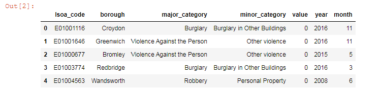
On the second line in your Jupyter notebook, type this code to read the file:
df = pd.read_csv('london_crime_by_lsoa.csv')
df.head()
This will show the first 5 lines of the .csv file:
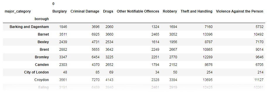
Next, prepare data for plotting. For simplicity, we won’t use the “value” column and will focus on the “borough” and “major_category” columns instead.
# Select columns you need
df = df[['borough', 'major_category']]
# Group boroughs and crimes and count numbers
df_grouped = df.groupby(['borough', 'major_category']).size().reset_index()
# Create a pivot table
table = pd.pivot_table(df_grouped, index=['borough'], columns=['major_category'])
# Delete columns with Nan values and convert to integers
table = table.dropna(axis=1).astype(int)
table
Here’s the output:
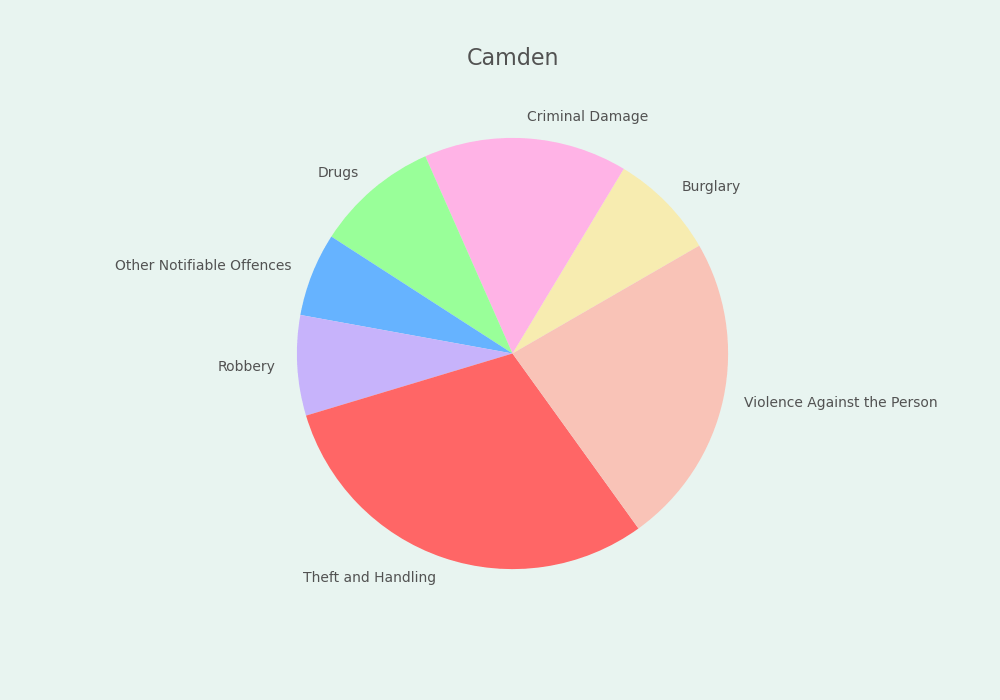
Plotting a Single Pie Chart
For starters, let’s create a single Matplotlib pie chart.
Here are variables we’ll need (Matplotlib chart colors, title, labels, etc.):
row_num = [5] # No. of the row
font_color = '#525252'
colors = ['#f7ecb0', '#ffb3e6', '#99ff99', '#66b3ff', '#c7b3fb','#ff6666', '#f9c3b7']
values = table.iloc[row_num].values.tolist()[0] # crime numbers
labels = [x[1] for x in table.columns] # crime names
title = table.iloc[row_num].index.values.tolist()[0] # borough
Plotting:
# Create subplots and a pie chart
fig, ax = plt.subplots(figsize=(10, 7), facecolor='#e8f4f0')
ax.pie(values, labels=labels, colors=colors, startangle=30, textprops={'color':font_color})
# Set title, its position, and font size
title = plt.title(title, fontsize=16, color=font_color)
title.set_position([.5, 1.02])
mpl.rcParams['font.size'] = 16.0
Here’s the result:
Save the file:
filename = 'pie-chart-single'
plt.savefig(filename+'.png', facecolor=('#e8f4f0'))
You might need to repeat facecolor in savefig(). Otherwise, plt.savefig might ignore it.
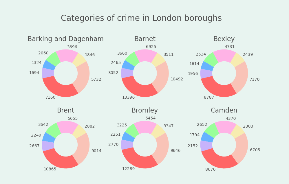
Plotting Multiple Donut Charts
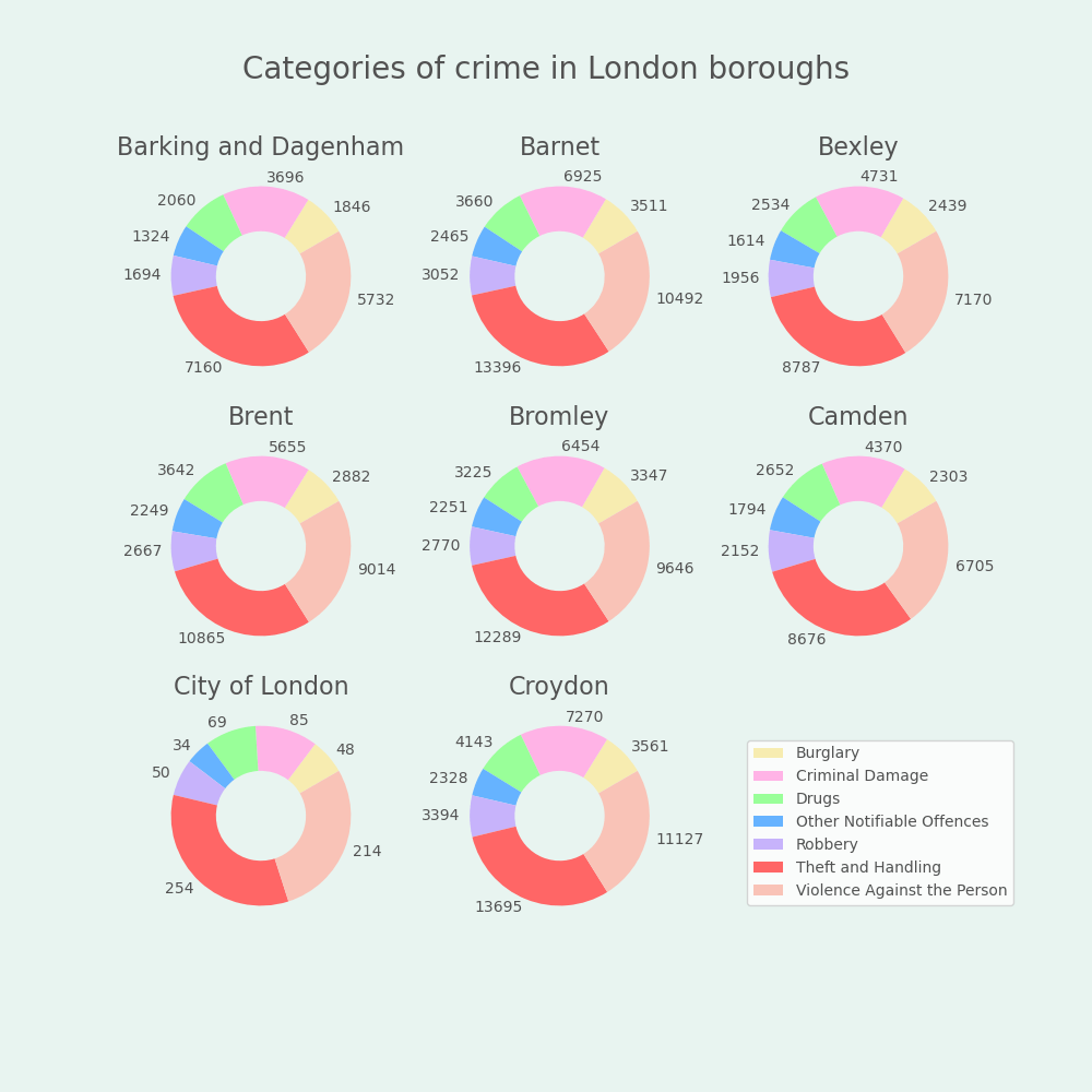
Now we’ll create multiple Matplotlib pie (donut) charts with a legend. We’ll plot multiple graphs in one figure with a loop, in one script.
All the code snippets below should be placed inside one cell in your Jupyter Notebook.
1. Set font and color variables
font_color = '#525252'
colors = ['#f7ecb0', '#ffb3e6', '#99ff99', '#66b3ff', '#c7b3fb','#ff6666', '#f9c3b7']
2. Create a figure and subplots
fig, axes = plt.subplots(3, 3, figsize=(10, 10), facecolor='#e8f4f0')
fig.delaxes(ax= axes[2,2])
subplots(3, 3) would create 9 subplots, with 3 rows and 3 columns. The first value is the number of rows, and the second one is the number of columns.
figsize=(10, 10) would create a 1000 × 1000 pixels figure.
fig.delaxes(ax= axes[2,2]) would remove the last subplot to clear a space for the legend. Thus, we’ll create 9 subplots with 8 charts.
3. Draw pie charts with a legend
We’ll use the for loop to iterate rows and create a pie chart for each of them. We’ll iterate only 8 rows in this example so we’re using table.head(8) instead of table.
wedgeprops=dict(width=.5) would create donuts (pie charts with holes in the center). Don’t use this argument, and you’ll get pie charts instead of donut charts.
labels=row.values would show values (crime numbers) and labels=[x[1] for x in row.index] would show crime names. To create a legend, we use [x[1] for x in row.index] (and not row.index) since we want to access the second value in a list of tuples, which is row.index.
for i, (idx, row) in enumerate(table.head(8).iterrows()):
    ax = axes[i // 3, i % 3]
    row = row[row.gt(row.sum() * .01)]
    ax.pie(row,
           labels=row.values,
           startangle=30,
           wedgeprops=dict(width=.5), # For donuts
           colors=colors,
           textprops={'color':font_color})
    ax.set_title(idx, fontsize=16, color=font_color)

    legend = plt.legend([x[1] for x in row.index],
                        bbox_to_anchor=(1.3, .87), # Legend position
                        loc='upper left',
                        ncol=1,
                        fancybox=True)
    for text in legend.get_texts():
        plt.setp(text, color=font_color) # Legend font color

fig.subplots_adjust(wspace=.2) # Space between charts

title = fig.suptitle('Categories of crime in London boroughs', y=.95, fontsize=20, color=font_color)
# To prevent the title from being cropped
plt.subplots_adjust(top=0.85, bottom=0.15)
Here’s the final result:
4. Save the chart as a picture
filename = 'pie-chart'
plt.savefig(filename+'.png', facecolor=('#e8f4f0'))
That’s it, our Matplotlib pie charts are ready. You can download the notebook on GitHub to get the full code.
Read also: