A scatter plot (also called a scatterplot, scatter chart, scatter diagram, scattergram, or scatter graph) is a plot with many data points that display the relationship between two variables.
In this tutorial, we’ll create a relational plot (relplot()) that uses scatterplot() as the default kind of plot. In a relplot, the points are plotted in two dimensions (like in an ordinary scatterplot), plus we can add more dimensions to the plot by setting colors and sizes according to two more variables.
Prerequisites
To create a scatter plot, we’ll need the following:
- Python installed on your machine
- Pip: a package management system (it comes with Python)
- Jupyter Notebook: an online editor for data visualization
- Pandas: a library to prepare data for plotting
- Matplotlib: a plotting library
- Seaborn: a plotting library
You can download the latest version of Python for Windows on the official website.
To get other tools, you’ll need to install recommended Scientific Python Distributions. Type this in your terminal:
pip install numpy scipy matplotlib ipython jupyter pandas sympy nose seaborn
Getting Started
Create a folder that will contain your notebook (e.g. “sns-scatterplot”) and open Jupyter Notebook by typing this command in your terminal (don’t forget to change the path):
cd C:\Users\Shark\Documents\code\sns-scatterplot
py -m notebook
This will automatically open the Jupyter home page at http://localhost:8888/tree. Click on the “New” button in the top right corner, select the Python version installed on your machine, and a notebook will open in a new browser window.
In the first line of the notebook, import all the necessary libraries:
import matplotlib.pyplot as plt
import pandas as pd
import seaborn as sns
%matplotlib notebook
You’ll need the last line (%matplotlib notebook) to display plots in input cells.
Data Preparation
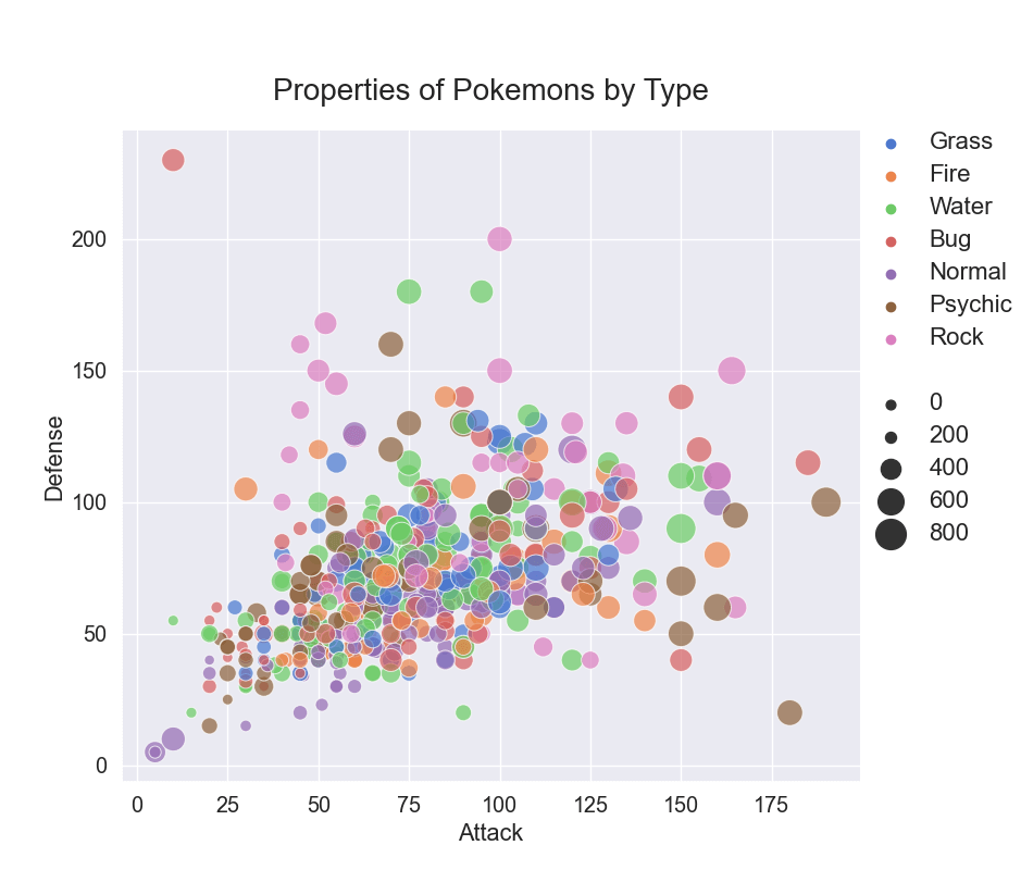
We’ll create a Seaborn scatterplot showing the properties of Pokemons depending on their types and total scores. The type will determine data points’ colors and the total score their size.
For our plot, we’ll need a data set with 3 numeric columns (2 for plotting in 2 dimensions plus 1 for point sizes) and 1 categorical column to create a “hue semantic” — to paint data points in different colors depending on Pokemon types.
For plotting, we’ll use the Pokemon dataset, which you can download on Kaggle (Pokemon.csv).
Since there are too many Pokemon types, we’ll find 7 most common ones (which are Rock, Fire, Psychic, Bug, Grass, Normal, and Water) and select pieces of data that correspond to those types:
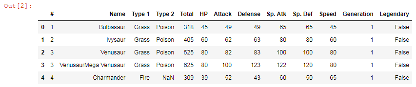
df = pd.read_csv('Pokemon.csv')
grouped = df.groupby(df['Type 1']).count()
df = df[df['Type 1'].isin(grouped.sort_values(by='Legendary').tail(7).index.values)]
df.head()
Here are the first 5 lines of the edited data set:
Plotting
We’ll create a Seaborn scatter plot in several steps. All the code snippets below should be placed inside one cell in your Jupyter Notebook.
1. Create a plot
Seaborn can create this plot with the scatterplot() method or with relplot() — if you need additional dimensions. We’ll use the latter one.
g = sns.relplot(x='Attack',
            y='Defense',
            hue='Type 1',
            size='Total',
            data=df,
            sizes=(40, 400),
            alpha=.7,
            palette='muted',
            height=8,
            aspect=8/8)
Here’s some more about parameters of sns.relplot():
- x, y: labels of the plot; variables that specify positions on the x and y axes (in our example, these are the names of df columns “Attack” and “Defence”)
- hue: 3rd variable that can be used to group multiple categories and show dependency between them in terms of different colors of the data points
- size: 4th variable that can be used to group multiple categories and show dependency between them in terms of different sizes of the data points
- data: data frame where the data is stored (df)
- sizes: range of data points’ sizes
- alpha: transparency of colors (0 = transparent, 1 = not transparent)
- palette: color theme (you can read about colormaps in the documentation)
- height: height of the scatterplot (not the figure)
- aspect: height/width of the scatterplot
By changing font_scale=1.3, you can decrease or increase the font size within the plot:
sns.set(font_scale = 1.3)
2. Set a title
title = 'Properties of Pokemons by Type'
plt.title(title, fontsize=20, pad=20)
plt.subplots_adjust(top=0.85)
pad=20 would create padding under the title, and plt.subplots_adjust would make sure our title and subtitle fit in the figure.
3. Edit the legend
In our example, Seaborn would create a legend with two legend titles — “Type” and “Total”. To get rid of them, we delete the text on lines #0 and #8 where our titles are located. We also move our legend with set_bbox_to_anchor and set the font size of legend labels with get_texts().
g._legend.texts[0].set_text('')
g._legend.texts[8].set_text('')
g._legend.set_bbox_to_anchor([1.01, .63])
plt.setp(g._legend.get_texts(), fontsize='16')
4. Save the plot as an image
filename = 'sns-scatterplot'
plt.savefig(filename+'.png')
That’s it, our Seaborn scatterplot is ready. You can download the notebook on GitHub to get the full code.
Read also: