Prerequisites
To create a bar chart, we’ll need the following:
- Python installed on your machine
- Pip: package management system (it comes with Python)
- Jupyter Notebook: an online editor for data visualization
- Pandas: a library to create data frames from data sets and prepare data for plotting
- Numpy: a library for multi-dimensional arrays
- Matplotlib: a plotting library
- Seaborn: a plotting library (we’ll only use part of its functionally to add gray grid to the plot and get rid of borders)
You can download the latest version of Python for Windows on the official website.
To get other tools, you’ll need to install recommended Scientific Python Distributions. Type this in your terminal:
pip install numpy scipy matplotlib ipython jupyter pandas sympy nose seaborn
Getting Started
Create a folder that will contain your notebook (e.g. “matplotlib-bar-chart”) and open Jupyter Notebook by typing this command in your terminal (don’t forget to change the path):
cd C:\Users\Shark\Documents\code\matplotlib-bar-chart
py -m notebook
This will automatically open the Jupyter home page at http://localhost:8888/tree. Click on the “New” button in the top right corner, select the Python version installed on your machine, and a notebook will open in a new browser window.
In the first line of the notebook, import all the necessary libraries:
import matplotlib.pyplot as plt
import matplotlib as mpl
import numpy as np
import pandas as pd
import seaborn as sns
sns.set()
%matplotlib notebook
You’ll need the last line (%matplotlib notebook) to display plots in input cells.
Data Preparation
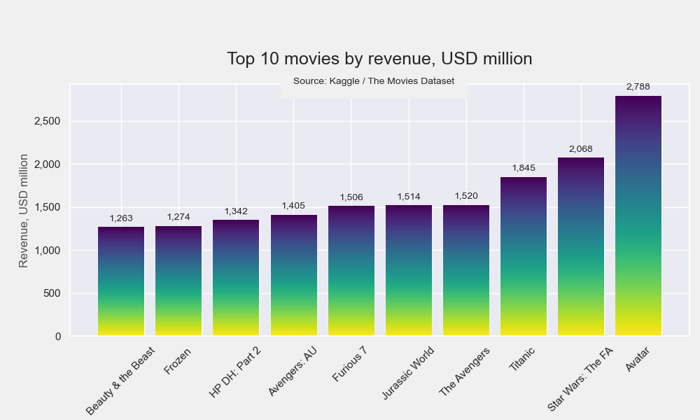
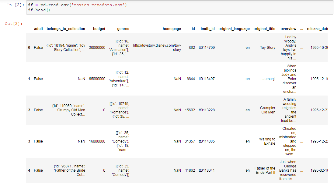
Let’s create a Python bar graph with labels that will show the top 10 movies with the highest revenue. We’ll plot a bar graph using a .csv file. Download the file named movies_metadata.csv on Kaggle and put it in your “matplotlib-bar-chart” folder.
On the second line of your Jupyter notebook, type this code to read the file and to display the first 5 rows:
df = pd.read_csv('movies_metadata.csv')
df.head()
Next, create a data frame, sort and format values:
data = pd.DataFrame(df, columns=['revenue', 'title'])
data_sorted = data.sort_values(by='revenue', ascending=False)
data_sorted['revenue'] = data_sorted['revenue'] / 1000000
pd.options.display.float_format = '{:,.0f}'.format
data_sorted.set_index('title', inplace=True)
ranking = data_sorted.head(10)
ranking
The output will look like this:
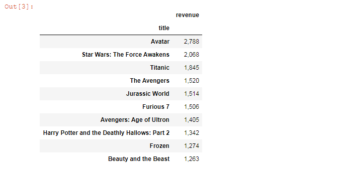
We’ll use this piece of data frame to create our chart.
Plotting
We’ll create a vertical ascending bar chart in 7 steps. All the code snippets below should be placed inside one cell in your Jupyter Notebook.
Here’s the list of variables that will be used in our code. You can insert your values or names if you like.
# Variables
index = ranking.index
values = ranking['revenue']
plot_title = 'Top 10 movies by revenue, USD million'
title_size = 18
subtitle = 'Source: Kaggle / The Movies Dataset'
y_label = 'Revenue, USD million'
filename = 'bar-plot'
1. Create subplots and set a colormap
First, sort data for plotting:
ranking.sort_values(by='revenue', inplace=True, ascending=True)
Next, draw a figure with a subplot. We’re using the viridis color scheme to create gradients later.
fig, ax = plt.subplots(figsize=(10,6), facecolor=(.94, .94, .94))
mpl.pyplot.viridis()
figsize=(10,6) creates a 1000 × 600 px figure.
facecolor means the color of the plot’s background.
mpl.pyplot.viridis() sets colormap (gradient colors from yellow to blue to purple). Other colormaps are plasma, inferno, magma, and cividis. See more examples in Matplotlib’s official documentation.
2. Create bars
bar = ax.bar(index, values)
plt.tight_layout()
ax.yaxis.set_major_formatter(mpl.ticker.StrMethodFormatter('{x:,.0f}'))
ax.bar() would create vertical bar plots, while ax.barh() would draw horizontal bar plots. We’re using Matplotlib bar, and our chart will have a vertical layout.
plt.tight_layout() adjusts subplot params so that subplots are nicely fit in the figure.
We’re also using set_major_formatter() to format ticks with commas (like 1,500 or 2,000).
3. Set title, its font size, and position
title = plt.title(plot_title, pad=20, fontsize=title_size)
plt.subplots_adjust(top=0.8, bottom=0.2, left=0.1)
pad=20 sets the title’s padding.
subplots_adjust() prevents the title and labels from being cropped.
4. Create gradient background
Set grid z-order to 0 and bar z-order to 1. This will hide the grid behind bars.
ax.grid(zorder=0)

def gradientbars(bars):
    grad = np.atleast_2d(np.linspace(0,1,256)).T
    ax = bars[0].axes
    lim = ax.get_xlim()+ax.get_ylim()
    for bar in bars:
        bar.set_zorder(1)
        bar.set_facecolor('none')
        x,y = bar.get_xy()
        w, h = bar.get_width(), bar.get_height()
        ax.imshow(grad, extent=[x,x+w,y,y+h], aspect='auto', zorder=1)
    ax.axis(lim)
gradientbars(bar)
extent=[x,x+w,y,y+h] means values in the following order: left, right, bottom, top. Change this to change the order of colors in the gradient, if needed.
5. Create bar labels/annotations
Since we’re creating a Python bar graph with labels, we need to define label values and label position.
def add_value_labels(ax, spacing=5):
    # For each bar: place a label
    for rect in ax.patches:
        # Get X and Y placement of label from rect
        y_value = rect.get_height()
        x_value = rect.get_x() + rect.get_width() / 2

        # Number of points between bar and label; change to your liking
        space = spacing
        # Vertical alignment for positive values
        va = 'bottom'

        # If value of bar is negative: place label below bar
        if y_value < 0:
            # Invert space to place label below
            space *= -1
            # Vertically align label at top
            va = 'top'

        # Use Y value as label and format number with one decimal place
        label = '{:,.0f}'.format(y_value)

        # Create annotation
        ax.annotate(
            label,                      # Use `label` as label
            (x_value, y_value),         # Place label at end of the bar
            xytext=(0, space),          # Vertically shift label by `space`
            textcoords='offset points', # Interpret `xytext` as offset in points
            ha='center',                # Horizontally center label
            va=va)                      # Vertically align label differently for
                                        # positive and negative values

# Call the function above
add_value_labels(ax)
6. Set a subtitle and labels, if needed
# Set subtitle
tfrom = ax.get_xaxis_transform()
ann = ax.annotate(subtitle, xy=(3, 1), xycoords=tfrom, bbox=dict(boxstyle='square,pad=1.3', fc='#f0f0f0', ec='none'))

#Set y-label
ax.set_ylabel(y_label, color='#525252')
You might also need to set custom x-axis labels (since some of the original movie titles are too long) and rotate them 45 degrees:
x = [0,1,2,3,4,5,6,7,8,9]
labels = ['Beauty & the Beast', 'Frozen', 'HP DH: Part 2', 'Avengers: AU', 'Furious 7', 'Jurassic World', 'The Avengers', 'Titanic', 'Star Wars: The FA', 'Avatar']
plt.xticks(x, labels, rotation=45)
7. Save the chart as a picture
plt.savefig(filename+'.png', facecolor=(.94, .94, .94))
You might need to repeat facecolor in savefig(). Otherwise, plt.savefig might ignore it.
That’s it, your vertical bar chart is ready. You can download the notebook on GitHub to get the full code.
Read also: