Prerequisites
To create a double-sided bar chart, we’ll need the following:
- Python installed on your machine
- Pip: package management system (it comes with Python)
- Jupyter Notebook: an online editor for data visualization
- Pandas: a library to prepare data for plotting
- Matplotlib: a plotting library
- Seaborn: a plotting library (we’ll only use part of its functionally to add a gray grid to the plot and get rid of Matplotlib’s default borders)
You can download the latest version of Python for Windows on the official website.
To get other tools, you’ll need to install recommended Scientific Python Distributions. Type this in your terminal:
pip install numpy scipy matplotlib ipython jupyter pandas sympy nose seaborn
Getting Started
Create a folder that will contain your notebook (e.g. “mpl-mirror”) and open Jupyter Notebook by typing this command in your terminal (don’t forget to change the path):
cd C:\Users\Shark\Documents\code\mpl-mirror
py -m notebook
This will automatically open the Jupyter home page at http://localhost:8888/tree. Click on the “New” button in the top right corner, select the Python version installed on your machine, and a notebook will open in a new browser window.
In the first line of the notebook, import all the necessary libraries:
import matplotlib.pyplot as plt
import matplotlib as mpl
import pandas as pd
import seaborn as sns
sns.set()
%matplotlib notebook
You’ll need the last line (%matplotlib notebook) to display plots in input cells.
Data Preparation
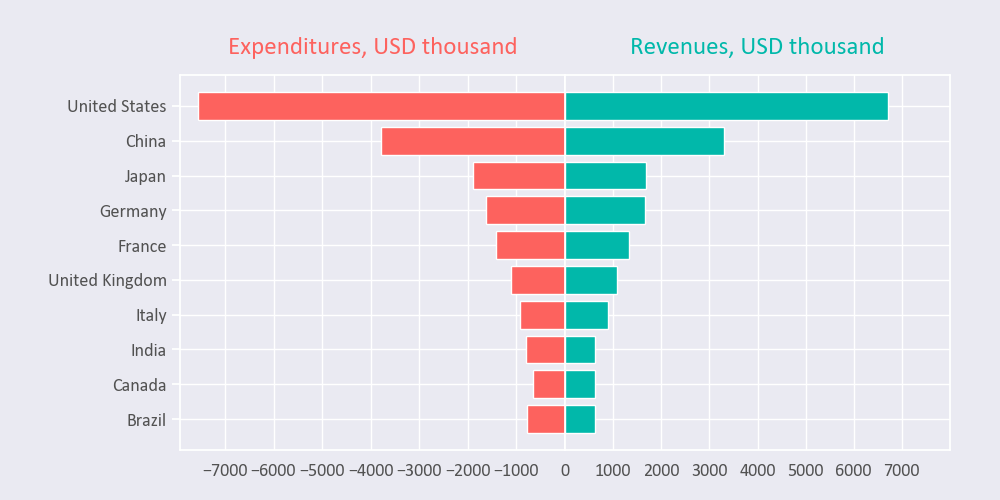
Let’s create a bidirectional bar chart that will show several countries’ revenues and expenditures. We’ll scrape a Wikipedia page and save the data as a .csv file.
Create a .py file in any folder you like and type the following:
import requests
import pandas as pd

url = 'https://en.wikipedia.org/wiki/List_of_countries_by_government_budget'
response = requests.get(url)
tables = pd.read_html(response.text)
tables[0].to_csv('data.csv')
This would create a .csv file with a table scraped from Wikipedia.
On the second line in your Jupyter notebook, type this code to read the file:
df = pd.read_csv('data.csv')
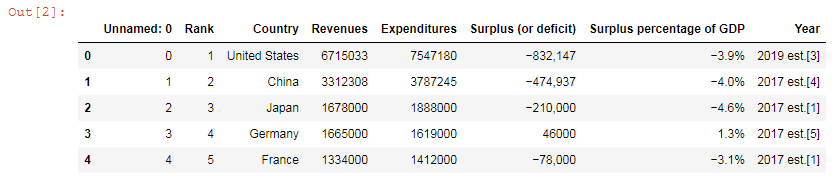
df.head()
This will show the first 5 lines of the .csv file:
Next, let’s select columns and rows we need for plotting and format numbers:
data = df[['Country','Revenues','Expenditures']].head(10)
data.set_index('Country', inplace=True)
data['Revenues'] = data['Revenues'].astype(float)
data['Revenues'] = data['Revenues'] / 1000
data['Expenditures'] = data['Expenditures'].astype(float)
data['Expenditures'] = data['Expenditures'] / 1000 * (-1)
data

We’ll use this piece of data to create our Matplotlib bidirectional bar chart.
Plotting
Here’s the list of variables we’ll use in our code:
font_color = '#525252'
hfont = {'fontname':'Calibri'}
facecolor = '#eaeaf2'
color_red = '#fd625e'
color_blue = '#01b8aa'
index = data.index
column0 = data['Expenditures']
column1 = data['Revenues']
title0 = 'Expenditures, USD thousand'
title1 = 'Revenues, USD thousand'
We’ll create a Matplotlib back-to-back chart in several steps. All the code snippets below should be placed inside one cell in your Jupyter Notebook.
1. Create a figure and subplots
fig, axes = plt.subplots(figsize=(10,5), facecolor=facecolor, ncols=2, sharey=True)
fig.tight_layout()
fig.set_size_inches(10, 5) creates a 1000 × 500 pixels figure.
ncols=2 would create two columns on the same figure.
sharey controls sharing of properties among y-axes (and sharex would control x-axes).
plt.tight_layout() adjusts subplot params so that subplots are nicely fit in the figure.
2. Create bars and set titles
axes[0].barh(index, column0, align='center', color=color_red, zorder=10)
axes[0].set_title(title0, fontsize=18, pad=15, color=color_red, **hfont)
axes[1].barh(index, column1, align='center', color=color_blue, zorder=10)
axes[1].set_title(title1, fontsize=18, pad=15, color=color_blue, **hfont)
bar() would create vertical bar plots, while barh() would draw horizontal bar plots. We’re using Matplotlib barh, and our chart will have a horizontal layout.
Also, use this additional code if you need:
# If you have positive numbers and want to invert the x-axis of the left plot
axes[0].invert_xaxis()

# To show data from highest to lowest
plt.gca().invert_yaxis()
3. Edit ticks
axes[0].set(yticks=data.index, yticklabels=data.index)
axes[0].yaxis.tick_left()
axes[0].tick_params(axis='y', colors='white') # tick color
axes[0].yaxis.tick_left() would set common labels (country names in our example) to the left of the left plot. Change this to axes[0].yaxis.tick_right() if you want to place the labels between subplots.
We can also add more ticks on the x-axis of the right plot to make the chart look symmetrical:
axes[1].set_xticks([1000, 2000, 3000, 4000, 5000, 6000, 7000, 8000])
4. Edit tick labels
Next, let’s hide the text of the last x-tick label as well as set font size, font color, and font family for our tick labels.
axes[1].set_xticklabels([1000, 2000, 3000, 4000, 5000, 6000, 7000])

for label in (axes[0].get_xticklabels() + axes[0].get_yticklabels()):
    label.set(fontsize=13, color=font_color, **hfont)
for label in (axes[1].get_xticklabels() + axes[1].get_yticklabels()):
    label.set(fontsize=13, color=font_color, **hfont)
5. Adjust subplots
Adjust subplots so that our titles and labels would fit in the figure:
plt.subplots_adjust(wspace=0, top=0.85, bottom=0.1, left=0.18, right=0.95)
You can increase wspace if you need space between two subplots of the chart.
6. Save the chart as a picture
filename = 'mpl-bidirectional'
plt.savefig(filename+'.png', facecolor=facecolor)
You might need to repeat facecolor in savefig(). Otherwise, plt.savefig might ignore it.
That’s it, our Matplotlib bidirectional chart is ready. You can download the notebook on GitHub to get the full code.
Read also: