Here is the complete guide to CSS Grid that includes all the main properties with examples.
CSS Grid is a system for building responsive websites. There are many things you can try with CSS Grid, for instance, an image gallery, chessboard, comic book layout or restaurant menu.
CSS Grid vs Flexbox
Like Flexbox, CSS Grid is a method to create a responsive layout. However, there is a difference: Flexbox is made for one-dimensional layouts and Grid is useful to create two-dimensional layouts. If you’re laying out items in one direction (for instance, buttons inside a navigation element), then you should use Flexbox. But if you’re creating an entire layout with both rows and columns , you should choose CSS Grid. And, of course, you can combine the two.
With Flexbox, you define the content. And with CSS Grid, you have to define the layout (columns and rows) first. You define the width of the columns and height of the rows, and only after that place the content in the available grid cells.
Terminology
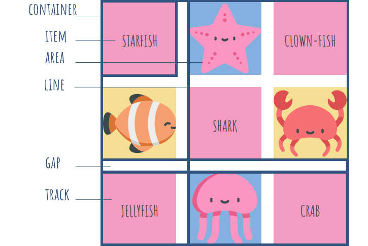
Grid Container is the element on which display: grid; is applied. It's the direct parent of all the grid items.
Absolutely-positioning an element to a grid container allows it to align to that container’s grid lines. However, such elements don’t take up space or participate in the grid layout.
Grid items are the children (direct descendants) nested inside the parent grid container. They can be any elements and can represent a header, sidebar, footer, etc.
Note: float, clear, display: inline-block, display: table-cell and vertical-align properties don’t affect a grid item.You should also avoid using percentages in paddings or margins on grid items, as they will get different behavior in different browsers.
Grid lines are the dividing lines that make up the structure of the grid. They can be vertical (column grid lines) or horizontal (row grid lines) and be on either side of a row or column.
Grid track is the space between two adjacent grid lines. Grid tracks are columns or rows of the grid.
Grid cell is the space between two adjacent row and two adjacent column grid lines. It’s a single unit of the grid. You can span an item across multiple cells.
Grid area is the total space surrounded by four grid lines. It may be comprised of any number of grid cells.
Grid Container
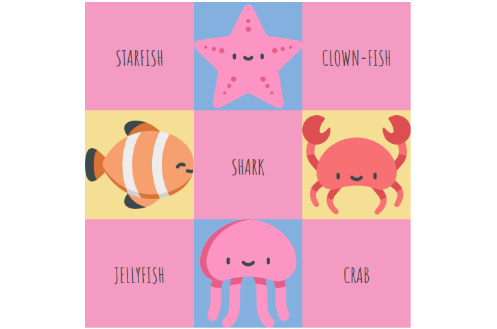
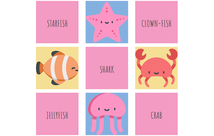
To make a CSS grid container, apply display: grid; to a parent <div> element. The display property can have another value — inline-grid — that generates an inline-level grid.
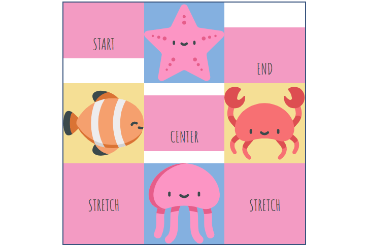
<div class="container">
    <div class="item1">starfish</div>
    <div class="item2"></div>
    <div class="item3">clown-fish</div>
    <div class="item4"></div>
    <div class="item5">shark</div>
    <div class="item6"></div>
    <div class="item7">jellyfish</div>
    <div class="item8"></div>
    <div class="item9">crab</div>
</div>
.container {
  display: grid;
}
CSS Grid Template
There are four grid-template-* properties: grid-template-rows, grid-template-columns, grid-template-areas, and grid-template. The last one is a shorthand for the first three.
grid-template-columns and grid-template-rows
CSS grid-template-columns and grid-template-rows properties define the columns and rows of the grid.
Their values represent the track size (can be a length, percentage, or a fraction of the free space in the grid — the fr unit), and the space between them is the grid line (a name of your choosing).
.container {
  grid-template-columns: <track-size> | <line-name> <track-size>;
  grid-template-rows: <track-size> | <line-name> <track-size>;
}
If your definition contains repeating parts, you can use the repeat() function:
.container {
  grid-template-rows: repeat(3, 33.33%);
  grid-template-columns: repeat(3, 33.33% [col-start]);
}
Which is equivalent to this:
container {
  grid-template-rows: 33.33% 33.33% 33.33%;
  grid-template-columns: 33.33% [col-start] 33.33% [col-start] 33.33% [col-start];
}
It creates three rows with a height of 33.33% and three columns with a width of 33.33%.
If you want the columns’ or rows’ width or height be dependent on the content size, use grid-template-columns: auto; or grid-template-rows: auto;.
grid-template-areas
This property defines a grid template by referencing the names of the grid areas which are specified with the grid-area property. Repeating the name of a grid area causes the content to span across those cells. The syntax visually represents the structure of the grid.
.container {
  display: grid;
  grid-template-rows: repeat(4, 25%);
  grid-template-columns: repeat(5, 20%);
  grid-template-areas:
    'a b b b b'
    'a c c c d'
    'a c c c d'
    'e f g h i';
}
Template areas for each row should be enclosed in quotes. Template area names cannot use spaces — use dashes or underscores instead (e. g. “top-left”, “top_left” or — alternatively — “TopLeft”). It also makes sense to use the first character of the items the template areas are describing (e. g. “h” for header, “m” for menu, “f” for footer).
The grid-area gives an item a name so that it can be referenced by a template created with the grid-template-areas property.
.item2 { grid-area: a; }
.item4 { grid-area: b; }
.item6 { grid-area: c; }
.item8 { grid-area: d; }

.item1 { grid-area: e; }
.item3 { grid-area: f; }
.item5 { grid-area: g; }
.item7 { grid-area: h; }
.item9 { grid-area: i; }
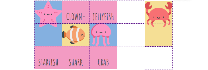
That’ll create a grid that’s 5 columns wide by 4 rows tall:
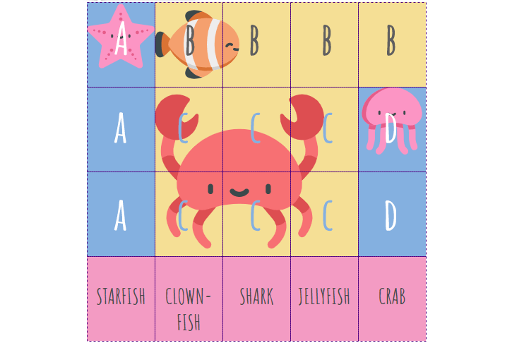
“A” is one area spanning 3 cells down, and “B” is spanning 4 cells to the right. CSS Grid automatically treats them as separate blocks.
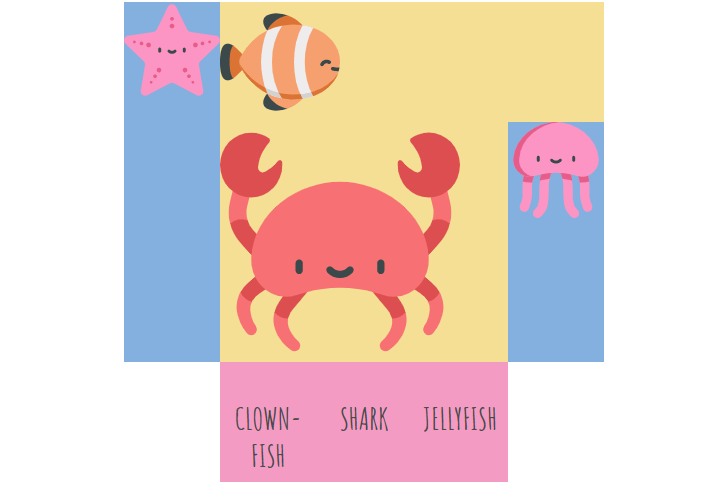
You can use a period as a grid-area value. It will signify an empty grid cell:
grid-template-areas:
  'a b b b b'
  'a c c c d'
  'a c c c d'
  '. f g h .';
grid-template
The grid-template property is a shorthand for setting grid-template-rows, grid-template-columns, and grid-template-areas in a single declaration.
.container {
  display: grid;
  grid-template:
    'a b b b b' 25% // represents a row with areas and the row’s height
    'a c c c d' 25%
    'a c c c d' 25%
    'e f g h i' 25%
    / 20% 20% 20% 20% 20%; // represents columns’ widths
}
The repeat() function isn’t allowed in these track listings, as the tracks are intended to visually line up one-to-one with the rows or columns.
That’s equivalent to this:
.container {
  display: grid;
  grid-template-rows: repeat(4, 25%);
  grid-template-columns: repeat(5, 20%);
    grid-template-areas:
    'a b b b b'
    'a c c c d'
    'a c c c d'
    'e f g h i';
}
Grid Auto
There are three grid-auto-* properties: grid-auto-rows, grid-auto-columns, and grid-auto-flow.
While the grid-template-* properties are used to define both the position and size of grid cells, the grid-auto-* properties are used only to define the size of grid cells. Unlike the grid-template-* properties, the grid-auto-* properties only accept a single length value.
grid-auto-columns and grid-auto-rows
These properties specify the size of grid tracks that get created when there are more grid items than cells in the grid or when a grid item is placed outside of the grid defined by grid-template-* properties (the explicit grid).
Use the grid-auto-columns property to set a default width for all columns. The grid-template-columns property overrides this property.
Use the grid-auto-rows property to set a default height for all rows. The grid-template-rows property overrides this property.
The grid-auto-columns and grid-auto-rows can have the following values:
- auto: sets the size of the rows or columns based on the size of the container default value; cells with auto will stretch to fill remaining space based on parent container size
- max-content: sets the size of each row or column depending on the largest item in the row or column
- min-content: sets the size of each row or column depending on the smallest item in the row or column
- <length>: sets the size of the rows or columns by using a length value (px, em, %, etc.)
- minmax(min, max): sets a size range greater than or equal to min and less than or equal to max (applies to grid-auto-columns only)
- fr: a fraction of the free space in the grid (applies to grid-auto-columns only)
.container {
  display: grid;
  grid-auto-rows: 150px;
}
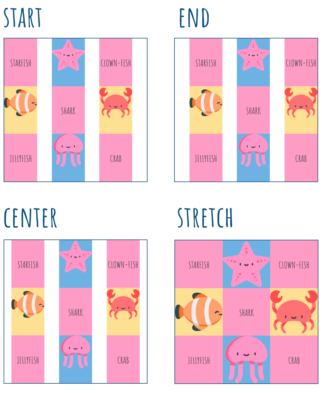
grid-auto-flow
If you have grid items that are not explicitly placed on the grid, you can use the grid-auto-flow property that will automatically place the items.
It may have the following values:
- row: fills in each row in turn, adding new rows if necessary (default)
- column: fills in each column in turn, adding new columns if necessary
- dense: forces child elements to fill in gaps if they can fit (if smaller items come up later). This value changes the visual order of items and might cause them to appear out of order
If you set grid-auto-flow to column, items will flow down the columns:
.container {
  display: grid;
  grid-template-rows: 80px 80px 80px;
  grid-template-columns: 96px 96px 96px 96px;
  grid-auto-flow: column;
}

.item2 {
  grid-column: 1;
  grid-row: 1 / 3;
}

.item6 {
  grid-column: 5;
  grid-row: 1 / 3;
}
If you set grid-auto-flow to dense, the gaps will be filled in:
Grid Gaps
Gaps are the horizontal and vertical spaces between grid cells. They specify the size of the grid lines. You can create grid gaps using grid-column-gap and grid-row-gap properties. grid-column-gap: 24px; creates a 24px gap between columns, grid-row-gap: 24px; creates a 24px gap between rows.
.container {
  display: grid;
  grid-template-rows: repeat(3, 30%);
  grid-template-columns: repeat(3, 30%);
  grid-row-gap: 12px;
  grid-column-gap: 24px;
}
You can use grid-gap as a shorthand for grid-row-gap and grid-column-gap.
.container {
  display: grid;
  grid-template-rows: repeat(3, 30%);
  grid-template-columns: repeat(3, 30%);
  grid-gap: 12px 24px;
}
How to Align Items Horizontally
These properties align the grid along the horizontal axis: justify-items, justify-content, and justify-self.
justify-items
This property applies to all grid items inside the container. The justify-items property may have the following values:
- start: aligns items towards the start edge of their cell
- end: aligns items towards the end edge of their cell
- center: aligns items in the center of their cell
- stretch: fills the whole width of the cell (default)
.container {
  justify-items: start | end | center | stretch;
}
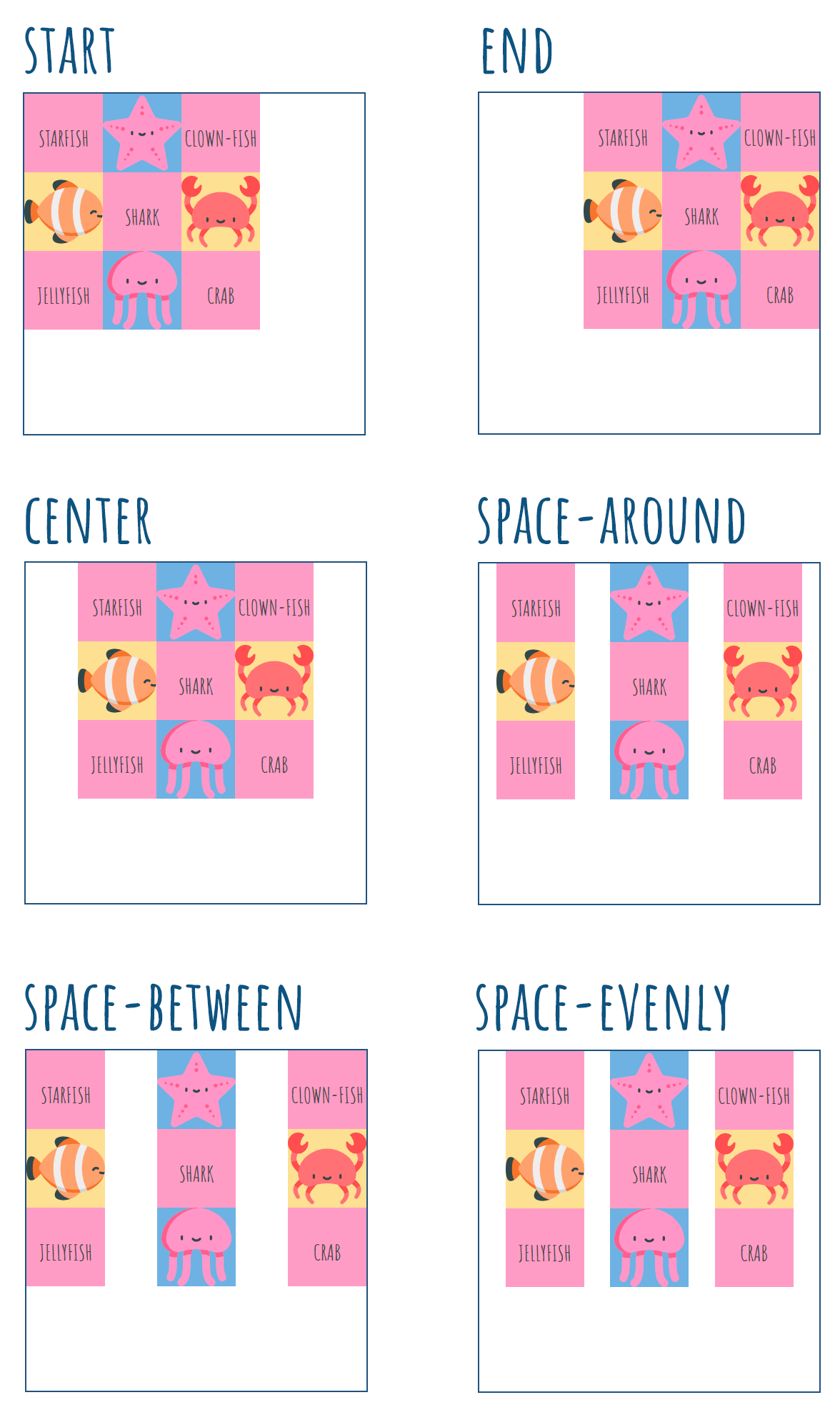
justify-content
Sometimes the total size of the grid might be less than the size of the grid container. This could happen if all of your grid items are sized with non-flexible units like px. In this case, you can align the grid content within the grid container with the help of the justify-content property.
It may have the following values:
- start: aligns the grid towards the start edge of the grid container
- end: aligns the grid towards the end edge of the grid container
- center: aligns the grid in the center of the grid container
- stretch: resizes the grid items to allow the grid to fill the full width of the grid container (doesn’t work with non-flexible units)
- space-around: places an even amount of space between each grid item, with half-sized spaces on the far ends
- space-between: places an even amount of space between each grid item, with no space at the far ends
- space-evenly: places an even amount of space between each grid item, including the far ends
.container {
  justify-content: start | end | center | stretch | space-around | space-between | space-evenly;
}
justify-self
To align an individual grid item inside a single cell, set the justify-self property on that individual item. It can have the following values:
- start: aligns the grid item to the left edge of the cell
- end: aligns the grid item to the right edge of the cell
- center: aligns the grid item in the center of the cell
- stretch: fills the whole width of the cell (default)
.item {
  justify-self: start | end | center | stretch;
}
How to Align Items Vertically
These properties align the grid along the vertical axis: align-items, align-content, and align-self.
align-items
This property applies to all grid items inside the container. The align-items property may have the following values:
- start: aligns items towards the start edge of their cell
- end: aligns items towards the end edge of their cell
- center: aligns items in the center of their cell
- stretch: fills the whole height of the cell (default)
.container {
  align-items: start | end | center | stretch;
}
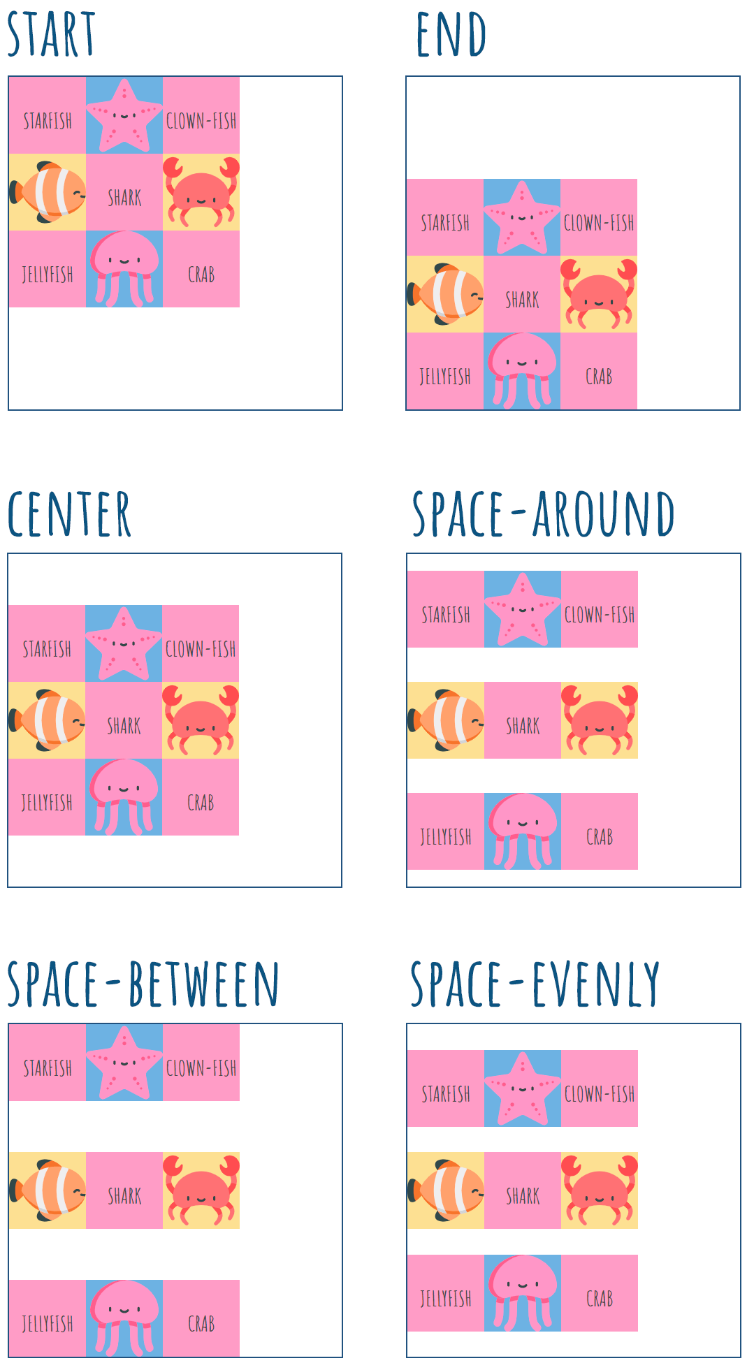
align-content
Sometimes the total size of your grid might be less than the size of the grid container. This could happen if all of your grid items are sized with non-flexible units like px. In this case, you can align the grid content within the grid container with the help of the align-content property.
It may have the following values:
- start: aligns the grid towards the start edge of the grid container
- end: aligns the grid towards the end edge of the grid container
- center: aligns the grid in the center of the grid container
- stretch: resizes the grid items to allow the grid to fill the full height of the grid container (doesn’t work with non-flexible units)
- space-around: places an even amount of space between each grid item, with half-sized spaces on the far ends
- space-between: places an even amount of space between each grid item, with no space at the far ends
- space-evenly: places an even amount of space between each grid item, including the far ends
.container {
  align-content: start | end | center | stretch | space-around | space-between | space-evenly;
}
align-self
To align an individual grid item inside a single cell, set the align-self property on that individual item. It can have the following values:
- start: aligns the grid item to the left edge of the cell
- end: aligns the grid item to the right edge of the cell
- center: aligns the grid item in the center of the cell
- stretch: fills the whole height of the cell (default)
.item {
  align-self: start | end | center | stretch;
}
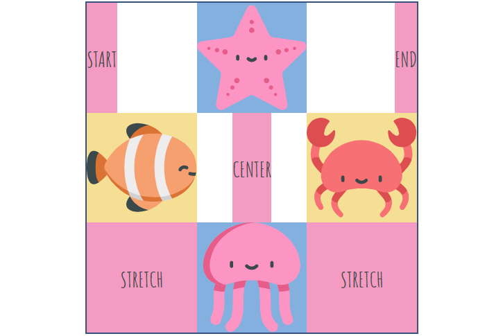
Align Both Horizontally and Vertically
The place-* properties are shorthands for justify-* and align-* properties.
place-items
place-items sets both the align-items and justify-items properties in a single declaration.
.container {
  <align-items> / <justify-items>
}
The first value sets align-items, and the second value sets justify-items. If the second value is omitted, the first value is assigned to both properties.
Examples:
.container {
  place-items: center;
}

.container {
  place-items: center stretch;
}
place-content
place-content sets both the align-content and justify-content properties in a single declaration.
.container {
  <align-content> / <justify-content>
}
The first value sets align-content, and the second value sets justify-content. If the second value is omitted, the first value is assigned to both properties.
Examples:
.container {
  place-content: center;
}

.container {
  place-content: center stretch;
}
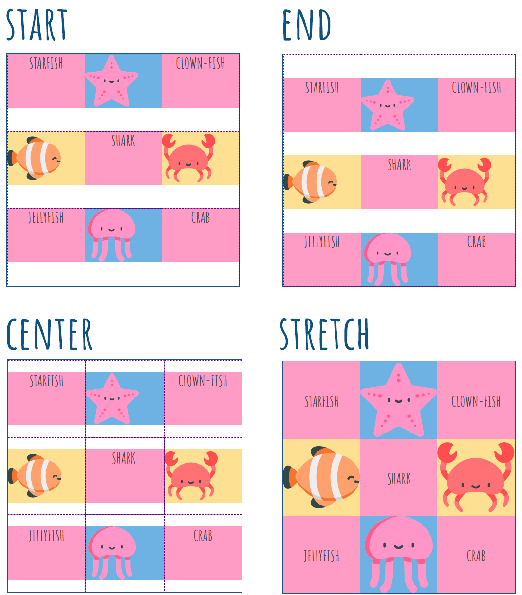
place-self
place-self sets both the align-self and justify-self properties in a single declaration.
.item {
  <align-self> / <justify-self>
}
The first value sets align-self, and the second value sets justify-self. If the second value is omitted, the first value is assigned to both properties.
Examples:
.item1 {
  place-self: center;
}

.item3 {
  place-self: center stretch;
}
Grid (Shorthand)
The grid property is a shorthand property that sets all of the explicit grid properties (grid-template-rows, grid-template-columns, and grid-template-areas) or all the implicit grid properties (grid-auto-rows, grid-auto-columns, and grid-auto-flow) in a single declaration.
You can only specify the explicit or the implicit grid properties in a single grid declaration.
.container {
  grid: 250px 400px / 4fr 2fr;
}
Is equivalent to:
.container {
  grid-template-rows: 250px 400px;
  grid-template-columns: 4fr 2fr;
}
Grid-*-start, grid-*-end
This set of properties (grid-column-start, grid-column-end, grid-row-start, grid-row-end) determines a grid item’s location within the grid and specify starting and ending points across which you want to span cell content. They refer to specific grid lines and apply to an item, not to the container.
- grid-column-start/grid-row-start is the line where the item begins
- grid-column-end/grid-row-end is the line where the item ends
These properties may have the following values:
- <line>: a number to refer to a numbered grid line or a name to refer to a named grid line
- span <number>: the item will span across the provided number of grid tracks
- span <name>: the item will span across until it hits the next line with the provided name
- auto: an automatic span or a default span
You can also use a shorthand: grid-column (for grid-column-start + grid-column-end) or grid-row (grid-row-start + grid-row-end). Each one accepts the same values as the longhand version.
For example:
.item {
  grid-row-start: 2;
  grid-row-end: 4;
}
Or:
.item {
  grid-row: 2 / span 3;
}
It means that the item will take up rows 2 to 4. If it’s written as grid-row: 2 / span 3, the first part is the row where the item begins, and the second part is the number of cells the item will span across. It works the same for columns.
Grid items can overlap when you specify the order with z-index. Descendants that are positioned outside a grid item still participate in the grid layout.
Special Keywords and Functions
When sizing rows and columns, you can use various lengths: like px, rem, %, etc. You also can use keywords like auto-fit, auto-fill, min-content, max-content, fractional units (fr), as well as functions such as minmax() and repeat().
auto-fill fills the row with as many columns as it can fit. It creates columns whenever a new column can fit. The newly added columns can be empty, but they will still occupy a designated space in the row.
.container {
  grid-template-columns: repeat(auto-fill, minmax(100px, 1fr));
}
auto-fit fits the currently available columns into space by expanding them so that they take up any available space. It allows wrapping columns into rows when there’s not enough space to fit the minimum value without overflowing the content. The newly added columns will not occupy any space and will be collapsed.
.container {
  grid-template-columns: repeat(auto-fit, minmax(100px, 1fr));
}
A fractional (fr) unit is one part of the available space. 1fr tells the browser to distribute the space between the columns so that each column gets one equal fraction of that space. If the width of the div is 400px, repeat(4, 1fr) means that 400px will be divided into 4 equal parts of 100px. You can also use floating-point numbers to define fr. The same 1fr within the same parent will shrink to a smaller size when gaps are added.
.container {
  grid-template-columns: repeat(4, 1fr);
}
min-content represents the largest min-content contribution of the grid items occupying the grid track. min-content contribution is the size that a box contributes to its containing block’s min-content size.
.container {
  grid-template-columns: 200px 1fr 2fr min-content;
}
max-content represents the largest max-content contribution of the grid items occupying the grid track. max-content contribution is the size that a box contributes to its containing block’s max-content size.
.container {
  grid-template-columns: 200px 1fr 2fr max-content;
}
minmax(min, max) sets a size range greater than or equal to min and less than or equal to max. For example, to set a column to be 1fr, but shrink no further than 300px:
.container {
  grid-template-columns: 1fr minmax(300px, 1fr);
}
repeat() allows repeating columns or rows as many times as needed. For example, to make 5 columns:
.container {
  grid-template-columns: repeat(5, 1fr);
}
Which is equivalent to this:
container {
  grid-template-columns: 1fr 1fr 1fr 1fr 1fr;
}
You can combine these things, for example:
grid-template-columns: repeat(auto-fill, minmax(300px, 1fr));
Responsive CSS Grid
Make your layouts responsive. Below is a simple example of how to do it.
1. Create a container and put some elements inside it.
<div class="container">
    <div class="menu"><span>MENU</span></div>
    <div class="aside"><span>ASIDE</span></div>
    <div class="content"><span>CONTENT</span></div>
    <div class="footer"><span>FOOTER</span></div>
</div>
2. Apply display: grid; to the container.
.container {
  display: grid;
}
3. Define grid items.
.menu {
  grid-area: m;
  background: #7eb4e2;
}

.aside {
  grid-area: a;
  background: #f69ec4;
}

.content {
  grid-area: c;
  background: #f9dd94;
}

.footer {
  grid-area: f;
  background: #32557f;
  color: #fff;
}
4. Define rows, columns and the grid template for wide-screen devices. For example, create a grid of 3 rows and 12 columns.
.container {
  display: grid;
  grid-gap: 2% 1.5%;
  grid-template-rows: 18% 60% 18%;
  grid-template-columns: repeat(12, 1fr);
  grid-template-areas:
    'm m m m m m m m m m m m'
    'a a a a c c c c c c c c'
    'f f f f f f f f f f f f';
}
5. Change the template for mobile devices with the help of media queries. For example, shift the .aside element to an additional row.
@media screen and (max-width: 768px) {
  .container {
    grid-template-rows: 18% 35% 23% 18%;
    grid-template-columns: repeat(12, 1fr);
    grid-template-areas:
      'm m m m m m m m m m m m'
      'c c c c c c c c c c c c'
      'a a a a a a a a a a a a'
      'f f f f f f f f f f f f';
  }
}
Here is a demo (open it in a new window to see how it looks on a widescreen):
CSS Grid Website Examples
Here are a few examples of what you can do with CSS Grid: