
Prerequisites
To create a stacked bar chart, we’ll need the following:
- Python installed on your machine
- Pip: package management system (it comes with Python)
- Jupyter Notebook: an online editor for data visualization
- Pandas: a library to prepare data for plotting
- Matplotlib: a plotting library
- Seaborn: a plotting library (we’ll only use part of its functionally to add a gray grid to the plot and get rid of Matplotlib’s default borders)
You can download the latest version of Python for Windows on the official website.
To get other tools, you’ll need to install recommended Scientific Python Distributions. Type this in your terminal:
pip install numpy scipy matplotlib ipython jupyter pandas sympy nose seaborn
Getting Started
Create a folder that will contain your notebook (e.g. “mpl-stacked”) and open Jupyter Notebook by typing this command in your terminal (don’t forget to change the path):
cd C:\Users\Shark\Documents\code\mpl-stacked
py -m notebook
This will automatically open the Jupyter home page at http://localhost:8888/tree. Click on the “New” button in the top right corner, select the Python version installed on your machine, and a notebook will open in a new browser window.
In the first line of the notebook, import all the necessary libraries:
import matplotlib.pyplot as plt
import matplotlib as mpl
import pandas as pd
import seaborn as sns
sns.set()
import re
%matplotlib notebook
You’ll need the last line (%matplotlib notebook) to display plots in input cells.
Data Preparation
Let’s create a stacked chart that will show the pay structure in San Francisco. We’ll plot a Matplotlib/Seaborn stacked bar chart using a .csv file. You can download the SF Salaries dataset on Kaggle (Salaries.csv).
On the second line in your Jupyter notebook, type this code to read the file:
df = pd.read_csv('Salaries.csv')
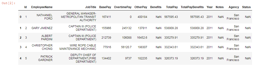
df.head()
This will show the first 5 lines of the .csv file:
Next, prepare the data for plotting:
# Delete columns we don’t need
df = df.drop(['Id','EmployeeName','TotalPay','Year','Notes','Agency','Status'], axis=1)
# Delete any row with NaN values
df = df.dropna(how='any')
# Delete any row with zero values
df = df[df!=0].dropna()
# Sort values to show the highest salaries
df = df.sort_values(by='TotalPayBenefits')
data = df.tail()
# Set 'JobTitle' as the index
data.set_index('JobTitle', inplace=True)
# Rename columns by adding spaces
data = data.rename(columns=lambda x: re.sub('([a-z])([A-Z])','\g<1> \g<2>',x))
# Format values
data = data / 1000
data
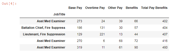
Our data are now ready for plotting.
Plotting
We’ll need the following variables for plotting:
font_color = '#525252'
csfont = {'fontname':'Georgia'} # title font
hfont = {'fontname':'Calibri'} # main font
colors = ['#f47e7a', '#b71f5c', '#621237', '#dbbaa7']
1. Create a plot
ax = data.iloc[:, 0:4].plot.barh(align='center', stacked=True, figsize=(10, 6), color=colors)
plt.tight_layout()
data.iloc[:, 0:4] selects all columns except the last one, which we needed only for sorting the data. And stacked=True makes bars stack on top of one another.
barh creates a horizontal bar plot, while bar plots a vertical layout.
figsize=(10, 6) creates a 1000 × 600 px figure.
plt.tight_layout() adjusts subplot params so that subplots are nicely fit in the figure.
2. Create a title
title = plt.title('San Francisco salaries, USD thousand', pad=60, fontsize=18, color=font_color, **csfont)
title.set_position([.5, 1.02])

# Adjust the subplot so that the title would fit
plt.subplots_adjust(top=0.8, left=0.26)
pad=60 sets the title padding.
3. Set labels’ and ticks’ font size and color
for label in (ax.get_xticklabels() + ax.get_yticklabels()):
    label.set_fontsize(15)
plt.xticks(color=font_color, **hfont)
plt.yticks(color=font_color, **hfont)
4. Create a legend
legend = plt.legend(loc='center',
       frameon=False,
       bbox_to_anchor=(0., 1.02, 1., .102),
       mode='expand',
       ncol=4,
       borderaxespad=-.46,
       prop={'size': 15, 'family':'Calibri'})

for text in legend.get_texts():
    plt.setp(text, color=font_color) # legend font color
plt.legend has several parameters. Here are some of them:
- frameon=False removes the legend’s border
- bbox_to_anchor sets the position
- mode='expand' makes the legend span the entire width of the subplot
- ncol sets the number of colons in the legend
- borderaxespad=-.46 removes the padding (this is useful if you removed the legend’s frame)
5. Create annotations
for p in ax.patches:
    width, height = p.get_width(), p.get_height()
    x, y = p.get_xy()
    ax.text(x+width/2,
            y+height/2,
            '{:.0f}'.format(width),
            horizontalalignment='center',
            verticalalignment='center',
            color='white',
            fontsize=14,
            **hfont)
Note that if you’re creating a vertical stacked bar plot, you need to set '{:.0f} %'.format(height) instead of '{:.0f}'.format(width).
6. Save the chart as a picture
filename = 'mpl-stacked'
plt.savefig(filename+'.png')
That’s it, your Matplotlib stacked bar chart is ready. You can download the notebook on GitHub to get the full code.
Read also: