
Bootstrap is one of many CSS frameworks along with Simple Grid, Pure.css, and Foundation. Bootstrap is the most popular CSS framework, and its most useful feature is its grid system.
Bootstrap’s grid system uses a series of containers, rows, and columns to layout and align content. It’s built with flexbox and is fully responsive.
How To Install Bootstrap
There are two ways to install Bootstrap.
1. To quickly add Bootstrap to your project, insert the stylesheet and JS links. Put the stylesheet <link> into the <head> tag before all other stylesheets to load Bootstrap CSS and after the two required <meta> tags.
<head>
    <meta charset="utf-8">
    <meta name="viewport" content="width=device-width, initial-scale=1, shrink-to-fit=no">
    <link rel="stylesheet" href="https://stackpath.bootstrapcdn.com/bootstrap/4.3.1/css/bootstrap.min.css" integrity="sha384-ggOyR0iXCbMQv3Xipma34MD+dH/1fQ784/j6cY/iJTQUOhcWr7x9JvoRxT2MZw1T" crossorigin="anonymous">
...
</head>
Place the <script>s right before the closing </body> tag. jQuery must come first, then Popper.js, and then Bootstrap JS plugins.
<body>
    ...
    <script src="https://code.jquery.com/jquery-3.3.1.slim.min.js" integrity="sha384-q8i/X+965DzO0rT7abK41JStQIAqVgRVzpbzo5smXKp4YfRvH+8abtTE1Pi6jizo" crossorigin="anonymous"></script>
    <script src="https://cdnjs.cloudflare.com/ajax/libs/popper.js/1.14.7/umd/popper.min.js" integrity="sha384-UO2eT0CpHqdSJQ6hJty5KVphtPhzWj9WO1clHTMGa3JDZwrnQq4sF86dIHNDz0W1" crossorigin="anonymous"></script>
    <script src="https://stackpath.bootstrapcdn.com/bootstrap/4.3.1/js/bootstrap.min.js" integrity="sha384-JjSmVgyd0p3pXB1rRibZUAYoIIy6OrQ6VrjIEaFf/nJGzIxFDsf4x0xIM+B07jRM" crossorigin="anonymous"></script>
</body>
2. To drop chosen Bootstrap files into your project, you can download files with compiled code. Follow the link, download files and choose three of them that will be used for Bootstrap grid system: bootstrap.min.css, bootstrap-grid.min.css, and bootstrap.bundle.min.js.
Put the stylesheet <link> into the <head> tag before all other stylesheets to load Bootstrap CSS and after the two required <meta> tags. Indicate the path to the Bootstrap CSS files in your project:
<head>
    <meta charset="utf-8">
    <meta name="viewport" content="width=device-width, initial-scale=1, shrink-to-fit=no">

    <link href="css/bootstrap.min.css" rel="stylesheet">
    <link href="css/bootstrap-grid.min.css" rel="stylesheet">
...
</head>
After that, place the <script>s right before the closing </body> tag. jQuery must come first, then Popper.js, and then Bootstrap JS plugins.
<body>
…
    <script src="https://code.jquery.com/jquery-3.3.1.slim.min.js" integrity="sha384-q8i/X+965DzO0rT7abK41JStQIAqVgRVzpbzo5smXKp4YfRvH+8abtTE1Pi6jizo" crossorigin="anonymous"></script>
    <script src="https://cdnjs.cloudflare.com/ajax/libs/popper.js/1.14.7/umd/popper.min.js" integrity="sha384-UO2eT0CpHqdSJQ6hJty5KVphtPhzWj9WO1clHTMGa3JDZwrnQq4sF86dIHNDz0W1" crossorigin="anonymous"></script>
    <script src="js/bootstrap.bundle.min.js"></script>
</body>
Bootstrap Grid Container
In Bootstrap grid system, all columns and rows should be placed inside the parent .container element. Use .container for a fixed (pixel) width or .container-fluid for full width (width: 100%) across all viewport and device sizes.
<div class="container">
    <!-- Rows and columns will be placed here -->
</div>
Rows and Columns
Bootstrap grid system includes columns (.col elements) that contain the content and rows (.row elements) that are used to create horizontal groups of columns.
Columns should be nested inside rows. You can use a maximum of 12 columns per one row. Only columns may be immediate children of rows. And content should be placed inside columns.
Column classes indicate the number of columns you’d like to use out of the possible 12 per row. So, if you want 3 equal-width columns across, you can use .col-4.
This code creates 3 columns each having the width of 4 grid columns out of 12:
<div class="container">
    <div class="row">
        <div class="col-4">
            One of three columns
        </div>
        <div class="col-4">
            One of three columns
        </div>
        <div class="col-4">
            One of three columns
        </div>
    </div>
</div>
Columns have horizontal padding to create the gutters between individual columns. This padding is counteracted on the rows with negative margins. You can remove the padding from columns and margin from rows with .no-gutters class on the .row element.
.no-gutters {
  margin-right: 0;
  margin-left: 0;

  > .col,
  > [class*="col-"] {
    padding-right: 0;
    padding-left: 0;
  }
}
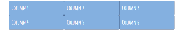
You can create equal-width columns that span multiple rows by inserting an element with the .w-100 class where you want the columns to break to a new line.
<div class="container">
    <div class="row">
        <div class="col">Column 1</div>
        <div class="col">Column 2</div>
        <div class="col">Column 3</div>

        <!-- Force next columns to break to new line -->
        <div class="w-100"></div>

        <div class="col">Column 4</div>
        <div class="col">Column 5</div>
        <div class="col">Column 6</div>
    </div>
</div>
You can also force the next columns to break to a new line at md breakpoint and up by adding .d-none and .d-*-block classes which mean display: none; and display: block;, respectively. For example, if you want rows to appear on medium devices and up, add .d-md-block:
<div class="container">
    <div class="row">
        <div class="col">Column 1</div>
        <div class="col">Column 2</div>
        <div class="col">Column 3</div>

        <div class="w-100 d-none d-md-block"></div>

        <div class="col">Column 4</div>
        <div class="col">Column 5</div>
        <div class="col">Column 6</div>
    </div>
</div>
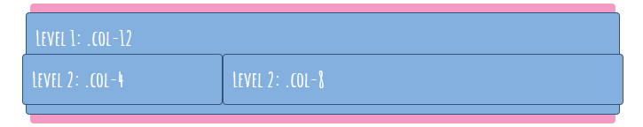
You can nest rows with columns inside a parent column. For example:
<div class="container">
    <div class="row">
        <div class="col col-12">
            Level 1: .col-12
            <div class="row">
                <div class="col col-4">
                    Level 2: .col-4
                </div>
                <div class="col col-8">
                    Level 2: .col-8
                </div>
            </div>
        </div>
    </div>
</div>
Column Width
Column widths are set in percentages, so they’re always fluid and sized relative to their parent .row element. Columns with no width specified will automatically have equal width. For instance, three .col-4 elements inside one container will each automatically be 33.33% wide.
You can specify the width of individual columns making them more narrow or wider than the rest. For example, the first and the third columns (.col-5) will have the width of 5/12 grid columns and the second one will have the width of 2/12 grid columns:
<div class="container">
    <div class="row">
        <div class="col-5">col-5</div>
        <div class="col-2">col-2</div>
        <div class="col-5">col-5</div>
    </div>
</div>

You can also use col-{breakpoint}-auto classes to size columns based on the width of their content. For example:
<div class="container">
    <div class="row">
        <div class="col-auto">Shark</div>
        <div class="col-auto">The shark sharks the sharking shark</div>
        <div class="col-auto">Shark your own shark</div>
    </div>
</div>

Responsive Grid
Bootstrap uses pxs for grid breakpoints and container widths because the viewport width in pixels doesn’t change with the font size.
To make the grid responsive, there are five grid breakpoints, one for each responsive breakpoint:
- extra small (.col-): is used for all breakpoints
- small (.col-sm-): the maximum container width is 540px
- medium (.col-md-): the maximum container width is 720px
- large (.col-lg-): the maximum container width is 960px
- extra large (.col-xl-): the maximum container width is 1140px
Grid breakpoints are based on minimum width media queries. They apply to that one breakpoint and all those above it. For example, .col-sm-4 applies to small, medium, large, and extra-large devices, but not the first extra small breakpoint.
For instance, this code will create three columns (4/12 grid columns each) that will transform into one column (12/12 grid columns each) and three rows in extra small devices:
<div class="container">
    <div class="row">
        <div class="col-sm-4 col-12"></div>
        <div class="col-sm-4 col-12"></div>
        <div class="col-sm-4 col-12"></div>
    </div>
</div>
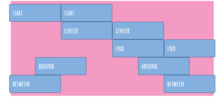
Horizontal Alignment
To align columns horizontally, add the following classes to the parent .row element:
- .justify-content-start: to pack columns toward the container’s left side
- .justify-content-center: to place columns in the center
- .justify-content-end: to pack columns toward the container’s right side
- .justify-content-around: to evenly distribute columns in the line with equal space on both sides of the columns
- .justify-content-between: to distribute columns so that the spacing between any two of them is equal
<div class="container">
    <div class="row justify-content-start">
        <div class="col-3">start</div>
        <div class="col-3">start</div>
    </div>
    <div class="row justify-content-center">
        <div class="col-3">center</div>
        <div class="col-3">center</div>
    </div>
    <div class="row justify-content-end">
        <div class="col-3">end</div>
        <div class="col-3">end</div>
    </div>
    <div class="row justify-content-around">
        <div class="col-3">around</div>
        <div class="col-3">around</div>
    </div>
    <div class="row justify-content-between">
        <div class="col-3">between</div>
        <div class="col-3">between</div>
    </div>
</div>
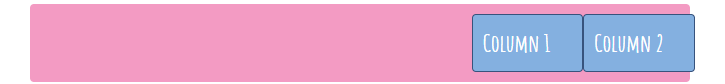
You can also use margin utilities like .mr-auto to force sibling columns away from one another (to create an auto-margin to the right) or .ml-auto to push two items to the right (to create an auto-margin to the left). These classes are responsive: for example, you can apply them for middle-sized devices by using .ml-md-auto.
<div class="row">
    <div class="col-2 mr-auto">Column 1</div>
    <div class="col-2">Column 2</div>
</div>
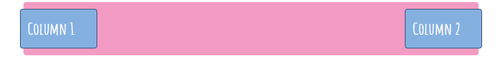
<div class="row">
    <div class="col-2 ml-auto">Column 1</div>
    <div class="col-2">Column 2</div>
</div>
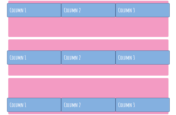
Vertical Alignment
To align columns vertically, apply the following classes to the parent .row element:
- .align-items-start: to place columns in the top part of the container
- .align-items-center: to place columns in the middle of the container
- .align-items-end: to place columns in the bottom part of the container
To align columns vertically, you should define the rows as full-height rows by adding the .h-100 class to them. If the parent of the element you’re trying to align vertically has no defined height, none of the vertical alignment solutions will work.
.container {
  height: 150px;
}
<div class="container">
    <div class="row align-items-start h-100">
        <div class="col">Column 1</div>
        <div class="col">Column 2</div>
        <div class="col">Column 3</div>
    </div>
</div>

<div class="container">
    <div class="row align-items-center h-100">
        <div class="col">Column 1</div>
        <div class="col">Column 2</div>
        <div class="col">Column 3</div>
    </div>
</div>

<div class="container">
    <div class="row align-items-end h-100">
        <div class="col">Column 1</div>
        <div class="col">Column 2</div>
        <div class="col">Column 3</div>
    </div>
</div>
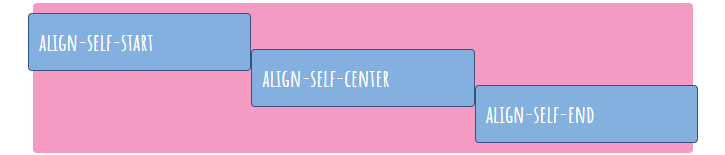
You can also align individual columns by applying the following classes to those individual columns:
- .align-self-start: to place a column in the top part of the container
- .align-self-center: to place a column in the middle of the container
- .align-self-end: to place a column in the bottom part of the container
<div class="container">
    <div class="row h-100">
        <div class="col align-self-start">align-self-start</div>
        <div class="col align-self-center">align-self-center</div>
        <div class="col align-self-end">align-self-end</div>
    </div>
</div>
Reordering Columns
Use .order-* classes to change the visual order of columns. The .order-12 class will shift the content to the end, and .order-1 will shift it to the beginning, but after the unordered content that comes first. These classes are responsive, so you can set the order by breakpoint (e.g., .order-1.order-md-2).
<div class="row">
    <div class="col">Column 1</div>
    <div class="col order-12">Column 2</div>
    <div class="col order-1">Column 3</div>
</div>
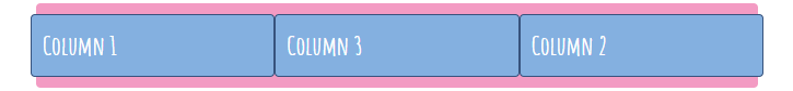
There are also responsive .order-first and .order-last classes that shift an element to the first and the last places, respectively.