Positioning of Navigation Bar Elements
Suppose you need to create the simplest navigation bar there can ever be: a horizontal bar consisting of four buttons with links. The markup would be the following:
<nav>
    <ul>
        <li><a>HOME</a></li>
        <li><a>ABOUT</a></li>
        <li><a>WORK</a></li>
        <li><a>CONTACT</a></li>
    </ul>
</nav>
Note that it’s recommended to put navigation buttons inside the <ul> list and inside the <nav> element for semantic reasons — to make your page more accessible to search engines.
With this markup, you’ll get a vertical list. To make it horizontal, apply display: inline-block; to your <li> elements, and remove list bullets by applying list-style-type: none;:
li {
  list-style-type: none;
  display: inline-block;
}
This will make horizontal buttons with empty spaces between them. To remove those gaps, apply a negative margin to your <li> elements:
li {
  margin-right: -4px;
}
Next, you’ll probably want to make the buttons of equal width. To make it happen, use the following CSS rules:
nav ul a {
  display: block;
  width: 8em;
}
And to align text inside buttons, do this:
nav ul {
  text-align: center;
}
Finally, to remove double borders between the neighboring elements, do this:
li {
  border-top: 1px solid #fff;
  border-bottom: 1px solid #fff;
  border-left: 1px solid #fff;
}

li:last-child {
  border-right: 1px solid #fff;
}
Just add your CSS rules for colors and padding, and the result will be the following:

Horizontal Bar with Flexbox
You can also create a smart positioning of your navigation bar elements using a flexbox technique.
Suppose you have the same markup as in the previous example and you want to move the last button to the far right side. To obtain this result, apply the following rules:
nav ul {
  display: flex;
}

nav ul > li:last-child {
  margin-left: auto;
}

Other, less important styles for this kind of navigation bar are the following:
nav ul {
  text-align: center;
}

nav li {
  background-color: #32557f;
  color: #fff;
  list-style-type: none;
  padding: 15px 0;
  border-top: 1px solid #fff;
  border-bottom: 1px solid #fff;
  border-left: 1px solid #fff;
}

nav li:nth-child(4), nav li:nth-child(3) {
  border-right: 1px solid #fff;
}

nav a {
  display: block;
  width: 6em;
}
Responsive Navigation Bar with Flexbox
Using flexbox, you can also make your navigation bar responsive — in other words, to make it widen or shrink depending on the window size.
Your main container’s width should have a percentage value (width the min-width property set at a fixed px value), and your element should have a 100% width.
.main {
  width: 45%;
  min-width: 330px;
}

nav {
  width: 100%;
}
Next, assign flex-direction: row; to the <ul> element to position its children in a left to right format.
nav ul {
  display: flex;
  flex-direction: row;
  margin: 0;
  padding: 0;
}
Finally, flex-grow: 1; will spread the <li> elements across the container. If you give a specific a value of 2, that element will be twice as wide as the size of the others.
nav ul li {
  flex-grow: 1;
}

nav ul li a {
  display: block;
}
The result will be as following:
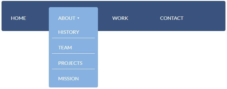
Pure CSS Dropdown Menu
This method of creating a dropdown menu doesn’t require do use JavaScript or jQuery and was inspired by a tutorial found on the Internetingishard.com website.
To create a dropdown menu, add elements for your dropdown menu (<li class="dropdown">) into the markup, like this:
<nav>
<ul class="menu">
<li><a>HOME</a></li>
<li class="dropdown"><a><span>ABOUT ▾</span></a>
<ul class="submenu">
<li><a>HISTORY</a></li>
<li><a>TEAM</a></li>
<li><a>PROJECTS</a></li>
<li><a>MISSION</a></li>
</ul>
</li>
<li><a>WORK</a></li>
<li><a>CONTACT</a></li>
</ul>
</nav>
The button intended to call a dropdown menu should contain another list (.submenu) with the dropdown menu. This button’s text should also be included in <span>. You can add to the text ▾ for an arrow symbol.
First, make your navigation bar’s position fixed. Also, apply display: flex; and arrange elements in a row (flex-direction: row;). Assign other styles, such as width, padding, background, etc.
nav {
  position: fixed;
  display: flex;
  flex-direction: row;

  width: 50%;
  padding: 30px;
  background: #32557f;
  color: #fff;
  border-radius: 5px;
}
Assign paddings to the .menu element’s children.
.menu {
  padding-top: 15px;
}

.menu > li {
  display: inline;
  padding-right: 100px;
}

.menu > li:last-of-type {
  padding-right: 0;
}
Next, make your dropdown menu appear when hovering over the chosen button. Using flexbox properties, make your dropdown menu look like a column, adjust its positioning, and apply other styles as you wish. Next, make the dropdown menu invisible with the display: none; property.
.dropdown {
  position: relative;
}

.dropdown:hover .submenu {
  display: flex;
  flex-direction: column;
  position: absolute;
  top: -25px;
  left: -30px;

  background: #7eb4e2;
  border-radius: 5px;
  padding-top: 60px;
}

.submenu {
  display: none;
}
After that, add the z-index property to the button in the main menu that calls the dropdown menu and to the dropdown menu itself:
.submenu {
  z-index: 100;
}

.dropdown a > span {
  z-index: 200;
  position: relative;
}
Finally, style the dropdown menu’s buttons:
.submenu li {
  list-style: none;
  border-bottom: 1px solid #fff;
  padding: 0 40px 10px 20px;
  margin: 10px;
}
.submenu li:last-of-type {
  border-bottom: none;
}
The result will look like this on hover:
Resizing Navigation Bar on Scroll
The resizing of a navigation bar is useful when it is fixed, in other words, when it sticks to the top of the page and shrinks on scroll. You can make it possible using jQuery.
Here’s the markup:
<nav>
    <ul class="menu">
        <li><a>HOME</a></li>
        <li><a>ABOUT</a></li>
        <li><a>WORK</a></li>
        <li><a>CONTACT</a></li>
    </ul>
</nav>
In your jQuery file, you need to specify how much pixels from the top of the page you want to scroll before the navigation bar (.menu) starts shrinking. Let’s say it’s 200px.
Next, you need to add a class (.menu-scroll) to your menu that will change the size of the navigation bar. And you need to remove this class when you’re not scrolling.
The final jQuery code looks like this:
$(window).scroll(function() {
    if ($(document).scrollTop() > 200) {
        $('.menu').addClass('menu-scroll');
    } else {
        $('.menu').removeClass('menu-scroll');
    }
});
For example, the styles for the .menu and .menu-scroll classes can be the following:
.menu li {
  padding: 15px 0;
}

.menu-scroll li {
  padding: 5px 0;
}
You can also add transition effects to the elements to make them resize smoother:
nav, a, li {
  transition: .7s all;
}
Here’s a demo (it's better seen in full screen mode):
Highlighting Menu Buttons on Scroll
Suppose you have a navigation bar with buttons by clicking which the page scrolls to the corresponding section of the document. To make this work, you need to create anchor links to the sections with corresponding ids:
<nav>
    <ul class="menu">
        <li><a href="#home">HOME</a></li>
        <li><a href="#about">ABOUT</a></li>
        <li><a href="#work">WORK</a></li>
        <li><a href="#contact">CONTACT</a></li>
    </ul>
</nav>

<div class="text">
    <div>
        <h2 id="home">Home</h2>
        Some content
    </div>
    <div>
        <h2 id="about">About</h2>
        Some content
    </div>
    <div>
        <h2 id="work">Work</h2>
        Some content
    </div>
    <div>
        <h2 id="contact">Contact</h2>
        Some content
    </div>
</div>
You can go further and highlight the buttons on click. You can do this with this jQuery code:
$(function() {
    $('.menu a').on('click', function(e) {
        e.preventDefault();

        $('.menu a').removeClass('active').filter(this).addClass('active');

        var selector = $(this).attr('href'); /* A link with a href attribute, e. g. #about */
        var h = $(selector); /* A title in the document */

        $('html, body').animate({
            scrollTop: h.offset().top - 70
        }, 400);
    })
})
You can style links in the active state, for example:
.menu a.active {
  color: #f69ec4;
}
Here’s the demo (it's better seen in full screen mode):
You can make highlighted elements even more beautiful and spectacular by using animation. Here is an example: